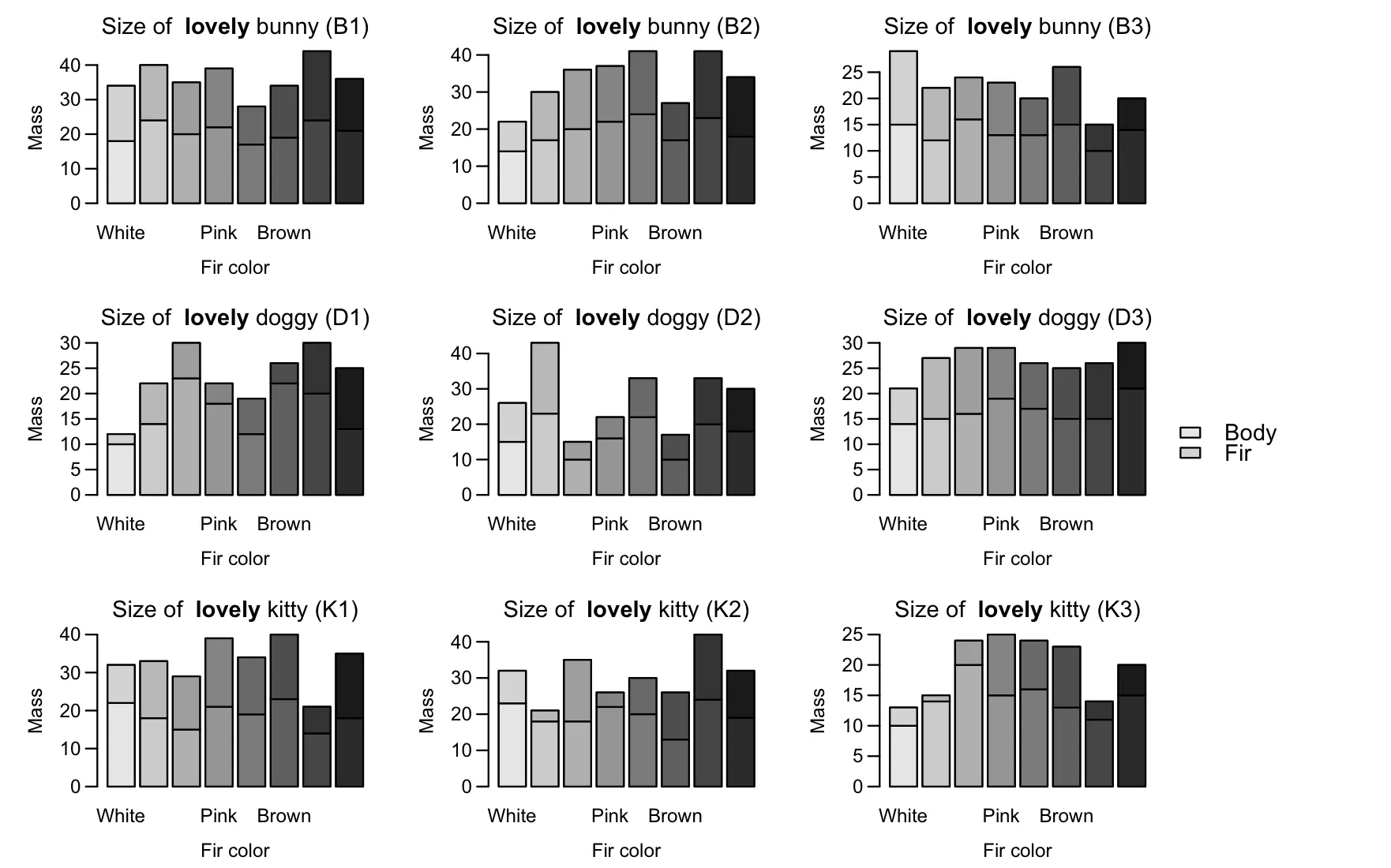
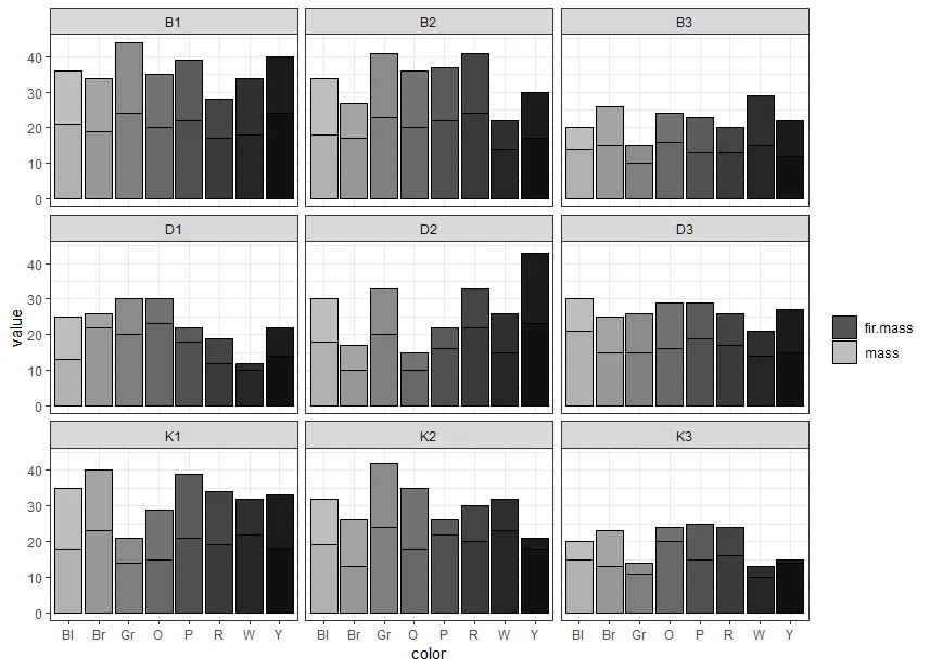
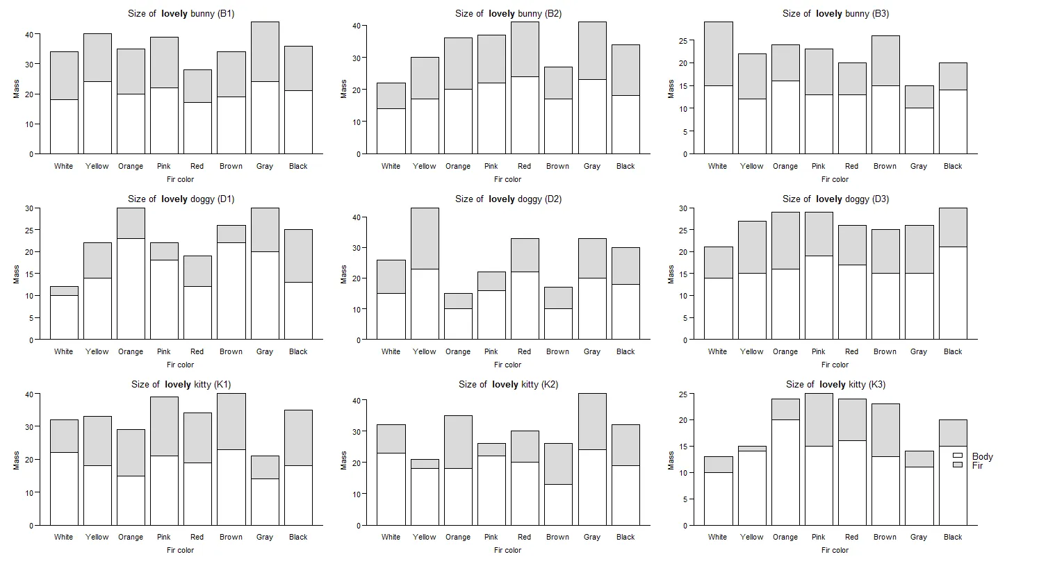
我正在尝试创建一个具有子图和堆叠条形图的图形。我希望每个条形图在x轴上的类别中逐渐改变颜色。我还希望每个条形图的堆叠部分比底部部分稍微浅一些。这类似于this question,但我想要跨条形图渐变的颜色(而不是在条形图内)。它也类似于this one,因为条形图的底部部分比堆叠部分暗,但我想知道是否有一种方法可以在基本R中实现,而不使用ggplot。
最后,我想将一个公共图例放在整个图的中间右侧,但我无法将其从bottomright区域移动。我参考了this,但它没有起作用。
以下是我的数据和代码。
最后,我想将一个公共图例放在整个图的中间右侧,但我无法将其从bottomright区域移动。我参考了this,但它没有起作用。
以下是我的数据和代码。
color <- c('W', 'Y', 'O', 'P', 'R', 'Br', 'Gr', 'Bl', 'W', 'Y', 'O', 'P', 'R', 'Br', 'Gr', 'Bl', 'W', 'Y', 'O', 'P', 'R', 'Br', 'Gr', 'Bl',
'W', 'Y', 'O', 'P', 'R', 'Br', 'Gr', 'Bl', 'W', 'Y', 'O', 'P', 'R', 'Br', 'Gr', 'Bl', 'W', 'Y', 'O', 'P', 'R', 'Br', 'Gr', 'Bl',
'W', 'Y', 'O', 'P', 'R', 'Br', 'Gr', 'Bl', 'W', 'Y', 'O', 'P', 'R', 'Br', 'Gr', 'Bl', 'W', 'Y', 'O', 'P', 'R', 'Br', 'Gr', 'Bl')
mass <- c(10, 14, 20, 15, 16, 13, 11, 15, 10, 14, 23, 18, 12, 22, 20, 13, 14, 17, 20, 22, 24, 17, 23, 18, 14, 15, 16, 19, 17, 15, 15, 21, 22, 18,
15, 21, 19, 23, 14, 18, 15, 23, 10, 16, 22, 10, 20, 18, 15, 12, 16, 13, 13, 15, 10, 14, 23, 18, 18, 22, 20, 13, 24, 19, 18, 24, 20, 22, 17, 19, 24, 21)
fir.mass <- c(3, 1, 4, 10, 8, 10, 3, 5, 2, 8, 7, 4, 7, 4, 10, 12, 8, 13, 16, 15, 17, 10, 18, 16, 7, 12, 13, 10, 9, 10, 11, 9, 10, 15, 14, 18, 15,
17, 7, 17, 11, 20, 5, 6, 11, 7, 13, 12, 14, 10, 8, 10, 7, 11, 5, 6, 9, 3, 17, 4, 10, 13, 18, 13, 16, 16, 15, 17, 11, 15, 20, 15)
name <- c('K3', 'K3', 'K3', 'K3', 'K3', 'K3', 'K3', 'K3', 'D1', 'D1', 'D1', 'D1', 'D1', 'D1', 'D1', 'D1', 'B2', 'B2', 'B2', 'B2', 'B2', 'B2', 'B2', 'B2',
'D3', 'D3', 'D3', 'D3', 'D3', 'D3', 'D3', 'D3', 'K1', 'K1', 'K1', 'K1', 'K1', 'K1', 'K1', 'K1', 'D2', 'D2', 'D2', 'D2', 'D2', 'D2', 'D2', 'D2',
'B3', 'B3', 'B3', 'B3', 'B3', 'B3', 'B3', 'B3', 'K2', 'K2', 'K2', 'K2', 'K2', 'K2', 'K2', 'K2', 'B1', 'B1', 'B1', 'B1', 'B1', 'B1', 'B1', 'B1')

pet.data <- data.frame(color, name, mass, fir.mass)

# Specify which individual belongs to which pet
kitty <- c('K1', 'K2', 'K3')
bunny <- c('B1', 'B2', 'B3')
doggy <- c('D1', 'D2', 'D3')

# Create gradually changing colors
blackcolors <- colorRampPalette(c('white', 'black'))
# I want the stacked part to be lighter in color than the bottom part
graycolors <- colorRampPalette(c('white', 'black'))

par(mfrow = c(3, 3), mar = c(4, 4, 2, 1), oma = c(0.5, 0.5, 0.5, 6), mgp = c(2.2, 0.7, 0))
for (i in 1: nlevels(pet.data$name)) {
pet.type <- ifelse(levels(pet.data$name)[i] %in% kitty, 'kitty', ifelse(levels(pet.data$name)[i] %in% bunny, 'bunny', 'doggy'))
pet.name <- levels(pet.data$name)[i]
barplot(rbind(pet.data$mass[pet.data$name == levels(pet.data$name)[i]], pet.data$fir.mass[pet.data$name == levels(pet.data$name)[i]]),
    main = substitute(paste('Size of  ', bold('lovely '), pet.type, ' (', pet.name, ')'),
    env = list(pet.type = pet.type, pet.name = pet.name)),
    xlab = 'Fir color', ylab = 'Mass', las = 1,
    names = c('White', 'Yellow', 'Orange', 'Pink', 'Red', 'Brown', 'Gray', 'Black'), col = c(blackcolors(8), graycolors(8)))
abline(h = 0)
}

# I want to add a legend in the middle right but it is not working
legend(x = 'right', y = 'middle', inset = c(-0.1, 0), legend = c('Body', 'Fir'), fill = c(blackcolors(8), graycolors(8)), bty = 'n', cex = 1.2, xpd = TRUE)
这是我得到的结果。
请问有人可以帮忙修复这个问题吗?非常感谢!