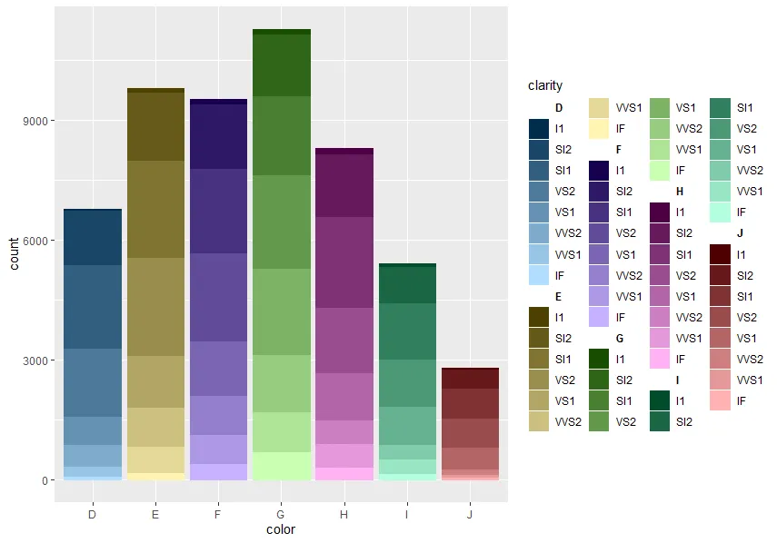
我已经编写了一个名为ColourPalleteMulti的函数,它可以让您基于数据子组创建多个颜色调色板:
ColourPalleteMulti <- function(df, group, subgroup){
categories <- aggregate(as.formula(paste(subgroup, group, sep="~" )), df, function(x) length(unique(x)))
category.start <- (scales::hue_pal(l = 100)(nrow(categories)))
category.end <- (scales::hue_pal(l = 40)(nrow(categories)))
colours <- unlist(lapply(1:nrow(categories),
function(i){
colorRampPalette(colors = c(category.start[i], category.end[i]))(categories[i,2])}))
return(colours)
}
本质上,该函数确定有多少不同的组,然后计算每个组中有多少颜色。然后将所有不同的调色板连接在一起。
要使用这个调色板,最简单的方法是添加一个新列group,将用于创建调色板的两个值粘贴在一起:
library(ggplot2)
df <- diamonds
df$group <- paste0(df$color, "-", df$clarity, sep = "")
colours <-ColourPalleteMulti(df, "color", "clarity")
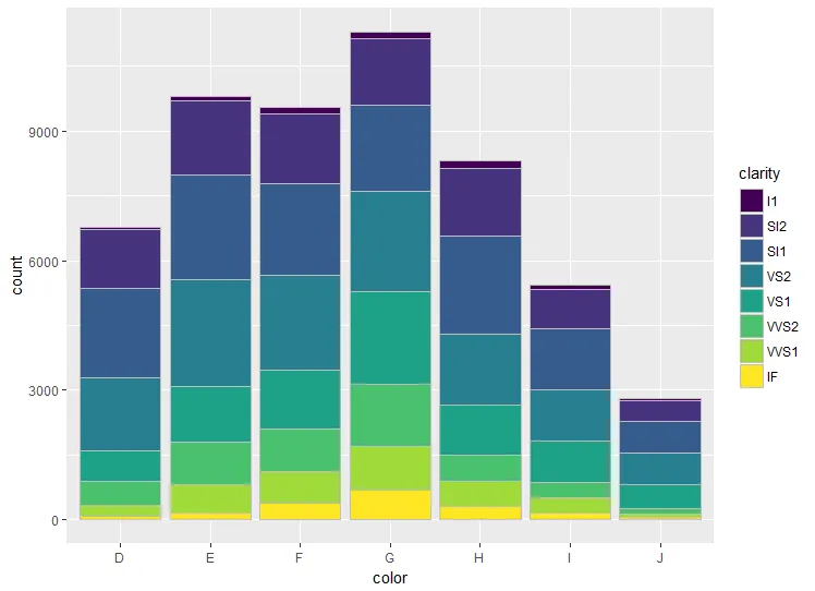
ggplot(df, aes(color)) +
geom_bar(aes(fill = group), colour = "grey") +
scale_fill_manual("Subject", values=colours, guide = "none")
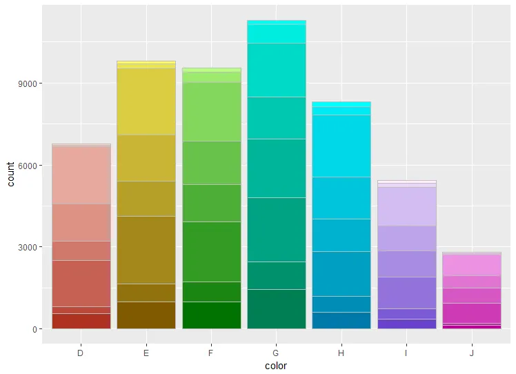
编辑:
如果您想让每个条形图内的条形颜色不同,只需更改用于绘制条形图的变量即可:
ggplot(df, aes(cut)) +
geom_bar(aes(fill = group), colour = "grey") +
scale_fill_manual("Subject", values=colours, guide = "none")
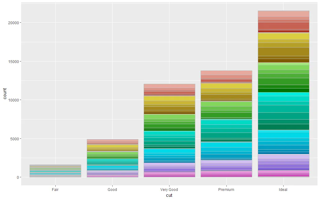
注意:说实话,您想要绘制的数据集可能包含过多的子类别,因此这种方法可能不适用。
而且,尽管这种视觉效果非常好,但我建议避免使用这样的颜色比例尺。它更多是为了使图表看起来漂亮,但不同的颜色对于我们已经从X轴知道哪个组中的数据是多余的。