ggrepel能否避免坐标轴标签重叠?

7
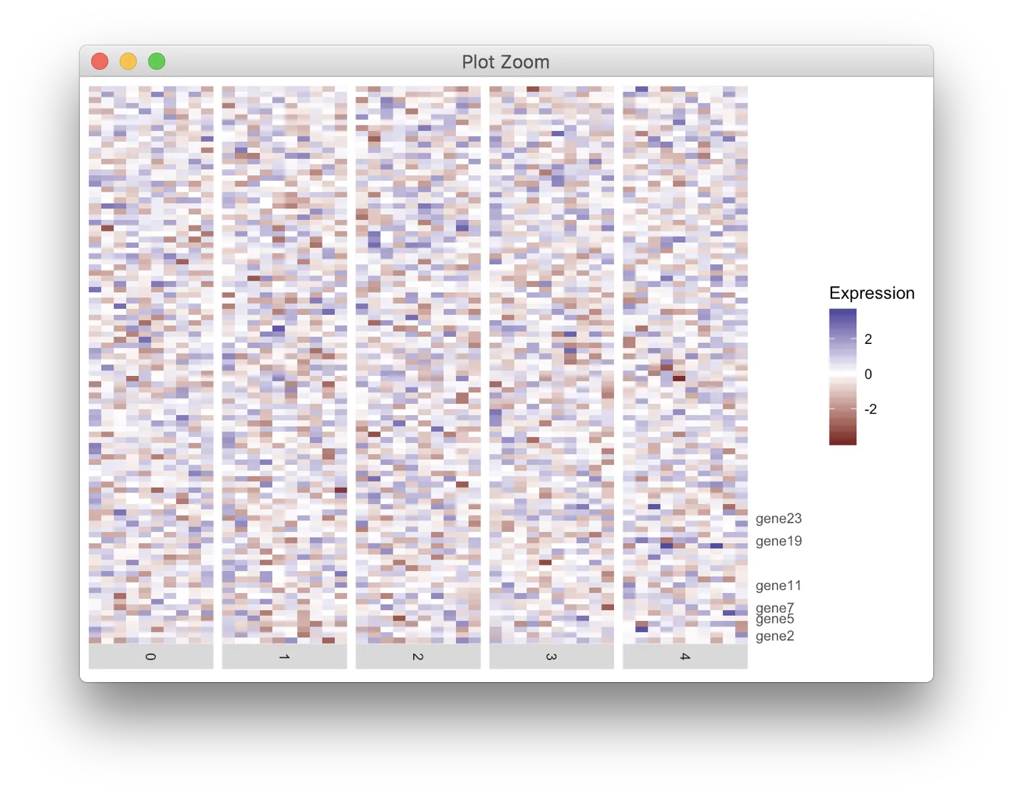
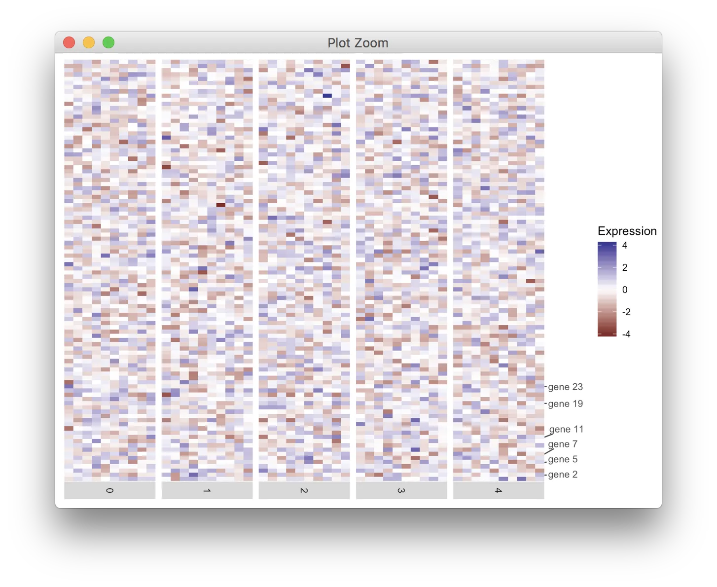
我正在使用ggplot2绘制热图。需要在y轴上标记几个刻度,但是有些刻度过于接近并重叠。我知道ggrepel可以分离文本标签,但目前还没有解决我的问题。
以下是我的代码。欢迎提出任何建议。谢谢。
代码:
df <- data.frame()

for (i in 1:50){
  tmp_df <- data.frame(cell=paste0("cell", i), 
                       gene=paste0("gene", 1:100), exp = rnorm(100), ident = i %% 5)
  df<-rbind(df, tmp_df)
}

labelRow=rep("", 100)
for (i in c(2, 5, 7, 11, 19, 23)){
  labelRow[i] <- paste0("gene", i)
}

library(ggplot2)
heatmap <- ggplot(data = df, mapping = aes(x = cell, y = gene, fill = exp)) +
  geom_tile() + 
  scale_fill_gradient2(name = "Expression") + 
  scale_y_discrete(position = "right", labels = labelRow) +
  facet_grid(facets = ~ident,
             drop = TRUE,
             space = "free",
             scales = "free", switch = "x") +
  scale_x_discrete(expand = c(0, 0), drop = TRUE) +
  theme(axis.line = element_blank(),
        axis.ticks = element_blank(),
        axis.title.y = element_blank(),
        axis.text.y = element_text(),
        axis.title.x = element_blank(),
        axis.text.x = element_blank(),
        strip.text.x = element_text(angle = -90))

heatmap

enter image description here

1个回答

6
对于这种问题,我更喜欢将轴作为单独的绘图进行绘制,然后再组合起来。这需要一些调整,但可以让你绘制几乎任何想要的轴。
在我的解决方案中,我使用了cowplot软件包中的get_legend()、align_plots()和plot_grid()函数。免责声明:我是该软件包的作者。
library(ggplot2)
library(cowplot); theme_set(theme_gray()) # undo cowplot theme setting
library(ggrepel)

df<-data.frame()
for (i in 1:50){
  tmp_df <- data.frame(cell=paste0("cell", i), 
                       gene=paste0("gene", 1:100), exp=rnorm(100), ident=i%%5)
  df<-rbind(df, tmp_df)
}


labelRow <- rep("", 100)
genes <- c(2, 5, 7, 11, 19, 23)
labelRow[genes] <- paste0("gene ", genes)

# make the heatmap plot
heatmap <- ggplot(data = df, mapping = aes(x = cell,y = gene, fill = exp)) +
  geom_tile() + 
  scale_fill_gradient2(name = "Expression") + 
  scale_x_discrete(expand = c(0, 0), drop = TRUE) + 
  facet_grid(facets = ~ident,
             drop = TRUE,
             space = "free",
             scales = "free", switch = "x") + 
  theme(axis.line = element_blank(),
        axis.title = element_blank(),
        axis.text = element_blank(),
        axis.ticks = element_blank(),
        strip.text.x = element_text(angle = -90),
        legend.justification = "left",
        plot.margin = margin(5.5, 0, 5.5, 5.5, "pt"))

# make the axis plot
axis <- ggplot(data.frame(y = 1:100,
                          gene = labelRow),
               aes(x = 0, y = y, label = gene)) +
  geom_text_repel(min.segment.length = grid::unit(0, "pt"),
                 color = "grey30",  ## ggplot2 theme_grey() axis text
                 size = 0.8*11/.pt  ## ggplot2 theme_grey() axis text
                 ) +
  scale_x_continuous(limits = c(0, 1), expand = c(0, 0),
                     breaks = NULL, labels = NULL, name = NULL) +
  scale_y_continuous(limits = c(0.5, 100.5), expand = c(0, 0),
                     breaks = NULL, labels = NULL, name = NULL) +
  theme(panel.background = element_blank(),
        plot.margin = margin(0, 0, 0, 0, "pt"))

# align and combine
aligned <- align_plots(heatmap + theme(legend.position = "none"), axis, align = "h", axis = "tb")
aligned <- append(aligned, list(get_legend(heatmap)))
plot_grid(plotlist = aligned, nrow = 1, rel_widths = c(5, .5, .7))

enter image description here


如果您的原始数据框具有行名称和列名称,则应添加labels=NULL,例如:scale_x_discrete(expand=c(0, 0),drop=TRUE,labels=NULL)+scale_y_discrete(expand=c(0, 0),drop=TRUE,labels=NULL)以避免显示不需要的标签。 - PengY
Claus,感谢你的建议!我稍微修改了一下你的代码,以便它适用于热力图的左侧。虽然我可以对齐标签,但是轴和热力图之间有很大的边距。你知道这是为什么吗?我将热力图和轴的所有边缘边距都设为0,所以我不知道它们之间还有空间。你有什么建议吗? - adn bps

网页内容由stack overflow 提供, 点击上面的
可以查看英文原文,
原文链接