MATLAB:使用自定义色图绘制栅格地图

3
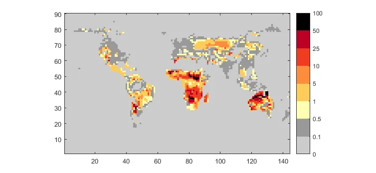
在MATLAB中,我有一个与引用对象R相关联的矩阵map_data(都在this MAT-file中)。我想要将其映射到离散的色条上,给定一个不规则的值范围,使其看起来像这样:

enter image description here

我想使用
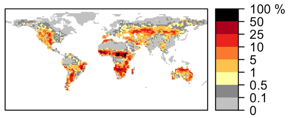
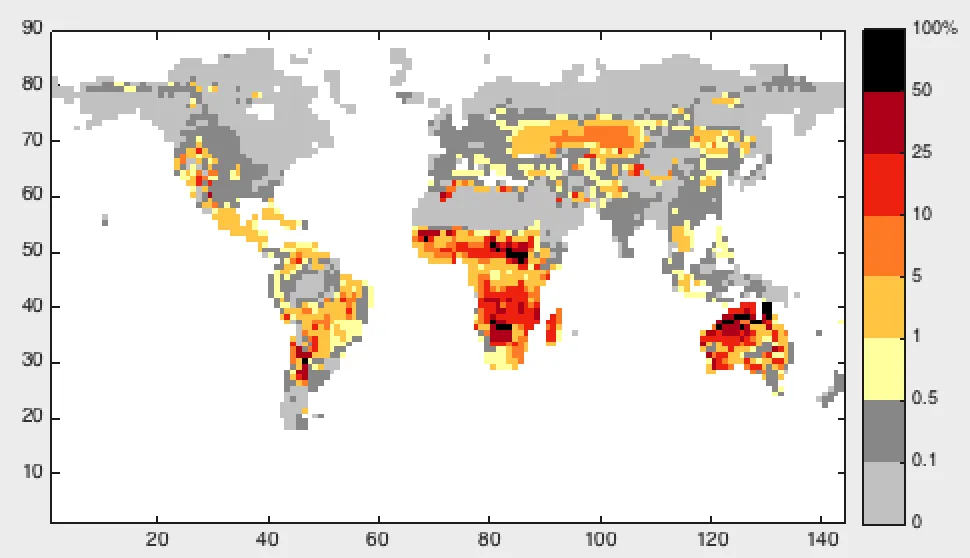
geoshow()或类似的东西,它可以让我随意重新投影,并将形状文件叠加在光栅图像之上。但是,任何能帮助我的方法都将不胜感激。
我正在使用MATLAB r2014b。以下是颜色地图的相关信息:
                                R    G    B
0     <= map_data < 0.001     204  204  204
0.001 <= map_data < 0.005     153  153  153
0.005 <= map_data < 0.01      255  255  178
0.01  <= map_data < 0.05      254  204   92
0.05  <= map_data < 0.1       253  141   60
0.1   <= map_data < 0.25      240   59   32
0.25  <= map_data < 0.5       189    0   38
0.5   <= map_data < 1           0    0    0

在MATLAB答案上进行了交叉发布。

2个回答

1

MATLAB仅支持线性调色板的内置支持。因此,对于像这样的非线性映射,您需要转换map_data的值,以使颜色变化均匀分布。对于这样的离散调色板,整数索引是理想的,并且您可以使用histc轻松获得它们:

ranges = [0 0.001 0.005 0.01 0.05 0.1 0.25 0.5 1];
[~,ind] = histc(map_data,ranges);

使用ind中的索引代替map_data中的值作为颜色数据,然后将指定的颜色应用为彩色地图。在需要在你的彩色条上标记真实的map_data值的地方,手动重新标记相应彩色条的YTickLabel即可。我没有地图工具箱来演示如何使用geoshow,但按照以下方式显示为简单的图像即可:
image(ind)
axis equal tight
set(gca,'YDir','normal')
colormap([204  204  204
          153  153  153
          255  255  178
          254  204   92
          253  141   60
          240   59   32
          189    0   38
          0    0    0]/255);
h = colorbar;
h.YTickLabel = edges(h.YTick)*100;

这将导致以下结果:

map_data with discrete colormap


啊,好建议!不过需要进行一些编辑以使其适合我的情况,因此我不会将其标记为答案。我会在新答案中放置我的代码,如果您想将其合并到您的代码中,我会将您的答案标记为正确答案。(前提是有人告诉我如何使用映射工具箱函数。) - Sam R
(我还没有足够的声望来点赞 :-/) - Sam R
请帮我处理一个类似的查询,但需要在mollweid投影中输出结果:http://stackoverflow.com/questions/39155845/attaching-customized-colormap-to-geoshow-in-matlab - Munish

1

威尔有一个很好的想法使用histc(),但我不得不编辑他的代码使其适用于我。这是最终的结果。

my_colormap = [204  204  204
               153  153  153
               255  255  178
               254  204   92
               253  141   60
               240   59   32
               189    0   38
                 0    0    0]/255 ;
binEdges = [0 0.001 0.005 0.01 0.05 0.1 0.25 0.5 1] ;
labels = textscan(num2str(binEdges*100),'%s') ;
labels = labels{1} ;
labels{length(labels)} = [labels{length(labels)} '%'] ;

[~,indices] = histc(map_data,binEdges);
indices(isnan(map_data)) = NaN ;
indices(isinf(map_data)) = NaN ;

figure ;
pcolor(indices-1)   % Instead of image(), to display NaN values as white
shading flat
axis equal tight

colormap(gca,my_colormap);   % gca as first argument prevents 
                             % colormap from changing for all 
                             % subsequent plots
h = colorbar;
caxis([0 length(binEdges)-1])
h.YTickLabel = labels ;

Resulting plot


网页内容由stack overflow 提供, 点击上面的
可以查看英文原文,
原文链接