- 由于潜在的问题,
df.index -= pd.DateOffset(hours=3)已被删除
- 每个月的前几个小时会被归入上一个月
- 每天的前几个小时会被归入前一天
import pandas as pd
import matplotlib.pyplot as plt
import seaborn as sns
from pathlib import Path
from datetime import date
from pandas.tseries.offsets import MonthEnd
p = Path('/PythonProjects/stack_overflow/data/ozone/')
files = list(p.glob('OZONE*.csv'))
df = pd.concat([pd.read_csv(file) for file in files])
df.start_hour = pd.to_timedelta(df['start_hour'], unit = 'h')
df.date = pd.to_datetime(df.date)
df['datetime'] = df.date + df.start_hour
df.drop(columns=['date', 'start_hour'], inplace=True)
df['month'] = df.datetime.dt.month
df['day'] = df.datetime.dt.day
df['year'] = df.datetime.dt.year
df = df[df.month.isin([4, 5, 6])].copy()
df.set_index('datetime', inplace = True)
df['r_mean'] = df.value.rolling('8H', min_periods=6).mean()
r_mean_daily_max = df.groupby(['year', 'month', 'day'], as_index=False)['r_mean'].max()
mda8 = r_mean_daily_max.groupby(['year', 'month'], as_index=False)['r_mean'].mean()
mda8['datetime'] = pd.to_datetime(mda8.year.astype(str) + mda8.month.astype(str), format='%Y%m') + MonthEnd(1)
df.info() & .head()在任何处理之前
<class 'pandas.core.frame.DataFrame'>
Int64Index: 78204 entries, 0 to 4663
Data columns (total 9 columns):
--- ------ -------------- -----
0 site 78204 non-null int64
1 date 78204 non-null object
2 start_hour 78204 non-null int64
3 value 78204 non-null float64
4 variable 78204 non-null object
5 units 78204 non-null object
6 quality 4664 non-null float64
7 prelim 4664 non-null object
8 name 78204 non-null object
dtypes: float64(2), int64(2), object(5)
memory usage: 6.0+ MB
site date start_hour value variable units quality prelim name
0 3135 2011-01-01 0 14.0 OZONE Parts Per Billion ( ppb ) NaN NaN Calexico-Ethel Street
1 3135 2011-01-01 1 11.0 OZONE Parts Per Billion ( ppb ) NaN NaN Calexico-Ethel Street
2 3135 2011-01-01 2 22.0 OZONE Parts Per Billion ( ppb ) NaN NaN Calexico-Ethel Street
3 3135 2011-01-01 3 25.0 OZONE Parts Per Billion ( ppb ) NaN NaN Calexico-Ethel Street
4 3135 2011-01-01 5 22.0 OZONE Parts Per Billion ( ppb ) NaN NaN Calexico-Ethel Street
处理后的df.info和.head()
<class 'pandas.core.frame.DataFrame'>
DatetimeIndex: 20708 entries, 2011-04-01 00:00:00 to 2020-06-30 23:00:00
Data columns (total 11 columns):
--- ------ -------------- -----
0 site 20708 non-null int64
1 value 20708 non-null float64
2 variable 20708 non-null object
3 units 20708 non-null object
4 quality 2086 non-null float64
5 prelim 2086 non-null object
6 name 20708 non-null object
7 month 20708 non-null int64
8 day 20708 non-null int64
9 year 20708 non-null int64
10 r_mean 20475 non-null float64
dtypes: float64(3), int64(4), object(4)
memory usage: 1.9+ MB
site value variable units quality prelim name month day year r_mean
datetime
2011-04-01 00:00:00 3135 13.0 OZONE Parts Per Billion ( ppb ) NaN NaN Calexico-Ethel Street 4 1 2011 NaN
2011-04-01 01:00:00 3135 29.0 OZONE Parts Per Billion ( ppb ) NaN NaN Calexico-Ethel Street 4 1 2011 NaN
2011-04-01 02:00:00 3135 31.0 OZONE Parts Per Billion ( ppb ) NaN NaN Calexico-Ethel Street 4 1 2011 NaN
2011-04-01 03:00:00 3135 28.0 OZONE Parts Per Billion ( ppb ) NaN NaN Calexico-Ethel Street 4 1 2011 NaN
2011-04-01 05:00:00 3135 11.0 OZONE Parts Per Billion ( ppb ) NaN NaN Calexico-Ethel Street 4 1 2011 NaN
r_mean_daily_max.info() 和 .head()
<class 'pandas.core.frame.DataFrame'>
Int64Index: 910 entries, 0 to 909
Data columns (total 4 columns):
--- ------ -------------- -----
0 year 910 non-null int64
1 month 910 non-null int64
2 day 910 non-null int64
3 r_mean 910 non-null float64
dtypes: float64(1), int64(3)
memory usage: 35.5 KB
year month day r_mean
0 2011 4 1 44.125
1 2011 4 2 43.500
2 2011 4 3 42.000
3 2011 4 4 49.625
4 2011 4 5 45.500
mda8.info() & .head()
<class 'pandas.core.frame.DataFrame'>
Int64Index: 30 entries, 0 to 29
Data columns (total 4 columns):
--- ------ -------------- -----
0 year 30 non-null int64
1 month 30 non-null int64
2 r_mean 30 non-null float64
3 datetime 30 non-null datetime64[ns]
dtypes: datetime64[ns](1), float64(1), int64(2)
memory usage: 1.2 KB
year month r_mean datetime
0 2011 4 49.808135 2011-04-30
1 2011 5 55.225806 2011-05-31
2 2011 6 58.162302 2011-06-30
3 2012 4 45.865278 2012-04-30
4 2012 5 61.061828 2012-05-31
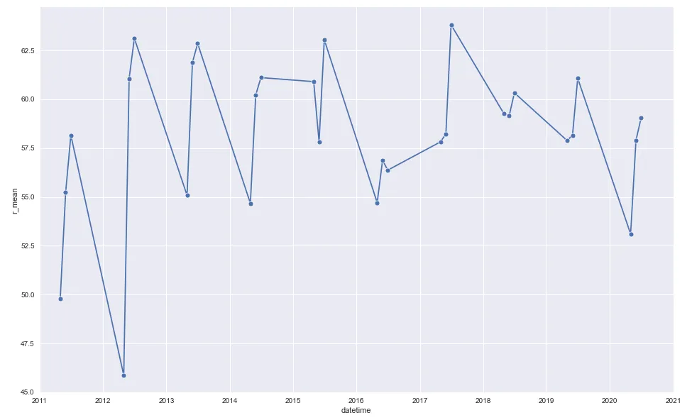
mda8
plot 1
sns.lineplot(mda8.datetime, mda8.r_mean, marker='o')
plt.xlim(date(2011, 1, 1), date(2021, 1, 1))
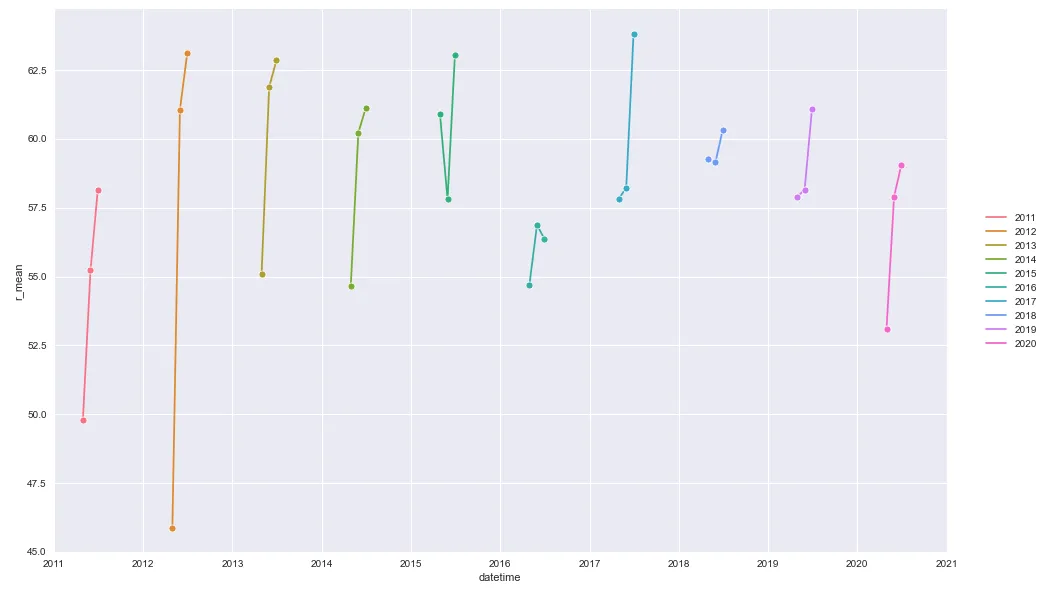
第二个图表
years = mda8.year.unique()
colors = sns.color_palette('husl', n_colors=len(years))
cmap = dict(zip(years, colors))
for g, d in mda8.groupby('year'):
sns.lineplot(d.datetime, d.r_mean, marker='o', hue=g, palette=cmap)
plt.xlim(date(2011, 1, 1), date(2021, 1, 1))
plt.legend(bbox_to_anchor=(1.04,0.5), loc="center left", borderaxespad=0)
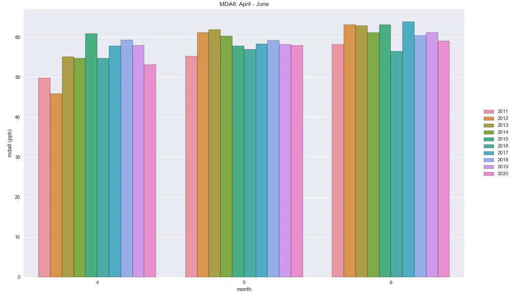
第三个图表
sns.barplot(x='month', y='r_mean', data=mda8, hue='year')
plt.legend(bbox_to_anchor=(1.04,0.5), loc="center left", borderaxespad=0)
plt.title('MDA8: April - June')
plt.ylabel('mda8 (ppb)')
plt.show()
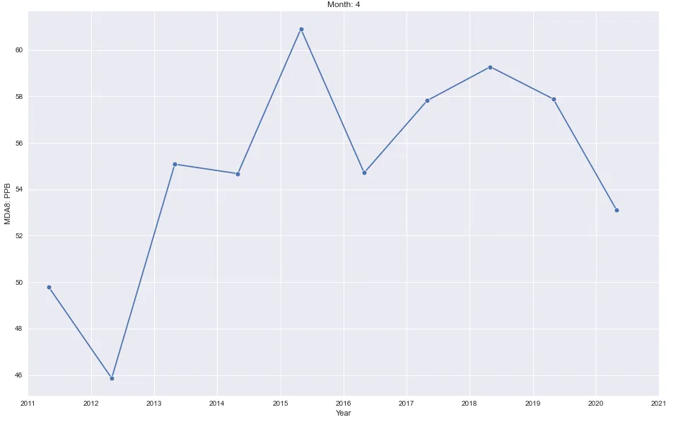
第四个图表
for month in mda8.month.unique():
data = mda8[mda8.month == month]
plt.figure()
sns.lineplot(data.datetime, data.r_mean, marker='o')
plt.xlim(date(2011, 1, 1), date(2021, 1, 1))
plt.title(f'Month: {month}')
plt.ylabel('MDA8: PPB')
plt.xlabel('Year')
- 每月将有一个图表
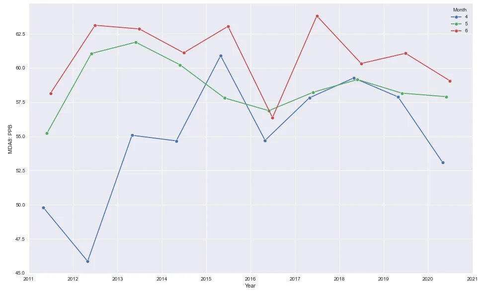
图表5
for month in mda8.month.unique():
    data = mda8[mda8.month == month]
    sns.lineplot(data.datetime, data.r_mean, marker='o', label=month)
    plt.legend(title='Month')
    plt.xlim(date(2011, 1, 1), date(2021, 1, 1))
    plt.ylabel('MDA8: PPB')
    plt.xlabel('Year')
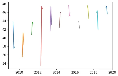
- 需求:我想为四月、五月和六月分别制作三个散点图。
- 主要问题是无法使用日期时间轴进行绘图。
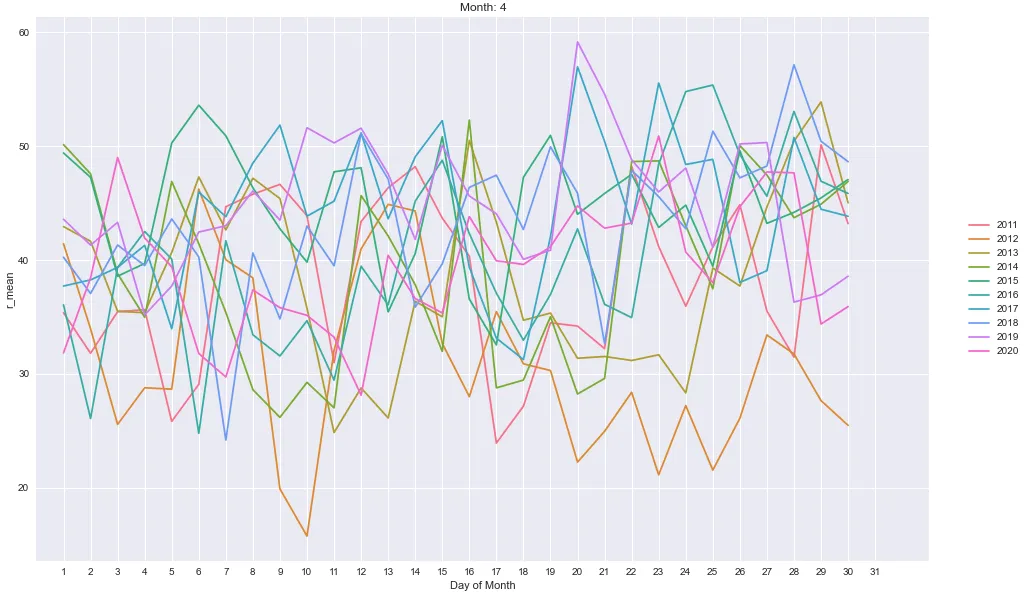
折线图
- 有些繁忙。
- 使用了自定义颜色映射,因为标准调色板中没有足够的颜色来给每年分配唯一的颜色。
years = df.index.year.unique()
colors = sns.color_palette('husl', n_colors=len(years))
cmap = dict(zip(years, colors))
for k, v in df.groupby('month'):
plt.figure(figsize=(16, 10))
for year in v.index.year.unique():
data = v[v.index.year == year]
sns.lineplot(data.index.day, data.r_mean, err_style=None, hue=year, palette=cmap)
plt.xlim(0, 33)
plt.xticks(range(1, 32))
plt.title(f'Month: {k}')
plt.xlabel('Day of Month')
plt.legend(bbox_to_anchor=(1.04,0.5), loc="center left", borderaxespad=0)
plt.show()
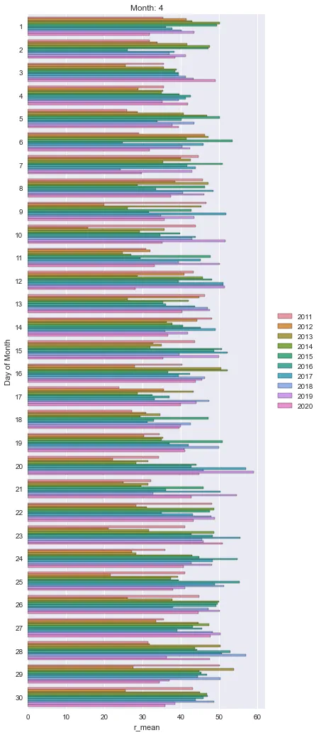
柱状图
for k, v in df.groupby('month'):
plt.figure(figsize=(10, 20))
sns.barplot(x=v.r_mean, y=v.day, ci=None, orient='h', hue=v.index.year)
plt.title(f'Month: {k}')
plt.ylabel('Day of Month')
plt.legend(bbox_to_anchor=(1.04,0.5), loc="center left", borderaxespad=0)
plt.show()
 再次强调,我想为每个月制作单独的散点图,虽然这更接近我想要的。谢谢任何帮助。