在Plotly中调整文本标签的大小。

11
我试图根据不同国家的大小调整文本大小,使得文本在国家的边界内。
import pandas as pd
import plotly.express as px

df=pd.read_csv('regional-be-daily-latest.csv', header = 1)

fig = px.choropleth(df, locations='Code', color='Track Name')
fig.update_layout(margin={"r":0,"t":0,"l":0,"b":0})

fig.add_scattergeo(

  locations = df['Code'],
  text = df['Track Name'],
  mode = 'text',
)

fig.show()

关于可视化:

enter image description here

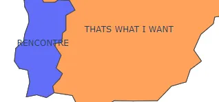
橙色国家的文本位于国家边界内,但用于标记蓝色国家的文本更大。

最好调整大小,以便不超出国家边界。


你找到解决方案了还是仍需要帮助?如果已经解决,请添加解决方案 :) - Lidor Eliyahu Shelef
2个回答

13
您可以使用update_layout函数来设置字体大小,并通过在字体参数中传递字典来指定字体的大小。
import pandas as pd
import plotly.express as px

df=pd.read_csv('regional-be-daily-latest.csv', header = 1)

fig = px.choropleth(df, locations='Code', color='Track Name')
fig.update_layout(margin={"r":0,"t":0,"l":0,"b":0})

fig.add_scattergeo(

  locations = df['Code'],
  text = df['Track Name'],
  mode = 'text',
)


fig.update_layout(
    font=dict(
        family="Courier New, monospace",
        size=18,  # Set the font size here
        color="RebeccaPurple"
    )
)

fig.show()

1
嘿,不幸的是它并不按照我的意愿工作。 - Greencolor

1

网页内容由stack overflow 提供, 点击上面的
可以查看英文原文,
原文链接