我需要修改Plotly图表中标签和标题的大小。
我找到了一种只能修改坐标轴标签和标题大小的方法。
此外,当我已经指定了x轴和y轴标题时,为什么只显示了x轴标题而没有显示y轴标题,我也不太明白。
这是我的代码:
cc <- count(mydata, year_dx1, Age)
cc2 <- left_join(cc, count(cc, year_dx1, wt = n, name = 'nn'))
cc2 %>%
mutate(Percentage = (n / nn)*100) %>%
plot_ly(x = ~year_dx1, y = ~Percentage, color = ~Age) %>%
add_bars() %>%
layout(barmode = "stack")%>%
layout(title = 'Age at diagnosis distribution by time', xaxis
= list(title = 'Year of diagnosis',
 yaxis = list(title = 'Count')))%>%
 layout(
  xaxis = list(titlefont = list(size = 22), tickfont =
list(size = 22)),
  yaxis = list(titlefont = list(size = 22), tickfont =
 list(size = 22)))
我已经尝试过这种方法,但它没有起作用:
  cc <- count(mydata, year_dx1, Age)
 cc2 <- left_join(cc, count(cc, year_dx1, wt = n, name ='nn'))
 cc2 %>% mutate(Percentage = (n / nn)*100) %>%
 plot_ly(x = ~year_dx1, y = ~Percentage, color = ~Age) %>%
 add_bars() %>% layout(barmode = "stack")%>% layout(title ='Age at diagnosis distribution by time', xaxis = list(title = 'Year of diagnosis',yaxis = list(title = 'Count')))%>%
  layout(xaxis = list(titlefont = list(size = 22), tickfont =
 list(size = 22)),yaxis = list(titlefont = list(size = 22), tickfont =list(size = 22)),legend = list(tickfont = list(size = 22)))
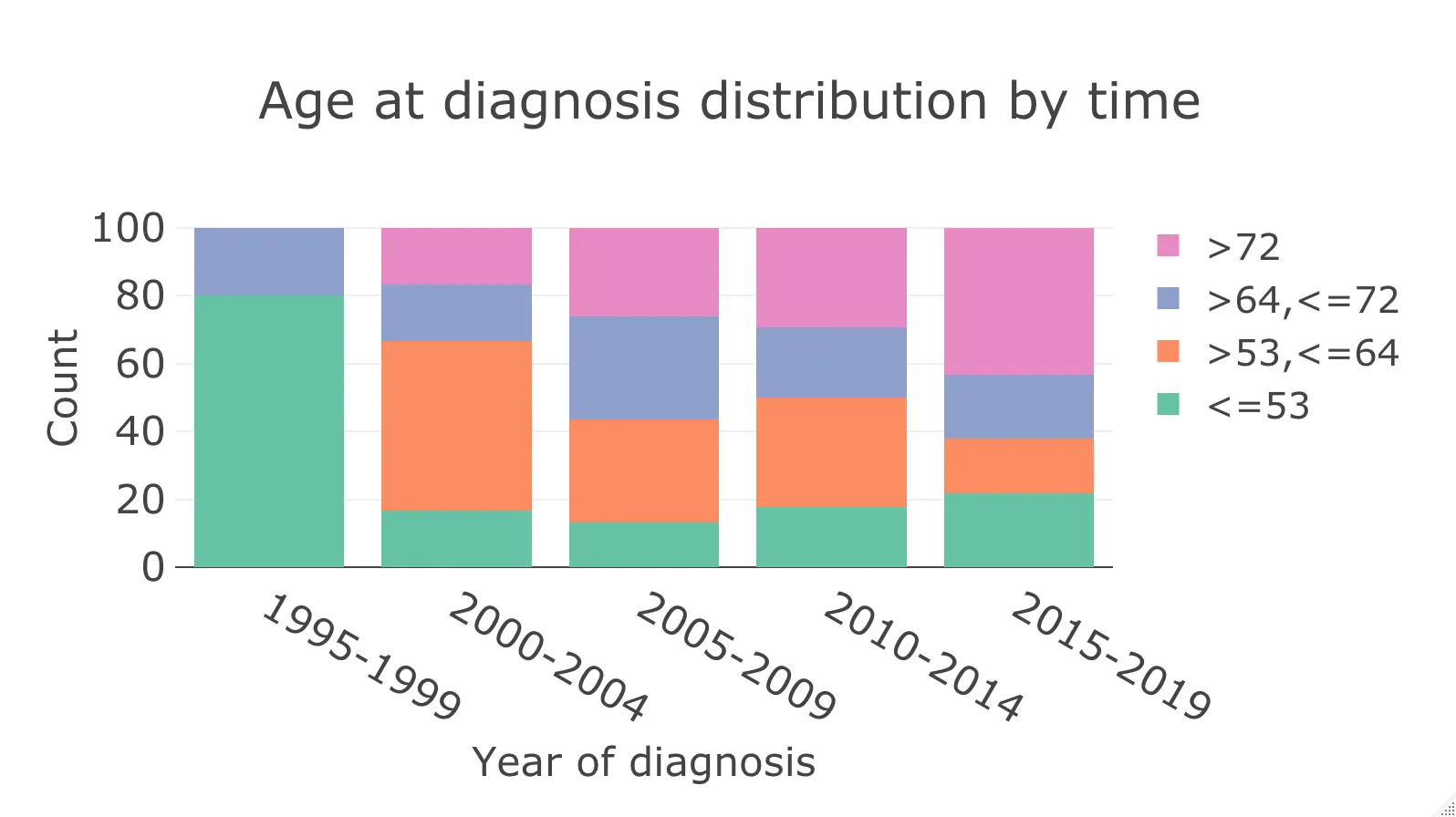
这是我的图表:
这是我的数据:
> mydata$Age
  [2] ">64,<=72" ">64,<=72" "<=53"     "<=53"     "<=53"     ">53,<=64" "<=53"
  [8] ">72"      ">53,<=64" ">64,<=72" ">64,<=72" ">53,<=64" ">72"      ">64,<=72"
 [15] ">53,<=64" ">72"      "<=53"     "<=53"     "<=53"     ">53,<=64" ">72"
 [22] ">72"      ">53,<=64" ">53,<=64" ">64,<=72" ">72"      "<=53"     ">72"
 [29] ">72"      ">53,<=64" ">53,<=64" ">72"      ">53,<=64" "<=53"     ">53,<=64"
 [36] ">64,<=72" ">72"      ">64,<=72" ">64,<=72" ">72"      ">64,<=72" ">64,<=72"
 [43] ">53,<=64" ">72"      ">53,<=64" ">72"      ">64,<=72" ">64,<=72" ">72"
 [50] "<=53"     ">53,<=64" ">53,<=64" ">72"      ">64,<=72" ">72"      ">72"
 [57] ">72"      ">72"      ">72"      ">64,<=72" "<=53"     ">53,<=64" ">53,<=64"
 [64] ">64,<=72" ">72"      ">72"      ">53,<=64" ">72"      ">72"      ">72"
 [71] "<=53"     "<=53"     "<=53"     ">64,<=72" "<=53"     ">53,<=64" ">53,<=64"
 [78] ">64,<=72" ">72"      ">53,<=64" "<=53"     "<=53"     "<=53"     ">72"
 [85] ">72"      ">64,<=72" "<=53"     ">53,<=64" ">64,<=72" ">53,<=64" "<=53"
 [92] "<=53"     ">72"      ">72"      ">53,<=64" ">53,<=64" "<=53"     ">72"
 [99] ">53,<=64" ">64,<=72" ">72"      ">53,<=64" ">72"      ">64,<=72" ">64,<=72"

> mydata$year_dx1
  [2] "2015-2019" "2010-2014" "2005-2009" "2010-2014" "2005-2009" "2010-2014"
  [7] "2000-2004" "2010-2014" "2000-2004" "2005-2009" "1995-1999" "2010-2014"
 [13] "2005-2009" "2005-2009" "2005-2009" "2015-2019" "2015-2019" "2015-2019"
 [19] "2015-2019" "2010-2014" "2010-2014" "2010-2014" "2015-2019" "2010-2014"
 [25] "2010-2014" "2005-2009" "2015-2019" "2005-2009" "2015-2019" "2005-2009"
 [31] "2010-2014" "2015-2019" "2005-2009" "2010-2014" "2005-2009" "2010-2014"
 [37] "2015-2019" "2005-2009" "2010-2014" "2005-2009" "2005-2009" "2010-2014"
 [43] "2015-2019" "2010-2014" "2010-2014" "2015-2019" "2005-2009" "2015-2019"
 [49] "2010-2014" "2015-2019" "2010-2014" "2015-2019" "2015-2019" "2015-2019"
 [55] "2015-2019" "2015-2019" "2015-2019" "2015-2019" "2010-2014" "2015-2019"
 [61] "1995-1999" "2015-2019" "2010-2014" "2015-2019" "2005-2009" "2005-2009"
 [67] "2015-2019" "2010-2014" "2015-2019" "2015-2019" "2015-2019" "2015-2019"
 [73] "1995-1999" "2005-2009" "2015-2019" "2010-2014" "2000-2004" "2005-2009"
 [79] "2010-2014" "2005-2009" "2010-2014" "1995-1999" "2010-2014" "2015-2019"
 [85] "2015-2019" "2015-2019" "2010-2014" "2005-2009" "2015-2019" "2010-2014"
 [91] "2005-2009" "2010-2014" "2000-2004" "2015-2019" "2005-2009" "2000-2004"
 [97] "1995-1999" "2015-2019" "2015-2019" "2000-2004" "2010-2014" "2010-2014"
[103] "2010-2014" "2010-2014" "2010-2014" "2000-2004" "2010-2014" "2015-2019"
我该如何解决这个问题?