我正在尝试使用plotly的这个示例绘制两条垂直线来表示均值和中位数。
可重现代码
library(plotly)

# data
df1 <- data.frame(cond = factor( rep(c("A","B"), each=200) ),
                  rating = c(rnorm(200),rnorm(200, mean=.8)))

df2 <- data.frame(x=c(.5,1),cond=factor(c("A","B")))

# graph
ggplot(data=df1, aes(x=rating, fill=cond)) +
  geom_vline(aes(xintercept=mean(rating, na.rm=T))
             , color="red", linetype="dashed", size=1, name="average") +
  geom_vline(aes(xintercept=median(rating, na.rm=T))
             , color="blue", linetype="dashed", size=1, name="median") +
  geom_histogram(binwidth=.5, position="dodge")

ggplotly()
问题
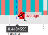
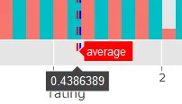
我想要隐藏显示在红色文本“average”旁边的y值-2.2。但是,我希望文本“average”像下面截图中一样显示。也就是说,我只想要隐藏我用黑色叉号标记的标签。 同样的问题也适用于中位数线。
我的尝试失败了
#plot
gg <- ggplot(data=df1, aes(x=rating, fill=cond)) +
    geom_vline(aes(xintercept=mean(rating, na.rm=T))
               , color="red", linetype="dashed", size=1, name="average")+
    geom_vline(aes(xintercept=median(rating, na.rm=T))
               , color="blue", linetype="dashed", size=1, name="median") +
    geom_histogram(binwidth=.5, position="dodge")

p <- plotly_build(gg)
# p$data[[1]]$y[1:2] <- " " # another attempt, but the line doesn't display at all
p$data[[1]]$y <- NULL # delete the y-values assigned to the average line
plotly_build(p)
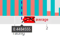
这次尝试仍然显示为
0(如下图所示):