我好像卡在了一个相对简单的问题上,但是在过去的一小时里搜索并尝试了很多实验后仍然无法解决。
我有两个numpy数组x和y,我正在使用seaborn的jointplot将它们绘制出来:
sns.jointplot(x, y)
现在我想将x轴和y轴分别标记为“X轴标签”和“Y轴标签”。如果我使用 plt.xlabel,标签会出现在边缘分布上。如何使它们出现在联合轴上?
我好像卡在了一个相对简单的问题上,但是在过去的一小时里搜索并尝试了很多实验后仍然无法解决。
我有两个numpy数组x和y,我正在使用seaborn的jointplot将它们绘制出来:
sns.jointplot(x, y)
现在我想将x轴和y轴分别标记为“X轴标签”和“Y轴标签”。如果我使用 plt.xlabel,标签会出现在边缘分布上。如何使它们出现在联合轴上?
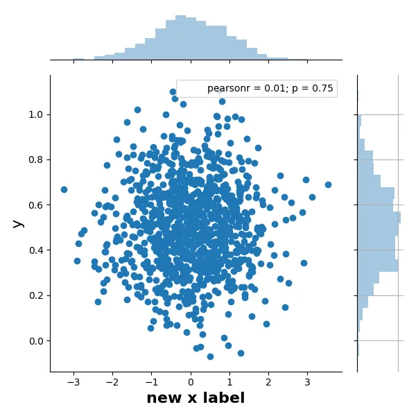
sns.jointplot 返回一个 JointGrid 对象,该对象可以让您访问 matplotlib 坐标轴,并进行进一步处理。
import seaborn as sns
import numpy as np

# example data
X = np.random.randn(1000,)
Y = 0.2 * np.random.randn(1000) + 0.5

h = sns.jointplot(X, Y)

# JointGrid has a convenience function
h.set_axis_labels('x', 'y', fontsize=16)

# or set labels via the axes objects
h.ax_joint.set_xlabel('new x label', fontweight='bold')

# also possible to manipulate the histogram plots this way, e.g.
h.ax_marg_y.grid('on') # with ugly consequences...

# labels appear outside of plot area, so auto-adjust
h.figure.tight_layout()
(您尝试的问题是plt.xlabel(“text”)等函数在当前坐标轴上操作,而不是在sns.jointplot中的中央坐标轴; 但面向对象的接口更具体,因为它会操作哪些内容)。
请注意,最后一个命令使用JointGrid的figure属性。此答案的初始版本使用了更简单但不是面向对象的方法,即通过matplotlib.pyplot接口。
要使用pyplot接口:
import matplotlib.pyplot as plt
plt.tight_layout()
或者,您可以在调用jointplot时在pandas DataFrame中指定轴标签。
import pandas as pd
import seaborn as sns

x = ...
y = ...
data = pd.DataFrame({
    'X-axis label': x,
    'Y-axis label': y,
})
sns.jointplot(x='X-axis label', y='Y-axis label', data=data)
DataFrame。你可以直接将字典传递给 data 关键字参数! - kilodalton
plt是指什么?它似乎未定义,并且我也无法在现有的 jointplot 上使用.tight_layout()。 - Chrimleplt是matplotlib.pyplot的常用缩写/别名,这是seaborn在其图表下使用的库。但不导入它有点懒,感谢你的澄清问题。 - Bonlenfum