如何在R / ggplot2中测量两个分布曲线之间的面积?

5

具体例子是假设x是在0到10之间的连续变量,红线是“商品”的分布,蓝线是“不良”的分布。我想看看将此变量纳入“好处”的检查中是否有价值,但首先我想量化蓝色>红色区域中的东西数量。

因为这是一个分布图,刻度看起来相同,但实际上在我的样本中好的东西要多98倍,这使事情变得复杂,因为它实际上不只是测量曲线下面积,而是测量不良样本,其中它的分布沿着大于红色的线路。

我一直在努力学习R,但甚至不知道如何解决这个问题,希望得到任何帮助。enter image description here

编辑 样本数据: http://pastebin.com/7L3Xc2KU <- 该样本有几百万行。

该图表是使用以下方法创建的:

graph <- qplot(sample_x, bad_is_1, data=sample_data, geom="density", color=bid_is_1)

这里提供一些样本数据会很有帮助。 - MrFlick
谢谢@MrFlick,我添加了一个链接来展示我正在处理的数据类型。 - Tyler Wood
在“基本”图形中,“多边形”是绘制此差异的方法。 要计算它,请找到两条曲线的交点,或者只需找到所有“红色”<“蓝色”的点,并对这些范围内函数之间的差异进行数值积分。 - Carl Witthoft
@CarlWitthoft 我最终计算了曲线之间梯形的面积。当你有一系列点时,使用R进行数值积分是否有更好的方法? - MrFlick
2个回答

12

我能想到的唯一方法就是使用简单梯形法计算曲线之间的面积。首先,我们手动计算密度。

d0 <- density(sample$sample_x[sample$bad_is_1==0])
d1 <- density(sample$sample_x[sample$bad_is_1==1])

现在,我们创建函数来在观测到的密度点之间进行插值。

f0 <- approxfun(d0$x, d0$y)
f1 <- approxfun(d1$x, d1$y)

接下来,我们找到密度重叠的 x 范围。

ovrng <- c(max(min(d0$x), min(d1$x)), min(max(d0$x), max(d1$x)))

并将其分成500个部分。

i <- seq(min(ovrng), max(ovrng), length.out=500)

现在我们计算密度曲线之间的距离。

h <- f0(i)-f1(i)

使用梯形面积公式,我们将d1>d0的区域的面积相加。

area<-sum( (h[-1]+h[-length(h)]) /2 *diff(i) *(h[-1]>=0+0))
# [1] 0.1957627

我们可以使用以下方法绘制该区域:

plot(d0, main="d0=black, d1=green")
lines(d1, col="green")
jj<-which(h>0 & seq_along(h) %% 5==0); j<-i[jj]; 
segments(j, f1(j), j, f1(j)+h[jj])

在这里输入图片描述


嗯,你总是可以使用抛物线拟合或切比雪夫多项式等方法。:-)。哎呀-你问了这个:“integrate”使用自适应积分法;有几种辛普森规则的实现。可能还有其他我还没有发现的。 - Carl Witthoft
@CarlWitthoft 当然,有很多像那样计算面积的方法。我只是不确定是否有任何内置的方法我错过了。 - MrFlick

6
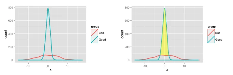
这是一种在两个密度图之间着色并计算该区域大小的方法。
# Create some fake data
set.seed(10)
dat = data.frame(x=c(rnorm(1000, 0, 5), rnorm(2000, 0, 1)), 
                 group=c(rep("Bad", 1000), rep("Good", 2000)))

# Plot densities
# Use y=..count.. to get counts on the vertical axis
p1 = ggplot(dat) +
       geom_density(aes(x=x, y=..count.., colour=group), lwd=1)

一些额外的计算用于阴影两个密度图之间的区域(改编自此SO问题):

pp1 = ggplot_build(p1)

# Create a new data frame with densities for the two groups ("Bad" and "Good")
dat2 = data.frame(x = pp1$data[[1]]$x[pp1$data[[1]]$group==1],
                 ymin=pp1$data[[1]]$y[pp1$data[[1]]$group==1],
                 ymax=pp1$data[[1]]$y[pp1$data[[1]]$group==2])

# We want ymax and ymin to differ only when the density of "Good" 
# is greater than the density of "Bad"
dat2$ymax[dat2$ymax < dat2$ymin] = dat2$ymin[dat2$ymax < dat2$ymin]

# Shade the area between "Good" and "Bad"
p1a = p1 +  
    geom_ribbon(data=dat2, aes(x=x, ymin=ymin, ymax=ymax), fill='yellow', alpha=0.5)

以下是两个图表:

enter image description here

要获取特定范围内GoodBad值的面积(数量),请对每个组使用density函数(或者您可以继续使用上面从ggplot中提取的数据,但这种方式可以更直接地控制密度分布生成的方式):

## Calculate densities for Bad and Good. 
# Use same number of points and same x-range for each group, so that the density 
# values will line up. Use a higher value for n to get a finer x-grid for the density
# values. Use a power of 2 for n, because the density function rounds up to the nearest 
# power of 2 anyway.
bad = density(dat$x[dat$group=="Bad"], 
             n=1024, from=min(dat$x), to=max(dat$x))
good = density(dat$x[dat$group=="Good"], 
             n=1024, from=min(dat$x), to=max(dat$x))

## Normalize so that densities sum to number of rows in each group

# Number of rows in each group
counts = tapply(dat$x, dat$group, length)

bad$y = counts[1]/sum(bad$y) * bad$y
good$y = counts[2]/sum(good$y) * good$y

## Results

# Number of "Good" in region where "Good" exceeds "Bad"
sum(good$y[good$y > bad$y])
[1] 1931.495  # Out of 2000 total in the data frame

# Number of "Bad" in region where "Good" exceeds "Bad"
sum(bad$y[good$y > bad$y])
[1] 317.7315  # Out of 1000 total in the data frame

网页内容由stack overflow 提供, 点击上面的
可以查看英文原文,
原文链接