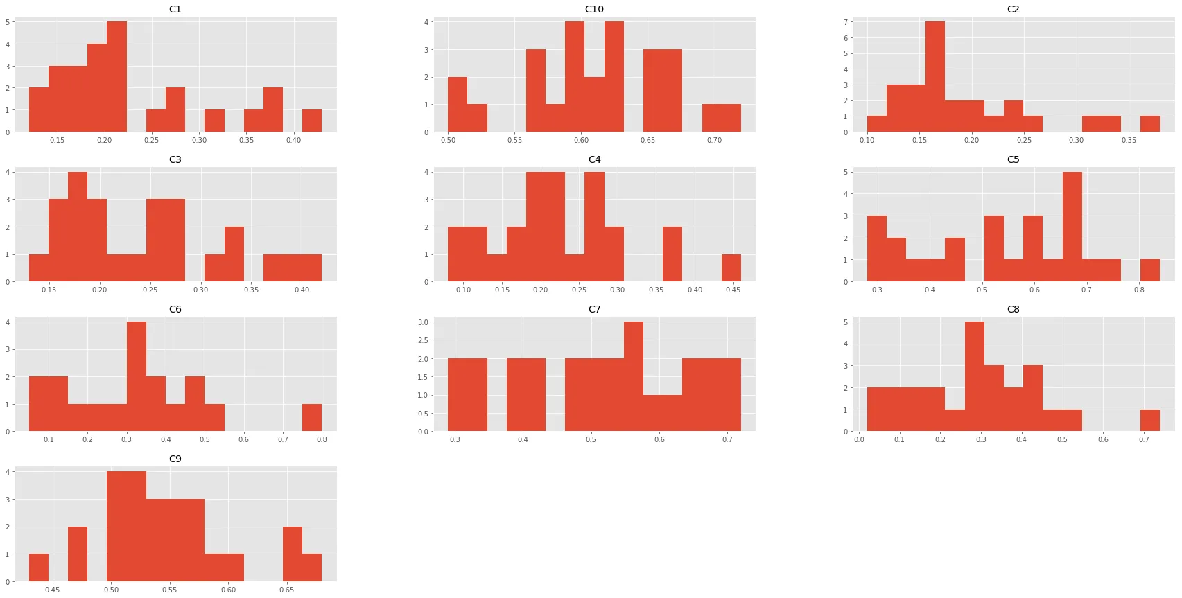
I have a Pandas dataframe (Dt) like this:
  Pc     Cvt      C1    C2    C3    C4    C5    C6    C7    C8    C9   C10
   0       1       2  0.08  0.17  0.16  0.31  0.62  0.66  0.63  0.52  0.38
   1       2       2  0.09  0.15  0.13  0.49  0.71  1.28  0.42  1.04  0.43
   2       3       2  0.13  0.24  0.22  0.17  0.66  0.17  0.28  0.11  0.30
   3       4       1  0.21  0.10  0.23  0.08  0.53  0.14  0.59  0.06  0.53
   4       5       1  0.16  0.21  0.18  0.13  0.44  0.08  0.29  0.12  0.52
   5       6       1  0.14  0.14  0.13  0.20  0.29  0.35  0.40  0.29  0.53
   6       7       1  0.21  0.16  0.19  0.21  0.28  0.23  0.40  0.19  0.52
   7       8       1  0.31  0.16  0.34  0.19  0.60  0.32  0.56  0.30  0.55
   8       9       1  0.20  0.19  0.26  0.19  0.63  0.30  0.68  0.22  0.58
   9      10       2  0.12  0.18  0.13  0.22  0.59  0.40  0.50  0.24  0.36
   10     11       2  0.10  0.10  0.19  0.17  0.89  0.36  0.65  0.23  0.37
   11     12       2  0.19  0.20  0.17  0.17  0.38  0.14  0.48  0.08  0.36
   12     13       1  0.16  0.17  0.15  0.13  0.35  0.12  0.50  0.09  0.52
   13     14       2  0.19  0.19  0.29  0.16  0.62  0.19  0.43  0.14  0.35
   14     15       2  0.01  0.16  0.17  0.20  0.89  0.38  0.63  0.27  0.46
   15     16       2  0.09  0.19  0.33  0.15  1.11  0.16  0.87  0.16  0.29
   16     17       2  0.07  0.18  0.19  0.15  0.61  0.19  0.37  0.15  0.36
   17     18       2  0.14  0.23  0.23  0.20  0.67  0.38  0.45  0.27  0.33
   18     19       1  0.27  0.15  0.20  0.10  0.40  0.05  0.53  0.02  0.52
   19     20       1  0.12  0.13  0.18  0.22  0.60  0.49  0.66  0.39  0.66
   20     21       2  0.15  0.20  0.18  0.32  0.74  0.58  0.51  0.45  0.37
   .
   .
   .
我希望能够绘制一个带有核密度估计(kde)的直方图,范围从C1到C10的每一列都需要绘制,并且要按照与使用pandas绘图相同的排列方式进行。
Dt.iloc[:,2:].hist()
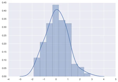
但是到目前为止,我还没有能够在每个直方图中添加kde;我想要像这样的效果:
有什么想法可以实现这个效果吗?
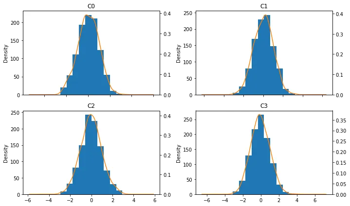
distplot和FacetGrid.map_dataframe的组合来实现,具体请参考这里。 - IanS