如何使用HTML和CSS创建旋转效果?

4

我需要在那个正方形上悬停时产生旋转效果,以下是我可以得到的内容。
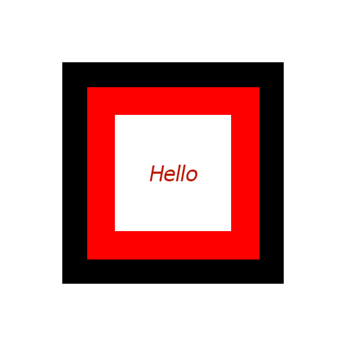
图像

HTML

<div class="mainSquare">
  <div class="firstInnerSquare">
    <div class="lastInnerSquare">
      Hello
    </div>
  </div>
</div>

CSS

.mainSquare{
  width:160px;
  height:160px;
  background:black;
  margin: 50px auto;
  padding:25px;
}
.firstInnerSquare{
  width:110px;
  height:110px;
  background:red;
  padding:25px;
}
.lastInnerSquare{
  text-align:center;
  width:110px;
  padding: 46px 0px;
  background:white;
}

这里是代码展示

希望能获得帮助。


5
希望你至少尝试自己编写代码。Stack Overflow不是一个编写代码的服务平台。建议你通过Google或搜索SO进行额外的研究,尝试一下,如果还有问题,请回来并附上你的代码,解释一下你尝试过什么以及为什么不成功。 - Paulie_D
你听说过 CSS 属性和动画吗? - user3186555
我对CSS和动画的知识不是很丰富。 - kishore.k.vaishnav
2个回答

10
您可以使用单个元素和两个伪元素来实现这一点。使 2 个伪元素比容器元素更大,将它们定位在容器后面,并添加一个 rotate 动画效果。 注意: 这只是一个基础示例,能帮助您入门。具体的微调工作请留给您来处理。您可以在 MDN 页面上了解更多有关 CSS 动画属性的信息。

.shape {
  position: relative; /* used to position the pseudos relative to the parent */
  height: 100px;
  width: 100px;
  background: white;
  border: 1px solid;
  margin: 100px; /* required because children are larger than parent */
}
.shape:after,
.shape:before {
  position: absolute;
  content: '';
}
.shape:before {
  height: 125%; /* make one pseudo 25% larger than parent */
  width: 125%;
  top: -12.5%; /* 25/2 to make sure its center is same as the parent's */
  left: -12.5%; /* 25/2 to make sure its center is same as the parent's */
  background: red;
  z-index: -1; /* send it behind the parent */
}
.shape:after {
  height: 150%; /* make this pseudo larger than the parent and the other pseudo */
  width: 150%;
  top: -25%; /* 50/2 to make sure its center is same as the parent's */
  left: -25%; /* 50/2 to make sure its center is same as the parent's */
  background: black;
  z-index: -2; /* send it behind both the parent and other pseudo */
}

/* add animation when hovering on parent */
.shape:hover:before { 
  animation: rotate 3s linear infinite;
}
.shape:hover:after {
  animation: rotate-rev 3s linear infinite;
}
@keyframes rotate {
  to {
    transform: rotate(359deg); /* some browsers don't display spin when it is 360 deg */
  }
}
@keyframes rotate-rev {
  to {
    transform: rotate(-359deg); /* reverse direction rotate */
  }
}
<div class='shape'></div>


@kishore.k.vaishnav:您可以通过增加“animation-duration”来减慢旋转速度。在问题下面看到您的评论后,我建议您阅读此MDN动画页面 - Harry

6

这是一个具有原始结构和单个关键帧语句的示例:

每个

需要更改的仅是动画持续时间和方向。 "中间"
的时间需要是外部/内部时间的50%。

.mainSquare {
  width: 160px;
  height: 160px;
  background: black;
  margin: 50px auto;
  padding: 25px;
  animation: spin 2s infinite linear;
}
.firstInnerSquare {
  width: 110px;
  height: 110px;
  background: red;
  padding: 25px;
  animation: spin 1s infinite linear reverse;
}
.lastInnerSquare {
  text-align: center;
  width: 110px;
  padding: 46px 0px;
  background: white;
  animation: spin 2s infinite linear;
}
@keyframes spin {
  to {
    transform: rotate(1turn);
  }
}
<div class="mainSquare">
  <div class="firstInnerSquare">
    <div class="lastInnerSquare">
      Hello
    </div>
  </div>
</div>


不错。这只需要一个关键帧 :) - Harry

网页内容由stack overflow 提供, 点击上面的
可以查看英文原文,
原文链接