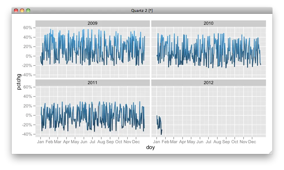
我正在尝试使用ggplot绘制每个日历年度中时间序列的变化,但是我在对x轴进行精细控制时遇到了问题。如果我不使用scale="free_x",那么我的x轴会显示出几年以及所涉及的年份,就像这样:
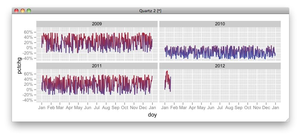
如果我使用scale="free_x",则如预期的那样,我会得到每个图的刻度标签,而且某些情况下这些标签会因图形而异,这不是我想要的:
我尝试过使用scale_x_date等方法来定义x轴,但是都没有成功。因此,我的问题是:
Q. 如何控制ggplot分面网格上的x轴断点和标签,以使(时间序列)x轴对于每个面板都相同,在面板底部仅显示一次,并以月份格式化为1、2、3等或作为“Jan”,“Feb”,“Mar”?
以下是代码:
require(lubridate)
require(ggplot2)
require(plyr)

# generate data
df <- data.frame(date=seq(as.Date("2009/1/1"), by="day", length.out=1115),price=runif(1115, min=100, max=200))
# remove weekend days
df <- df[!(weekdays(as.Date(df$date)) %in% c('Saturday','Sunday')),]
# add some columns for later
df$year <- as.numeric(format(as.Date(df$date), format="%Y"))
df$month <- as.numeric(format(as.Date(df$date), format="%m"))
df$day <- as.numeric(format(as.Date(df$date), format="%d"))

# calculate change in price since the start of the calendar year
df <- ddply(df, .(year), transform, pctchg = ((price/price[1])-1))

p <- ggplot(df, aes(date, pctchg)) +
  geom_line( aes(group = 1, colour = pctchg),size=0.75) +
  facet_wrap( ~ year, ncol = 2,scale="free_x") +
  scale_y_continuous(formatter = "percent") +
  opts(legend.position = "none")

print(p)