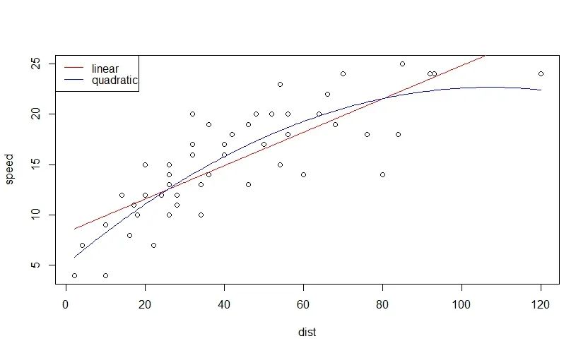
这是一个与汽车数据集相关的示例:
data(cars)
建立模型:
model_lm <- lm(speed ~ dist, data = cars)
model_lm2 <- lm(speed ~ dist + I(dist^2), data = cars)
创建新的数据:
new.data <- data.frame(dist = seq(from = min(cars$dist),
                                 to = max(cars$dist), length.out = 200))
预测:
pred_lm <- predict(model_lm, newdata = new.data)
pred_lm2 <- predict(model_lm2, newdata = new.data)
情节:
plot(speed ~ dist, data = cars)
lines(pred_lm ~ new.data$dist, col = "red")
lines(pred_lm2 ~ new.data$dist, col = "blue")
legend("topleft", c("linear", "quadratic"), col = c("red", "blue"), lty = 1)
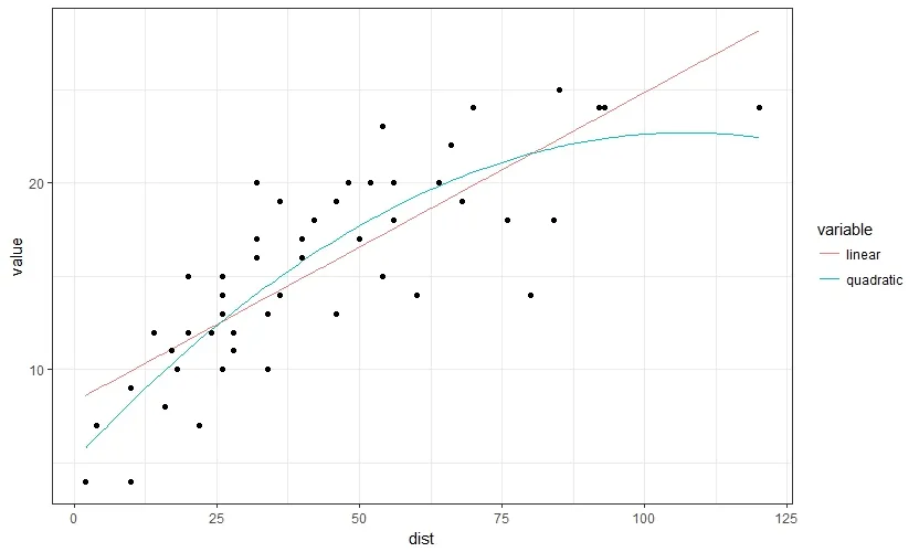
使用ggplot2
library(ggplot2)
将所有数据放入一个数据框中,使用reshape2中的melt函数将其转换为长格式。
preds <- data.frame(new.data,
                    linear = pred_lm,
                    quadratic =  pred_lm2)

preds <- reshape2::melt(preds,
                        id.vars = 1)
绘图
ggplot(data = preds)+
  geom_line(aes(x = dist, y = value, color = variable ))+
  geom_point(data = cars, aes(x = dist, y = speed))+
  theme_bw()
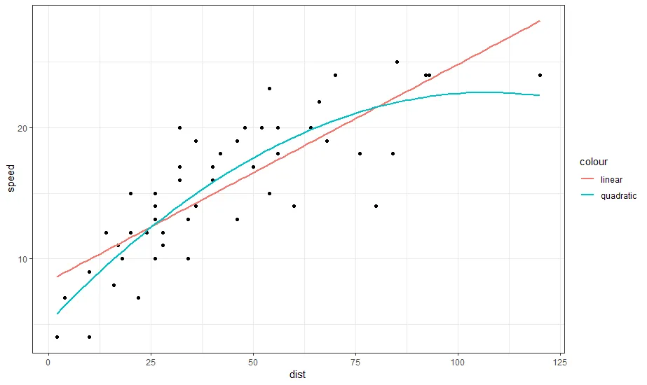
编辑:使用仅 ggplot2 的另一种方法是使用两个 geom_smooth 层,一个使用默认公式 y ~ x(因此无需指定),另一个使用二次模型 formula = y ~ x + I(x^2)。为了得到图例,我们可以在 aes 调用中指定颜色,并将所需的条目命名为我们希望在图例中显示的名称。
ggplot(cars,
       aes(x = dist, y = speed)) +
  geom_point() +
  geom_smooth(method = "lm",
              aes(color = "linear"),
              se = FALSE) +
  geom_smooth(method = "lm",
              formula = y ~ x + I(x^2),
              aes(color = "quadratic"),
              se = FALSE) +
  theme_bw()