在同一张图上绘制两个箱线图

3

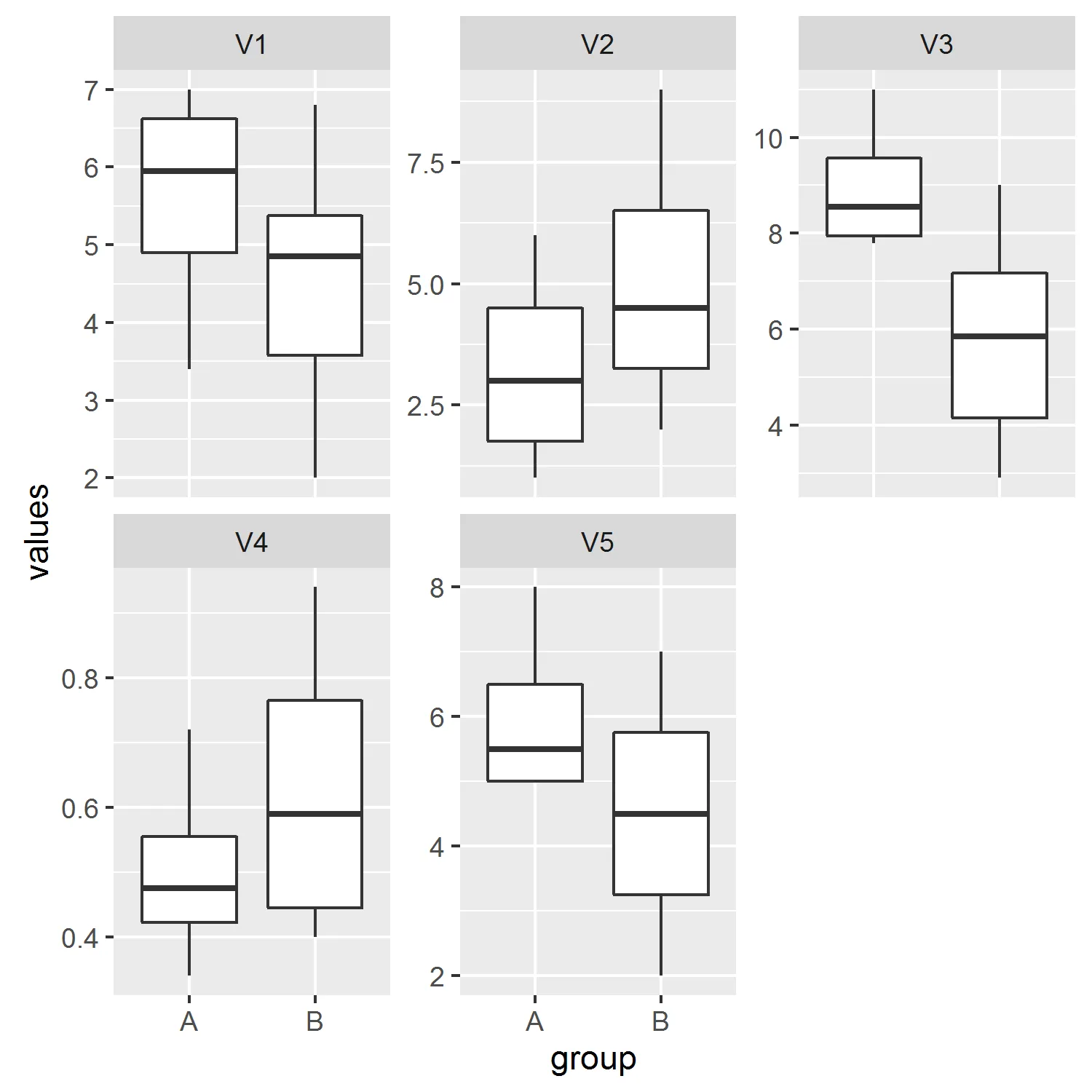
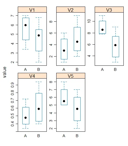
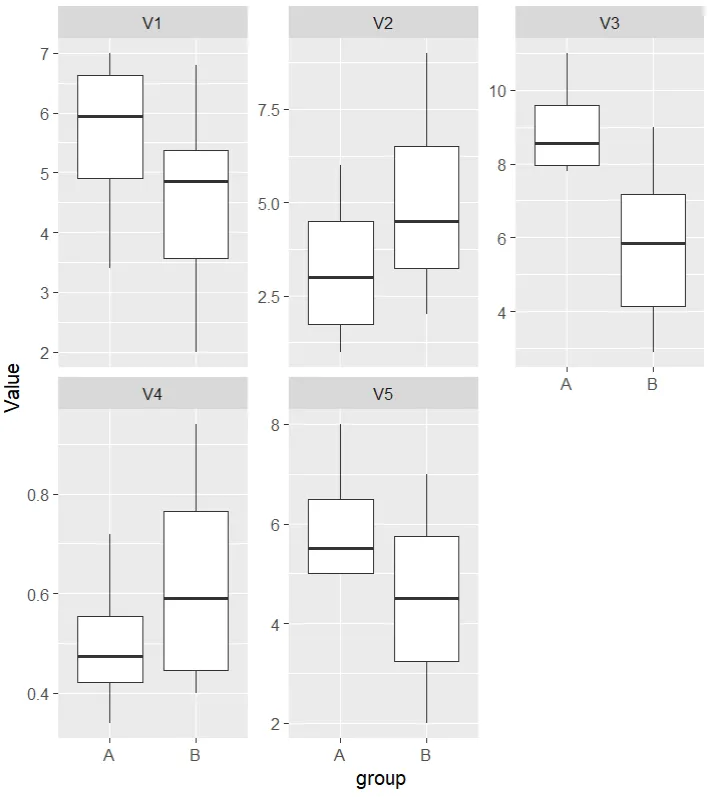
我有两个不同大小的数据集。我想在同一张图上绘制两个箱线图,以便更容易进行比较。如果只绘制一个箱线图,则很难发现差异。

我有一些虚假数据。

Group A
V1    V2   V3    V4     V5
6.5   2    11    0.5    6
7     1    8     0.34   8
5.4   4    7.8   0.45   5
3.4   6    9.1   0.72   5

Group B
V1    V2   V3    V4     V5
5.0   5    9     0.4    7
2     7    5.2   0.69   5
3.2   2    2.9   0.79   2
6.8   9    6.5   0.43   6
4.7   3    3.8   0.49   4
5.5   4    7.4   0.94   3

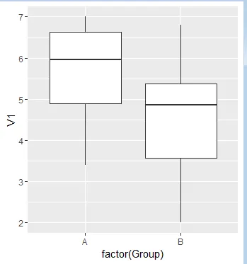
我不知道如何绘制这个图表,所以我没有例子。我会尽力描述这个情节。我想在同一个图上绘制组A和B的变量1。因此,在一个图上,我将有一个组A的箱形图和另一个组B的箱形图,填充着来自V1的数据。所以这两个箱形图将并排放置。有5个变量,我会有5个图表,每个图表都有2个并排的箱形图。如果我没有说明清楚,请告诉我。谢谢。
6个回答

4
假设您的数据集名称为grpa(A组)和grpb(B组)。首先向它们各自添加一个变量 Group

grpa$Group <-"A"

grpb$Group <-"B"

然后将它们合并成一个数据框:

combined <- rbind(grpa,grpb)

最后使用ggplot绘图,如下所示:

ggplot(combined,aes(x= factor(Group), y=V1))+geom_boxplot()

enter image description here

按需要进行标注。


4

ggplot 最好使用“长格式”数据(例如,每个值、变量和组别都有一列)。 您可以按照以下方式重新排列数据:

A <- read.table(text='V1    V2   V3    V4     V5
6.5   2    11    0.5    6
7     1    8     0.34   8
5.4   4    7.8   0.45   5
3.4   6    9.1   0.72   5', header=TRUE)

B <- read.table(text='V1    V2   V3    V4     V5
5.0   5    9     0.4    7
2     7    5.2   0.69   5
3.2   2    2.9   0.79   2
6.8   9    6.5   0.43   6
4.7   3    3.8   0.49   4
5.5   4    7.4   0.94   3', header=TRUE)

d <- rbind(cbind(stack(A), group='A'), cbind(stack(B), group='B'))

前几行如下所示:
head(d)

##   values ind group
## 1    6.5  V1     A
## 2    7.0  V1     A
## 3    5.4  V1     A
## 4    3.4  V1     A
## 5    2.0  V2     A
## 6    1.0  V2     A

现在我们可以这样绘制:
library(ggplot2)
ggplot(d, aes(group, values)) + 
  geom_boxplot() +
  facet_wrap(~ind, scales='free_y')

enter image description here


正是我想要的!我可以问一下 facet_wrap(~ind, scales='free_y') 是什么意思吗? - pineapple
facet_wrap将图形分成多个面板,在这种情况下,我们指定要根据 ind(当我们使用 stack 时给出的变量列的默认名称)进行分离。否则,所有变量都将被汇集在一起。而scales='free_y'允许为每个面板优化y轴限制(请参见?facet_wrap)。 - jbaums

4
我的解决方案是将两个data.frame以及表示观测属于哪些组的变量结合起来。然后,您可以使用reshape2中的melt函数将数据转换为准备绘图的data.frame。您可以使用facet_gridfacet_wrap为不同变量创建单独的图表。以下是一种实现方式:
library(ggplot2)
library(reshape2)

# Combine two data.frame
df <- rbind(GroupA, GroupB)

# Create variable Group
df$Group <- rep(c("A", "B"), c(dim(GroupA)[1], dim(GroupB)[1]))

# Transform to long format
df <- melt(df, "Group")

ggplot(df, aes(x=Group, y=value)) + geom_boxplot() + facet_grid(~ variable)

enter image description here


1
# Adding a variable to the dataframes Group_A & Group_B as done from pervious users
Group_A$fac <- "A"
Group_B$fac <- "B"
Group_c <- rbind(Group_A,Group_B)
df <- melt(Group_c)

#You can plot the same in bwplot from library(lattice) 

bwplot(value~fac|variable,data=df,scales=list(relation="free"),as.table=T)

enter image description here


0
group_a<-data.frame(
  V1 = c(6.5, 7, 5.4, 3.4),
  V2 = c(2, 1, 4, 6),
  V3 = c(11, 8, 7.8, 9.1),
  V4 = c(0.5, 0.34, 0.45, 0.72),
  V5 = c(6, 8, 5, 5)
  )
group_a
group_b<-data.frame(
  V1 =c(5.0,2,3.2,6.8,4.7,5.5),
  V2 =c(5,7,2,9,3,4),
  V3=c(9,5.2,2.9,6.5,3.8,7.4),
  V4=c(0.4,0.69,0.79,0.43,0.49,0.94),
  V5=c(7,5,2,6,4,3)
  )
group_b
# Create a new empty data frame with header
empty_df <- data.frame(Value = numeric(), var = character(), group = 
character(), stringsAsFactors = FALSE)
# Loop through each column in group_a
for (col in names(group_a)) {
  # Extracting column values
  column_values <- group_a[[col]]
  # Create a temporary data frame to hold the extracted column
  temp_df <- data.frame(Value = column_values, var = col, group = "A")
  # Append the temporary data frame to empty_df
  empty_df <- rbind(empty_df, temp_df)
  }

for (colb in names(group_b)) {
 column_values<-group_b[,colb]
 tempp_df<- data.frame(Value=column_values, var = colb, group = "B")
 empty_df<-rbind(empty_df,tempp_df)
}
ggplot(empty_df, aes(x = group, y = Value)) +
geom_boxplot() +
facet_wrap(~ var, scales = "free_y")

解决方案


-1
   par(mfrow=c(1,2))
   summary(A)
   summary(B)
   boxplot(A,ylim=summary(A)[[1]][1]) ##not sure about this just find where y is min
   boxplot(B,ylim=summary(B)[[1]][1]) ## still not sure
    ## adjusts the ylims in a way so that they are easy to compare you can also use boxplot(A,B) but that would make the graph look weird

网页内容由stack overflow 提供, 点击上面的
可以查看英文原文,
原文链接