我需要做一个箱线图(在Python和matplotlib中),但我没有原始的“原始”数据。我有的是最大值、最小值、平均数、中位数和IQR(正态分布)的预先计算值,但我仍然想做一个箱线图。当然,绘制异常值是不可能的,但除此之外,我想所有的信息都在那里。
我已经搜索了所有相关的答案但都没有成功。我找到的最接近的答案是同样的问题,但是针对R语言(我不熟悉)。请参见是否可以轻松地从以前计算的统计数据中绘制盒形图(在R中?)
我需要做一个箱线图(在Python和matplotlib中),但我没有原始的“原始”数据。我有的是最大值、最小值、平均数、中位数和IQR(正态分布)的预先计算值,但我仍然想做一个箱线图。当然,绘制异常值是不可能的,但除此之外,我想所有的信息都在那里。
我已经搜索了所有相关的答案但都没有成功。我找到的最接近的答案是同样的问题,但是针对R语言(我不熟悉)。请参见是否可以轻松地从以前计算的统计数据中绘制盒形图(在R中?)
import matplotlib.pyplot as plt

item = {}

item["label"] = 'box' # not required
item["mean"] = 5 # not required
item["med"] = 5.5
item["q1"] = 3.5
item["q3"] = 7.5
#item["cilo"] = 5.3 # not required
#item["cihi"] = 5.7 # not required
item["whislo"] = 2.0 # required
item["whishi"] = 8.0 # required
item["fliers"] = [] # required if showfliers=True

stats = [item]

fig, axes = plt.subplots(1, 1)
axes.bxp(stats)
axes.set_title('Default')
y_axis = [0, 1, 2, 3, 4, 5, 6, 7, 8, 9]
y_values = ["0", "1", "2", "3", "4", "5", "6", "7", "8", "9"]
plt.yticks(y_axis, y_values)
相关文档链接:
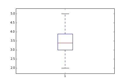
Mean=[3.4] #mean
IQR=[3.0,3.9] #inter quantile range
CL=[2.0,5.0] #confidence limit
A=np.random.random(50)
D=plt.boxplot(A) # a simple case with just one variable to boxplot
D['medians'][0].set_ydata(Mean)
D['boxes'][0]._xy[[0,1,4], 1]=IQR[0]
D['boxes'][0]._xy[[2,3],1]=IQR[1]
D['whiskers'][0].set_ydata(np.array([IQR[0], CL[0]]))
D['whiskers'][1].set_ydata(np.array([IQR[1], CL[1]]))
D['caps'][0].set_ydata(np.array([CL[0], CL[0]]))
D['caps'][1].set_ydata(np.array([CL[1], CL[1]]))
_=plt.ylim(np.array(CL)+[-0.1*np.ptp(CL), 0.1*np.ptp(CL)]) #reset the limit
参考@MKroehnert的回答以及箱线图绘制函数,以下内容可能有帮助:
import matplotlib.pyplot as plt

stats = [{
    "label": 'A',  # not required
    "mean":  5,  # not required
    "med": 5.5,
    "q1": 3.5,
    "q3": 7.5,
    # "cilo": 5.3 # not required
    # "cihi": 5.7 # not required
    "whislo": 2.0,  # required
    "whishi": 8.0,  # required
    "fliers": []  # required if showfliers=True
    }]

fs = 10  # fontsize

fig, axes = plt.subplots(nrows=1, ncols=1, figsize=(6, 6), sharey=True)
axes.bxp(stats)
axes.set_title('Boxplot for precalculated statistics', fontsize=fs)
plt.show()
for循环将多个stats附加到一个list中后绘制多个箱线图,例如(循环之前:final_data = list(),循环内但结束时:final_data.append(stats)),然后将它们全部绘制在一个图上,请删除此答案中stats字典周围的[]。可能是一个简单的解决方案,但我花了几分钟才弄清楚。 - JamesT