我希望将包含2个变量的数据以2D格式进行展示。数值用颜色表示,而两个变量则分别作为横轴和纵轴。我使用contourf函数绘制数据图表:
xrow和ycol都是6x6的矩阵,表示坐标。BDmatrix是6x6的矩阵,表示相应的数据。然而,我得到的是这个图像: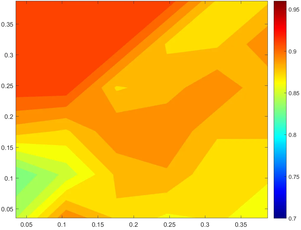 下面是xrow和yrow矩阵:
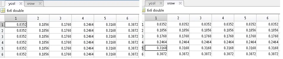 下面是BDmatrix矩阵:
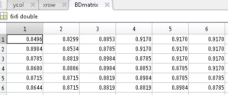 是否可能使轮廓颜色平滑变化,而不是出现连接数据点的直线?该图的问题在于粗粒度,不够吸引人。我已经尝试用imagec替换contourf,但似乎不起作用。我正在使用MATLAB R2015b。
clc; clear;

load('dataM.mat')

cMap=jet(256); %set the colomap using the "jet" scale
F2=figure(1);
[c,h]=contourf(xrow,ycol,BDmatrix,50);
set(h, 'edgecolor','none');

xlim([0.0352 0.3872]);
ylim([0.0352 0.3872]);

colormap(cMap);
cb=colorbar;
caxis([0.7 0.96]);
% box on;
hold on;
xrow和ycol都是6x6的矩阵,表示坐标。BDmatrix是6x6的矩阵,表示相应的数据。然而,我得到的是这个图像:
下面是xrow和yrow矩阵: 下面是BDmatrix矩阵: 是否可能使轮廓颜色平滑变化,而不是出现连接数据点的直线?该图的问题在于粗粒度,不够吸引人。我已经尝试用imagec替换contourf,但似乎不起作用。我正在使用MATLAB R2015b。