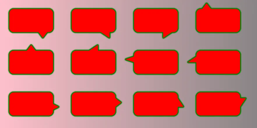
对话框带箭头

57

我有一个项目需要插入对话气泡/消息框。我试图实现的一般形状是这样的:

带箭头或三角形的CSS对话气泡

.bubble {
  height: 100px;
  width: 200px;
  border: 3px solid gray;
  background: lightgray;
  position: relative;
  cursor:pointer;
}
.triangle {
  width: 0;
  border-top: 20px solid black;
  border-left: 20px solid transparent;
  border-right: 20px solid transparent;
  cursor:pointer;
}
<div class="bubble">Speech bubble
</div>
<div class="triangle">
</div>

此时,由于透明边框也可以点击,因此它当前无法通过命中测试。

目标

  • 点击/悬停区域(可点击/悬停的区域)需要粘附在形状的边界上(这里的透明边框也是可悬停的,使其无效)。

  • 我需要在各种内容(图像、渐变、文本等)上显示形状,

问题

在操作此形状时我遇到的主要问题是:

  • 能够根据所引用元素的位置(顶部/左侧/右侧/底部) 移动三角形以围绕气泡说话
  • 需要强调时添加边框或盒阴影

有没有办法解决这些问题?


1
这是一个重复的问题。 - Andrew
4
@Andrew:感谢您的评论,但是我已经看了一段时间这个标签,却还没有找到一个包含所有提到的问题的问题。如果您遇到这样的问题,请随时提供链接,我会将我的答案移至那里。 - jbutler483
3个回答

93
为了实现这一点,您应该考虑更改标记以使您的HTML更有效。可以使用伪元素来实现此目的。我将逐个解决每个问题,并在我的答案末尾将它们整合起来。
首先:
使用伪元素避免额外的元素
您可以使用伪元素来删除额外的 .triangle div。这不仅减少了div数量,而且有助于定位,因为您可以使用top:、left:、right:和bottom: CSS属性来根据主要元素进行位置定位。如下所示:

.oneAndOnlyDiv {
  height: 100px;
  width: 200px;
  border: 3px solid gray;
  background: lightgray;
  position: relative;
}
.oneAndOnlyDiv:before {
  content: "";
  position: absolute;
  top: 100%;
  left: 20px;
  width: 0;
  border-top: 20px solid black;
  border-left: 20px solid transparent;
  border-right: 20px solid transparent;
}
<div class="oneAndOnlyDiv">Main div</div>


命中测试

为了创建您的“命中测试”,您可能希望使用旋转的元素而不是边框技巧。

类似于:

div {
  height: 100px;
  width: 200px;
  background: gray;
  position: relative;
  cursor:pointer;
}
div:before {
  content: "";
  position: absolute;
  top: 100%;
  left: 20px;
  height: 20px;
  width: 20px;
  background: black;
  transform: rotate(45deg);
  transform-origin:top right;
}
<div>Only element</div>

或者使用倾斜的伪元素:

div {
  height: 100px;
  width: 200px;
  background: gray;
  position: relative;
  cursor:pointer;
}
div:before {
  content: "";
  position: absolute;
  top: 90%;
  left: 20px;
  height: 30%;
  width: 20px;
  background: black;
  transform: skewY(-45deg);
  transform-origin:bottom left;
  z-index:-1;
}
<div>Only element</div>

只有当鼠标悬停在正方形或主要元素上时,才会显示指针。 但是等等,这会搞乱定位吗?你该怎么处理呢?

有几种解决方案。其中之一是使用 calc CSS 属性。

div {
  height: 100px;
  width: 200px;
  background: gray;
  position: relative;
  cursor:pointer;
}
div:before {
  content: "";
  position: absolute;
  top: -webkit-calc(100% - 10px); /*may require prefix for old browser support*/
  top: calc(100% - 10px); /*i.e. half the height*/
  left: 20px;
  height: 20px;
  width: 20px;
  background: gray;
  transform: rotate(45deg);
}
<div>Only element</div>

添加边框

现在很容易添加边框,只需在主元素中添加一个边框声明,并将伪元素的 border-bottomborder-right 设置为 inherit 即可。

边框

div {
  height: 100px;
  width: 200px;
  background: gray;
  position: relative;
  cursor:pointer;
  border:3px double black;
}
div:before {
  content: "";
  position: absolute;
  top: -webkit-calc(100% - 10px); /*may require prefix for old browser support*/
  top: calc(100% - 10px); /*i.e. half the height*/
  left: 20px;
  height: 20px;
  width: 20px;
  background: gray;
  transform: rotate(45deg);
  border-bottom:inherit;
  border-right:inherit;
  box-shadow:inherit;
}
<div>Only element</div>

盒阴影:

为了添加盒阴影,我使用了:after伪元素来隐藏盒阴影在其它伪元素上方,使元素看起来像一个单独的元素。

div {
  height: 100px;
  width: 200px;
  background: gray;
  position: relative;
  cursor:pointer;
  box-shadow: 5px 5px 10px 2px black;
}
div:before,div:after {
  content: "";
  position: absolute;
  top: -webkit-calc(100% - 10px); /*may require prefix for old browser support*/
  top: calc(100% - 10px); /*i.e. half the height*/
  left: 20px;
  height: 20px;
  width: 20px;
  background: gray;
  transform: rotate(45deg);
z-index:-1;
  box-shadow:inherit;
}
div:after{
  box-shadow:none;
  z-index:8;
  }
<div>Only element</div>

综合应用

您还可以通过使用border-radius属性,为消息框或气泡添加边框半径:

div {
  height: 100px;
  width: 200px;
  background: gray;
  position: relative;
  cursor:pointer;
  border:3px double black;
  border-radius:10px;
}
div:before {
  content: "";
  position: absolute;
  top: -webkit-calc(100% - 10px); /*may require prefix for old browser support*/
  top: calc(100% - 10px); /*i.e. half the height*/
  left: 20px;
  height: 20px;
  width: 20px;
  background: gray;
  transform: rotate(45deg);
  border-bottom:inherit;
  border-right:inherit;
  box-shadow:inherit;
}
<div>Only element</div>

甚至可以创建一个圆形,而不仅仅是三角形?

div {
  height: 100px;
  width: 200px;
  background: gray;
  position: relative;
  cursor:pointer;
  border:3px double black;
  border-radius:10px;
}
div:before {
  content: "";
  position: absolute;
  top: -webkit-calc(100% - 13px); /*may require prefix for old browser support*/
  top: calc(100% - 13px); /*i.e. half the height + border*/
  left: 20px;
  height: 20px;
  width: 20px;
  background: gray;
  transform: rotate(45deg);
  border:3px double transparent;
  border-bottom:inherit;
  border-right:inherit;
  box-shadow:inherit;
  border-radius:50%;
}
<div>Only element</div>

如果您遇到内容溢出并被伪元素“隐藏”的问题,并且您不介意使用边框,您可以使用负 z-index 来解决此问题。

不喜欢使用“幻数”吗?如果您不喜欢使用 calc 值,我的答案中的定位当前正在使用它(同时工作),您可能希望使用 transform:translate(50%)。这将是一个更好的方法,因为:

  • 您不需要知道边框的大小或一半的宽度
  • 您将使消息框/气泡在其定位上更加动态,并支持进一步的大小调整。

div {
  height: 100px;
  width: 200px;
  background: gray;
  position: relative;
  cursor: pointer;
  border: 3px double black;
  border-radius: 10px;
}
div:before {
  content: "";
  position: absolute;
  top: 100%;
  left: 30px;
  height: 20px;
  width: 20px;
  background: gray;
  box-sizing:border-box;
  transform: rotate(45deg) translate(-50%);
  border-bottom: inherit;
  border-right: inherit;
  box-shadow: inherit;
}
<div>Only element</div>

想要移动它?您可以!

div {
  height: 100px;
  width: 200px;
  background: gray;
  position: relative;
  cursor: pointer;
  border: 3px double black;
  border-radius: 10px;
}
div:before {
  content: "";
  position: absolute;
  top: 100%;
  left: 10%;
  height: 20px;
  width: 20px;
  background: gray;
  box-sizing: border-box;
  transform: rotate(45deg) translate(-50%);
  border-bottom: inherit;
  border-right: inherit;
  box-shadow: inherit;
  transition: all 0.8s;
}
div:hover:before {
  left: 90%;
}
<div>Only element</div>

想要它在正确的位置吗?

div {
  height: 100px;
  width: 200px;
  background: gray;
  position: relative;
  cursor: pointer;
  border: 3px double black;
  border-radius: 10px;
}
div:before {
  content: "";
  position: absolute;
  top: 15%;
  left: 100%;
  height: 20px;
  width: 20px;
  background: gray;
  box-sizing:border-box;
  transform: rotate(45deg) translate(-50%);
  border-top: inherit;
  border-right: inherit;
  box-shadow: inherit;
  transition:all 0.8s;
}
div:hover:before{
  top:80%;
  }
<div>Only Element</div>

想要让它成为不同形状的三角形吗?

div {
  height: 100px;
  width: 200px;
  background: gray;
  position: relative;
  cursor: pointer;
  border-radius: 10px;
}
div:before {
  content: "";
  position: absolute;
  top: 70%;
  left: 100%;
  height: 20px;
  width: 20px;
  background: gray;
  box-sizing:border-box;
  transform:  translate(-50%) skewX(45deg);
  box-shadow: inherit;
  transition:all 0.8s;
  z-index:-1;
}
div:hover:before{
  transform:  translate(-50%);
  border-radius:50%;
  top:20%;
  }
<div>Only Element</div>


4
非常详细的回答。 - Paulie_D
嗨 @Paulie_D:我认为有必要提供一个“详细”的答案,以回答大部分问题 :) - jbutler483
我的唯一评论是关于位置计算值。你能不能使用transform:translate(50%),这样就适用于所有尺寸...不需要魔法数字? - Paulie_D
@Paulie_D:你真是个天才(又忘了……哈哈)。已编辑。 - jbutler483

20

我们可以依靠clip-path和drop-shadow过滤器轻松实现这一点:

.box {
  margin: 50px;
  width: 200px;
  height: 100px;
  border-radius: 15px;
  background: red;
  position: relative;
  filter:  /* the more shadow you add the thicker the border will be */
    drop-shadow(0px 0px 1px green) 
    drop-shadow(0px 0px 1px green) 
    drop-shadow(0px 0px 1px green) 
    drop-shadow(0px 0px 1px green) 
    drop-shadow(0px 0px 1px green) 
    drop-shadow(0px 0px 1px green);
}

.box::before {
  content: "";
  position: absolute;
  top: 100%;
  left: 20%;
  height: 30px;
  width: 50px;
  background: inherit;
  clip-path: polygon(0 0, 100% 0, 50% 100%);
}

.box:hover {
  background:blue;
}

body {
  background:linear-gradient(to right, pink,grey);
}
<div class="box"></div>

我们可以将这个基本示例扩展到考虑任何类型的位置和三角形形状:

.box {
  margin: 30px;
  width: 150px;
  height: 80px;
  display:inline-block;
  border-radius: 15px;
  background: red;
  position: relative;
  filter:  /* the more shadow you add the thicker the border will be */
    drop-shadow(0px 0px 1px green) 
    drop-shadow(0px 0px 1px green) 
    drop-shadow(0px 0px 1px green) 
    drop-shadow(0px 0px 1px green) 
    drop-shadow(0px 0px 1px green) 
    drop-shadow(0px 0px 1px green);
}

.box::before {
  content: "";
  position: absolute;
  height: var(--h,20px);
  width: var(--w,30px);
  background: inherit;
  transform:scale(var(--x,1),var(--y,1));
}

.box.p-bottom::before{
  top: 100%;
  clip-path: polygon(0 0, 100% 0, 50% 100%);
}
.box.p-bottom.alt::before{
  clip-path: polygon(0 0, 100% 0, 100% 100%);
}
.box.p-top::before{
  bottom: 100%;
  clip-path: polygon(0 100%, 100% 100%, 50% 0);
}
.box.p-top.alt::before{
  clip-path: polygon(0 100%, 100% 100%, 100% 0);
}
.box.p-left::before{
  right: 100%;
  clip-path: polygon(100% 0, 100% 100%,0% 50%);
}
.box.p-left.alt::before{
  clip-path: polygon(100% 0, 100% 100%,0% 100%);
}
.box.p-right::before{
  left: 100%;
  clip-path: polygon(0% 0, 0% 100%,100% 50%);
}
.box.p-right.alt::before{
  clip-path: polygon(0% 0, 0% 100%,100% 100%);
}

.box.right::before{
  right:var(--p,20px);
}
.box.left::before {
  left:var(--p,20px);
}
.box.top::before{
  top:var(--p,20px);
}
.box.bottom::before {
  bottom:var(--p,20px);
}


.box:hover {
  background:blue;
}

body {
  background:linear-gradient(to right, pink,grey);
}
<div class="box p-bottom right"></div>
<div class="box p-bottom right alt"></div>
<div class="box p-bottom right alt" style="--x:-1"></div>
<div class="box p-top left"></div>
<div class="box p-top right" style="--p:40%"></div>
<div class="box p-top right alt" style="--p:40%"></div>
<div class="box p-left top"></div>
<div class="box p-left top alt"></div>
<div class="box p-right bottom" style="--w:20px;"></div>
<div class="box p-right bottom" style="--p:30px;--w:20px;--h:30px"></div>
<div class="box p-right bottom alt" style="--p:30px;--w:20px;--h:30px"></div>
<div class="box p-right bottom alt" style="--p:30px;--w:20px;--h:30px;--y:-1"></div>

带箭头的对话框 CSS

我们还可以考虑为整个形状设置任何类型的背景。这个技巧适用于固定的宽度/高度。我们的想法是创建一个大小相同的背景,用于主元素和伪元素,然后我们只需调整伪元素中内部元素的位置,以匹配父元素的位置(使它们完全重叠)。

.box {
  --h:20px;
  --w:30px;
  --p:20px;

  margin: 30px;
  width: 150px;
  height: 80px;
  display:inline-block;
  border-radius: 15px;
  background: 
    var(--back,linear-gradient(45deg,red,purple)) 
    center/
    calc(150px + 2*var(--w)) calc(80px + 2*var(--h));
  position: relative;
  filter:  /* the more shadow you add the thicker the border will be */
    drop-shadow(0px 0px 1px green) 
    drop-shadow(0px 0px 1px green) 
    drop-shadow(0px 0px 1px green) 
    drop-shadow(0px 0px 1px green) 
    drop-shadow(0px 0px 1px green) 
    drop-shadow(0px 0px 1px green);
}

.box::before {
  content: "";
  position: absolute;
  height: var(--h);
  width: var(--w);
  background: inherit;
  transform:scale(var(--x,1),var(--y,1));
  background-position:var(--b1) 0 var(--b2);
}

.box.p-bottom::before{
  top: 100%;
  clip-path: polygon(0 0, 100% 0, 50% 100%);
  --b1:bottom;
}
.box.p-bottom.alt::before{
  clip-path: polygon(0 0, 100% 0, 100% 100%);
}
.box.p-top::before{
  bottom: 100%;
  clip-path: polygon(0 100%, 100% 100%, 50% 0);
  --b1:top;
}
.box.p-top.alt::before{
  clip-path: polygon(0 100%, 100% 100%, 100% 0);
}
.box.p-left::before{
  right: 100%;
  clip-path: polygon(100% 0, 100% 100%,0% 50%);
  --b1:left;
}
.box.p-left.alt::before{
  clip-path: polygon(100% 0, 100% 100%,0% 100%);
}
.box.p-right::before{
  left: 100%;
  clip-path: polygon(0% 0, 0% 100%,100% 50%);
  --b1:right;
}
.box.p-right.alt::before{
  clip-path: polygon(0% 0, 0% 100%,100% 100%);
}

.box.right::before{
  right:var(--p);
  --b2:right calc(-1*var(--p) - var(--w)); 
}
.box.left::before {
  left:var(--p);
  --b2:left  calc(-1*var(--p) - var(--w));
}
.box.top::before{
  top:var(--p);
  --b2:top  calc(-1*var(--p) - var(--h));
}
.box.bottom::before {
  bottom:var(--p);
  --b2:bottom  calc(-1*var(--p) - var(--h));
}

body {
  background:linear-gradient(to right, pink,grey);
}
<div class="box p-bottom right"></div>
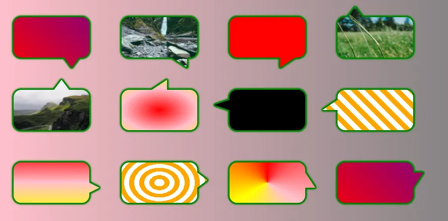
<div class="box p-bottom right alt" style="--back:url(https://picsum.photos/id/15/400/300)"></div>
<div class="box p-bottom right alt" style="--x:-1;--back:red"></div>
<div class="box p-top left" style="--back:url(https://picsum.photos/id/18/400/300)"></div>
<div class="box p-top right" style="--p:40px;--back:url(https://picsum.photos/id/1018/400/300)"></div>
<div class="box p-top right alt" style="--p:60px;--back:radial-gradient(red,pink,yellow)"></div>
<div class="box p-left top" style="--back:black"></div>
<div class="box p-left top alt" style="--back:repeating-linear-gradient(45deg,#fff 0 10px,orange 0 20px)"></div>
<div class="box p-right bottom" style="--w:20px;--back:linear-gradient(red,pink,yellow)"></div>
<div class="box p-right bottom" style="--p:30px;--w:20px;--h:30px;--back:repeating-radial-gradient(#fff 0 10px,orange 0 20px)"></div>
<div class="box p-right bottom alt" style="--p:30px;--w:20px;--h:30px;--back:conic-gradient(red,pink,yellow,red)"></div>
<div class="box p-right bottom alt" style="--p:30px;--w:20px;--h:30px;--y:-1;"></div>

CSS speech bubble with random background


5
谢谢 Temani。希望现在有了这些选项,我们将减少“如何制作气泡”的问题在 css-shapes 标签上! - jbutler483

4

SVG

这不会通过点击测试,因为透明边框也是可点击的。

在SVG中可以使用pointer-events来解决这个问题。
pointer-events:visibleFill; 只会选择有颜色的部分。

此示例使用filter_box-shadow,不支持IE。
同时使用了两种形状。

html,
body {
  margin: 0;
  padding: 0;
}
.bubble {
  width: 150px;
  height: 150px;
  -webkit-filter: drop-shadow(5px 5px 0px #aaa);
  filter: drop-shadow(5px 5px 0px #aaa);
}
.bubble-shape {
  fill: #1e1;
}
.shape-text {
  color: black;
}
<svg class="bubble" viewBox="0 0 110 110" xmlns="http://www.w3.org/2000/svg" preserveAspectRatio="none">
  <g class="bubble-shape" style="cursor:pointer; pointer-events:visibleFill;">
    <rect x="10" y="10" width="90" height="90" rx="15" ry="15" />
    <polygon points="20,94 40,94 30,105" />
  </g>
</svg>

图片描述

这个例子只使用了一条路径,
IE浏览器应该可以完全支持。

html,
body {
  margin: 0;
  padding: 0;
}
.bubble {
  width: 150px;
  height: 150px;
}
.bubble-shape {
  stroke-width: 15;
  stroke: #ddd;
  fill: #1e1;
}
.shape-text {
  color: black;
}
<svg class="bubble" viewBox="-70 -10 390 370" xmlns="http://www.w3.org/2000/svg" preserveAspectRatio="none">
  <g style="cursor:pointer; pointer-events:visible;">
    <path class="bubble-shape" d="m 0,0 250,0 c 25,0 50,20 50,50 l 0,225 c 0,25 -25,50 -50,50 l -175,0 -25,20 -20,-20 -40,0 c -25,0 -50,-25 -50,-50 l 0,-225 C -50,25 -50,0 0,0 Z" />
  </g>
</svg>

enter image description here


网页内容由stack overflow 提供, 点击上面的
可以查看英文原文,
原文链接