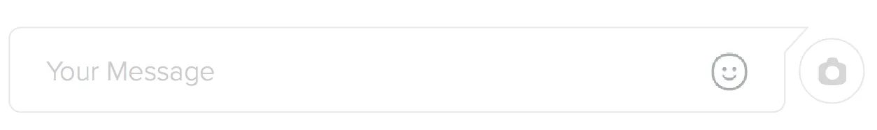
透明形状,上角带箭头

8
请看下面的图片。 期望的结果 我想在一个 div 的右上角添加一个箭头,并将其视为可编辑输入框。请帮助我如何使用 CSS 实现此功能。由于需要在其上显示表情符号,因此不能使用 SVG
<div placeholder="Your message" id="Message">
...
</div>

你的背景是纯色还是透明的? - Harry
1
是的,那会很有帮助。 - firebolt_ash
2个回答

14

您可以像下面的代码片段一样完成此操作。实现形状的方法如下:

  • 主要的div元素只有顶部、底部和左侧边框。右边框被置空,因为该元素及其箭头需要是透明的。如果存在右边框,则透明箭头也会显示出来。
  • 右侧的箭头是通过使用基于形状右侧的skew元素而实现的。
  • 形状的右侧边框是通过使用另一个伪元素实现的,其大小与整个容器的高度相同减去箭头伪元素的高度。该元素基于形状的右下角定位。

您可以根据需要调整高度和边框半径。我设置了位置,以使即使父元素的高度/宽度发生变化,形状也不会受到影响。

div.shape {
  position: relative;
  width: 300px;
  height: 100px;
  padding: 4px;
  margin-top: 20px;
  border: 2px solid gray;
  border-right: none; /* not required as the shape needs to be transparent */
  border-radius: 8px; /* not required as the right border is done through pseudo element */
  border-top-right-radius: 0px;
  border-bottom-right-radius: 0px;
}
div.shape:before {
  position: absolute;
  content: '';
  top: -2px; /* equal to border top of parent - no need to change*/
  right: -6px; /* for positioning - no need to change*/
  height: 15%; /* should be changed depending on height of arrow */
  width: 10%; /* should be changed depending on width of arrow */
  border-top: 2px solid gray;
  border-right: 3px solid gray; /* thicker border because skew makes it thin */

  /* to achieve the arrow like shape */ 
  -webkit-transform-origin: bottom right;
  -webkit-transform: skew(-45deg);
  -moz-transform: skew(-45deg);
  transform: skew(-45deg);
}
div.shape:after {
  position: absolute;
  content: '';
  right: -6px; /* for positioning - no need to change*/
  height: 85%; /* height of parent - height of arrow */
  width: 2%; /* no need to change */
  bottom: -2px; /* equal to border bottom of parent - no need to change*/
  border-right: 2px solid gray;
  border-bottom: 2px solid gray;
  border-bottom-right-radius: 8px; /* for producing curve on bottom right */
}

/* Just for demo */

body {
  background: -webkit-linear-gradient(0deg, crimson, indianred, purple);
  background: -moz-linear-gradient(90deg, crimson, indianred, purple);
  background: linear-gradient(90deg, crimson, indianred, purple);
}
<div class="shape">
  Lorem Ipsum Dolor Sit Amet...
</div>


通过更改位置属性和倾斜方向(从正角度到负角度),可以像下面的代码段一样将箭头添加到左侧。


div.shape {
  position: relative;
  width: 300px;
  height: 100px;
  padding: 4px;
  margin-top: 20px;
  margin-left: 20px;
  border: 2px solid gray;
  border-left: none; /* not required as the shape needs to be transparent */
  border-radius: 8px; /* not required as the right border is done through pseudo element */
  border-top-left-radius: 0px;
  border-bottom-left-radius: 0px;
}
div.shape:before {
  position: absolute;
  content: '';
  top: -2px; /* equal to border top of parent - no need to change*/
  left: -6px; /* for positioning - no need to change*/
  height: 15%; /* should be changed depending on height of arrow */
  width: 10%; /* should be changed depending on width of arrow */
  border-top: 2px solid gray;
  border-left: 3px solid gray; /* thicker border because skew makes it thin */

  /* to achieve the arrow like shape */ 
  -webkit-transform-origin: bottom right;
  -webkit-transform: skew(45deg);
  -moz-transform: skew(45deg);
  transform: skew(45deg);
}
div.shape:after {
  position: absolute;
  content: '';
  left: -6px; /* for positioning - no need to change*/
  height: 85%; /* height of parent - height of arrow */
  width: 2%; /* no need to change */
  bottom: -2px; /* equal to border bottom of parent - no need to change*/
  border-left: 2px solid gray;
  border-bottom: 2px solid gray;
  border-bottom-left-radius: 8px; /* for producing curve on bottom right */
}

/* Just for demo */

body {
  background: -webkit-linear-gradient(0deg, crimson, indianred, purple);
  background: -moz-linear-gradient(90deg, crimson, indianred, purple);
  background: linear-gradient(90deg, crimson, indianred, purple);
}
<div class="shape">
  Lorem Ipsum Dolor Sit Amet...
</div>


3

过滤器:drop-shadow()

该功能的兼容性有限

但效果非常酷炫 :P

.inputcontainer {
  display: inline-block;
  position: relative;
  filter: drop-shadow(0px 0px 5px black);
  -webkit-filter: drop-shadow(0px 0px 1px black);
}
.input {
  display: inline-block;
  border: none;
  border-radius: 10px;
  border-top-right-radius: 0px;
  width: 280px;
  height: 50px;
  background-color: white;
  padding-left: 20px;
  font-size: 20px;
}
.input:focus {
  outline: none;
}
.arrow {
  position: absolute;
  display: inline-block;
  top: 0;
  right: -5px;
  width: 20px;
  height: 20px;
  background-color: white;
  transform: skew(-45deg);
  z-index: -1;
}
<div class="inputcontainer">
  <input type="text" class="input" placeholder="Your message"/>
  <div class="arrow"></div>
</div>

Box-shadow:

这里的兼容性好多了

.inputcontainer {
  display: inline-block;
  position: relative;
  filter: drop-shadow(0px 0px 5px black);
}
.input {
  display: inline-block;
  border: none;
  border-radius: 10px;
  border-top-right-radius: 0px;
  width: 280px;
  height: 50px;
  background-color: white;
  padding-left: 20px;
  font-size: 20px;
  box-shadow: 0px 0px 0px 2px gray;
}
.input:focus {
  outline: none;
}
.arrow {
  position: absolute;
  display: inline-block;
  top: 0;
  right: -8px;
  width: 20px;
  height: 20px;
  background-color: white;
  transform: skew(-45deg);
  box-shadow: 2px -2px 0px 0px gray;
}
<div class="inputcontainer">
  <input type="text" class="input" placeholder="Your message"/>
  <div class="arrow"></div>
</div>


网页内容由stack overflow 提供, 点击上面的
可以查看英文原文,
原文链接