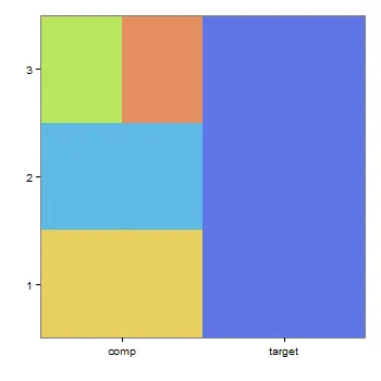
我想要做一个关于颜色集合和它们的补色的可视化展示。我希望使用geom_tile将它们放在一起。问题是有些目标颜色有多个补色,所以我需要能够平均地将补色瓷砖分配给这些颜色。
我的测试数据集如下:
test_pair = data.frame(pair_number = c(1, 1, 2, 2, 3, 3, 3),
                       color = c('#5f75e6', '#e6d05f', '#5f75e6', '#5fb9e6', '#5f75e6', '#b9e65f', '#e68d5f'),
                       group = c('target', 'comp', 'target', 'comp', 'target', 'comp', 'comp'),
                       bin_width = c(1, 1, 1, 1, 1, 0.5, 0.5))
以下为我的代码:
ggplot(test_pair, aes(x = factor(group), y = factor(pair_number), width = bin_width)) +
       geom_tile(aes(fill = color)) +
       scale_fill_identity() +
       scale_x_discrete('', expand = c(0, 0)) +
       scale_y_discrete('', expand = c(0, 0)) +
       theme_bw() +
       theme(line = element_blank(),
            panel.grid.major = element_blank(),
            panel.grid.minor = element_blank(),
            panel.border = element_blank(),
            plot.background = element_rect(fill = '#c4a879'),
            axis.ticks = element_blank(),
            axis.text.y = element_text(size = 14),
            axis.text.x = element_text(size = 14),
            axis.title.y = element_text(color = hex))
图形确实将其中一种互补色分成了两半,但是将该瓷砖居中并未绘制第二个互补色。我希望图形能够将两种互补色并排打印,而不必像geom_tile文档中那样指定x轴的断点。有人知道如何做到这一点吗?