我该如何只使用HTML和CSS创建一个圆形箭头?

46

我正在尝试使用CSS和HTML创建一个圆形定向箭头,以下是我的尝试。

尝试1

在这个尝试中,我旋转了<div>和一个箭头,但它们的位置不同。

这是CSS:

 #curves div {
   width: 100px;
   height: 100px;
   border: 5px solid #999;
 }
 #curves.width div {
   border-color: transparent transparent transparent #999;
 }
 #curve1 {
   -moz-border-radius: 50px 0 0 50px;
   border-radius: 50px 0 0 50px;
 }
 .arrow-right {
   width: 0;
   height: 0;
   border-top: 10px solid transparent;
   border-bottom: 10px solid transparent;
   border-left: 27px solid #ccc;
   float: right;
   margin-top: -7px;
   margin-right: -26px;
 }
<div id="curves" class="width">
  <div id="curve1"></div><span class="arrow-right"></span>
</div>

尝试 2

在这个例子中,我创建的箭头是直的。

.container {
  width: 60%;
  height: 9px;
  background: #ccc;
  margin: 100px auto;
  -moz-border-radius: 50px 0 0 50px;
  border-radius: 50px 0 0 50px;
}
.arrow-right {
  width: 0;
  height: 0;
  border-top: 10px solid transparent;
  border-bottom: 10px solid transparent;
  border-left: 27px solid #ccc;
  float: right;
  margin-top: -7px;
  margin-right: -26px;
}
<div class="container">
  </span><span class="arrow-right"></span>
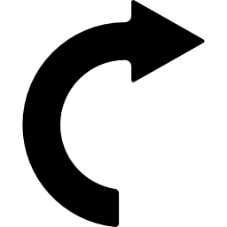
</div>

更新 我希望它看起来像这样

在此输入图片描述


嗯...其实这并不是真正的HTML代码,但也许你可以通过SVG标签找到你想要的东西(这里有一个SVG绘图工具:http://svg-edit.googlecode.com/svn/trunk/editor/svg-editor.html#group。你可以通过点击垂直的“SVG”按钮来查看代码,并进行复制/粘贴。) - Seblor
9
看起来这需要使用SVG或图标字体进行处理,而不是CSS。 - rr-
1
我并不质疑你询问的原因...我只是好奇在什么情况下你需要这个而不是像http://fortawesome.github.io/Font-Awesome/icons/这样简单的图标字体。 - Reece
我不想使用任何图像。这就是为什么。 - Manoj Dhiman
6个回答

55

您可以使用伪元素来生成三角形(使用著名的边框技巧)。

之后,您可以在实际元素上使用粗边框(带有border-radius50%,以使其成为圆形)。这允许您按照自己的喜好旋转箭头。

div {
  border: 20px solid transparent;
  border-top-color: black;
  border-left-color: black;
  height: 100px;
  width: 100px;
  border-radius: 50%;
  position: relative;
  -webkit-transform: rotate(-45deg);
  -ms-transform: rotate(-45deg);
  transform: rotate(-45deg);
  margin:30px auto;
}
div:before {
  content: "";
  position: absolute;
  top: -20px;
  left: 80%;
  height: 0;
  width: 0;
  border-left: 30px solid black;
  border-top: 30px solid transparent;
  border-bottom: 30px solid transparent;
  -webkit-transform: rotate(45deg);
  -ms-transform: rotate(45deg);
  transform: rotate(45deg);
}


/*BELOW IS FOR DEMO ONLY*/

div:hover {
  -webkit-transform: rotate(315deg);
  -ms-transform: rotate(315deg);
  transform: rotate(315deg);
  transition: all 0.8s;
}
html {
  text-align:center;
  color:white;
  font-size:30px;
  height: 100%;
  background: rgb(79, 79, 79);
  /* Old browsers */
  background: -moz-radial-gradient(center, ellipse cover, rgba(79, 79, 79, 1) 0%, rgba(34, 34, 34, 1) 100%);
  /* FF3.6+ */
  background: -webkit-gradient(radial, center center, 0px, center center, 100%, color-stop(0%, rgba(79, 79, 79, 1)), color-stop(100%, rgba(34, 34, 34, 1)));
  /* Chrome,Safari4+ */
  background: -webkit-radial-gradient(center, ellipse cover, rgba(79, 79, 79, 1) 0%, rgba(34, 34, 34, 1) 100%);
  /* Chrome10+,Safari5.1+ */
  background: -o-radial-gradient(center, ellipse cover, rgba(79, 79, 79, 1) 0%, rgba(34, 34, 34, 1) 100%);
  /* Opera 12+ */
  background: -ms-radial-gradient(center, ellipse cover, rgba(79, 79, 79, 1) 0%, rgba(34, 34, 34, 1) 100%);
  /* IE10+ */
  background: radial-gradient(ellipse at center, rgba(79, 79, 79, 1) 0%, rgba(34, 34, 34, 1) 100%);
  /* W3C */
  filter: progid: DXImageTransform.Microsoft.gradient(startColorstr='#4f4f4f', endColorstr='#222222', GradientType=1);
  /* IE6-9 fallback on horizontal gradient */
}
HOVER ME
<div></div>

如果您想要延长箭头,则可以将底部边框设为可见。例如:

div {
  border: 20px solid transparent;
  border-top-color: black;
  border-left-color: black;
  border-bottom-color: black;
  height: 100px;
  width: 100px;
  border-radius: 50%;
  position: relative;
  transform: rotate(-45deg);
  margin:30px auto;
}
div:before {
  content: "";
  position: absolute;
  top: -20px;
  left: 80%;
  height: 0;
  width: 0;
  border-left: 30px solid black;
  border-top: 30px solid transparent;
  border-bottom: 30px solid transparent;
  transform: rotate(45deg);
}


/*BELOW IS FOR DEMO ONLY*/

div:hover {
  transform: rotate(315deg);
  transition: all 0.8s;
}
html {
  text-align:center;
  color:white;
  font-size:30px;
  height: 100%;
  background: rgb(79, 79, 79);
  /* Old browsers */
  background: -moz-radial-gradient(center, ellipse cover, rgba(79, 79, 79, 1) 0%, rgba(34, 34, 34, 1) 100%);
  /* FF3.6+ */
  background: -webkit-gradient(radial, center center, 0px, center center, 100%, color-stop(0%, rgba(79, 79, 79, 1)), color-stop(100%, rgba(34, 34, 34, 1)));
  /* Chrome,Safari4+ */
  background: -webkit-radial-gradient(center, ellipse cover, rgba(79, 79, 79, 1) 0%, rgba(34, 34, 34, 1) 100%);
  /* Chrome10+,Safari5.1+ */
  background: -o-radial-gradient(center, ellipse cover, rgba(79, 79, 79, 1) 0%, rgba(34, 34, 34, 1) 100%);
  /* Opera 12+ */
  background: -ms-radial-gradient(center, ellipse cover, rgba(79, 79, 79, 1) 0%, rgba(34, 34, 34, 1) 100%);
  /* IE10+ */
  background: radial-gradient(ellipse at center, rgba(79, 79, 79, 1) 0%, rgba(34, 34, 34, 1) 100%);
  /* W3C */
  filter: progid: DXImageTransform.Microsoft.gradient(startColorstr='#4f4f4f', endColorstr='#222222', GradientType=1);
  /* IE6-9 fallback on horizontal gradient */
}
HOVER ME
<div></div>


2
你也可以在箭头的轴上获得一些有趣的效果 - 尝试 border-width: 20px 20px 0 10px; border-style: solid; border-color: black transparent transparent black; - Niet the Dark Absol
@NiettheDarkAbsol:这很酷 :) 随着对 [tag:css-shapes] 的兴趣日益增长,我想知道你是如何遇到这个问题的? - jbutler483
@NiettheDarkAbsol:干杯。我在想所有这些浏览量是从哪里来的 :P - jbutler483

26

SVG解决方案

在SVG中创建该形状非常简单。

对于对SVG感兴趣的人:

<svg width="200px" height="200px" viewbox="0 0 400 400">
  <path stroke="#000" stroke-width="50" fill="none"
        d="M200 350 A 100 100 0 0 1 200 150
           M200 150 200 125 225 150 200 175Z"/>
</svg>

我能使用它吗?


1
这是一个不错的选择,但并非每个浏览器都支持SVG。使用CSS更难以产生相同的结果。而使用PIE.htc,则无需再担心浏览器支持问题。但是对于SVG,在旧版IE中需要一些外部插件或Flash才能呈现它。但我喜欢它看起来很简单。 - Ismael Miguel
2
不支持IE8及以下版本的SVG。 - Persijn
8
值得庆幸的是,IE 8及以下的浏览器总占比不到2.5%。我认为现在的网络已经摆脱了这些浏览器。考虑到这一点,我打算停止支持早于IE 8的版本,并鼓励其他人也这样做。 - Michael Cordingley
3
人们应该停止害怕SVG。通过篡改HTML矩形只能做到这一步... - Kobi
顺便提一下,SVG可以使用CSS进行动画和样式设置。这种组合允许使用SVG作为图标内容的简单性,并具有CSS的样式控制。SVG动画 - Huski
你可以为SVG添加CSS样式,这很棒。但是只能在HTML文件中嵌入的SVG上添加样式。许多用户认为这会使他们的HTML文件变得混乱。 - Persijn

9

我在CSS中创建了这个小东西,您可以查看代码以了解它的工作原理。

注意这确实需要一个坚实的背景。

.arrow {
  width: 200px;
  height: 200px;
  border: 6px solid;
  border-radius: 50%;
  position: relative;
}
.arrow:before {
  content: "";
  display: block;
  width: 10px;
  height: 50px;
  background: #fff;
  position: absolute;
  bottom: 0;
  top: 0;
  right: -6px;
  margin: auto;
}
.arrow:after {
  content: "";
  width: 0;
  height: 0;
  border-left: 20px solid transparent;
  border-right: 20px solid transparent;
  border-top: 20px solid #000;
  position: absolute;
  bottom: 106px;
  right: -20px;
}
<div class="arrow"></div>


我能把这个减少到不到半圆吗? - Manoj Dhiman
1
在你的问题更新图片之前,我已经开始了这个项目。如果我看到了它,我会像 jbutler483 一样完成它。 - Ruddy

6

这里有另一种使用剪切路径而不是边框来完成的方法。

演示 - http://jsfiddle.net/r8rd0yde/4/

.arrow {
  position: relative;
  padding: 20px;
  width: 100px;
  height: 100px;
}
.circle {
  position: absolute;
  box-sizing: border-box;
  height: 100px;
  width: 100px;
  border: 15px solid #000;
  border-radius: 50%;
  -webkit-clip-path: inset(0 50% 0 0);
  clip-path: inset(0 50% 0 0);
}
.triangle {
  position: absolute;
  width: 35px;
  height: 30px;
  background: #000;
  margin-top: -6px;
  margin-left: 38px;
  -webkit-clip-path: polygon(50% 0, 0% 100%, 100% 100%);
  clip-path: polygon(50% 0, 0% 100%, 100% 100%);
  -moz-transform: rotate(90deg);
  -webkit-transform: rotate(90deg);
  -o-transform: rotate(90deg);
  -ms-transform: rotate(90deg);
  transform: rotate(90deg);
}
/* JUST FOR DEMO */

.arrow:hover {
  -webkit-transform: rotate(720deg);
  -ms-transform: rotate(720deg);
  transform: rotate(720deg);
  transition: all 1.2s;
}
<div class="arrow">
  <div class="circle"></div>
  <div class="triangle"></div>
</div>


5
您可以使用顺时针开口圆箭头(U+21BB)字符:

.arrow {
  display: inline-block;
  font-size: 300px;
  line-height: 200px;
  font-weight: bold;
  transform: rotate(90deg);
}
<span class="arrow"></span>


1
#curvedarrow {
  position: relative;
  width: 0;
  height: 0;
  border-top: 9px solid transparent;
  border-right: 9px solid red;
  -webkit-transform: rotate(10deg);
  -moz-transform: rotate(10deg);
  -ms-transform: rotate(10deg);
  -o-transform: rotate(10deg);
}
#curvedarrow:after {
  content: "";
  position: absolute;
  border: 0 solid transparent;
  border-top: 3px solid red;
  border-radius: 20px 0 0 0;
  top: -12px;
  left: -9px;
  width: 12px;
  height: 12px;
  -webkit-transform: rotate(45deg);
  -moz-transform: rotate(45deg);
  -ms-transform: rotate(45deg);
  -o-transform: rotate(45deg);
}

我在https://css-tricks.com/examples/ShapesOfCSS/中找到了这个。

虽然它可能不是你想要的确切形状,但它绝对是一个很好的起点。


网页内容由stack overflow 提供, 点击上面的
可以查看英文原文,
原文链接