简单来说,它应该只是一个正方形或圆形的轮廓 - 我可以相应地进行样式设置(例如将颜色更改为我想要的任何颜色,更改边框的厚度等)。
我希望将这个圆形或正方形应用于其他内容(如图像),并且中间部分应为空心的,以便您可以看到正方形或圆形下面的图像。
最好使用主要由CSS和HTML组成的方法来实现。
简单来说,它应该只是一个正方形或圆形的轮廓 - 我可以相应地进行样式设置(例如将颜色更改为我想要的任何颜色,更改边框的厚度等)。
我希望将这个圆形或正方形应用于其他内容(如图像),并且中间部分应为空心的,以便您可以看到正方形或圆形下面的图像。
最好使用主要由CSS和HTML组成的方法来实现。
试一试
div.circle {
  -moz-border-radius: 50px/50px;
  -webkit-border-radius: 50px 50px;
  border-radius: 50px/50px;
  border: solid 21px #f00;
  width: 50px;
  height: 50px;
}

div.square {
  border: solid 21px #f0f;
  width: 50px;
  height: 50px;
}<div class="circle">
<img/>
</div>
<hr/>
<div class="square">
<img/>
</div>你可以使用特殊字符来创建各种形状。例如:http://jsfiddle.net/martlark/jWh2N/2/
<table>
<tr>
<td>hollow square</td>
<td>□</td>
</tr>
<tr>
<td>solid circle</td>
<td>•</td>
</tr>
<tr>
<td>open circle</td>
<td>๐</td>
</tr>
</table>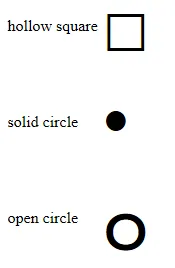
更多特殊字符可以在此处找到:HTML特殊字符
我不知道有没有一个仅使用CSS(2.1标准)实现圆形的简单解决方案,但对于正方形,你可以轻松地实现:
.squared {
    border: 2px solid black;
}
然后,使用以下HTML代码:
<img src="…" alt="an image " class="squared" />
如果你想让你的div在改变宽度/高度(例如使用js)时保持其圆形,请将半径设为50%。示例: css:
.circle {
    border-radius: 50%/50%;
    width: 50px;
    height: 50px;
    background: black;
}
html:
<div class="circle"></div>
画圆时间! :) 用border-radius轻松制作中空圆形:给元素添加边框和透明背景,这样你就可以透过它看到里面:
div {
    display: inline-block;
    margin-left: 5px;
    height: 100px;
    border-radius: 100%;
    width:100px;
    border:solid black 2px;
}

body{
    background:url('http://lorempixel.com/output/people-q-c-640-480-1.jpg');
    background-size:cover;
}<div></div>.square {
width: 100px;
height: 100px;
background: red;
}
.circle {
width: 100px;
height: 100px;
background: red;
-moz-border-radius: 50px;
-webkit-border-radius: 50px;
border-radius: 50px;
}
/* Cleaner, but slightly less support: use "50%" as value */<div class="square"></div>
<div class="circle"></div>上述链接中还有许多其他形状示例,但您需要测试浏览器兼容性。
如果需要根据页面的背景或要放置空心正方形的元素来更改正方形的背景颜色属性。始终将内圆的尺寸保持较小,相对于空心正方形。如果要更改颜色,只需更改空心正方形的背景颜色。使用position、top、left、transform属性将内圆居中于空心正方形上,不要乱动它们。
代码如下:
/* CSS Code */

.hollow-circle {
  width: 4rem;
  height: 4rem;
  background-color: transparent;
  border-radius: 50%;
  display: inline-block;

  /* Use this */
  border-color: black;
  border-width: 5px;
  border-style: solid;
  /* or */
  /* Shorthand Property */
  /* border: 5px solid #000; */
}

.hollow-square {
  position: relative;
  width: 4rem;
  height: 4rem;
  display: inline-block;
  background-color: black;
}

.inner-circle {
  position: absolute;
  top: 50%;
  left: 50%;
  transform: translate(-50%, -50%);
  width: 3rem;
  height: 3rem;
  border-radius: 50%;
  background-color: white;
}
<!-- HTML Code -->
<div class="hollow-circle">
</div>
<br/><br/><br/>
<div class="hollow-square">
<div class="inner-circle"></div>
</div>
<img>标签。我更喜欢像上面的解决方案那样使用普通的<div>。谢谢你。顺便说一句,我从未投过反对票。我投了赞成票 :) - marcamillion