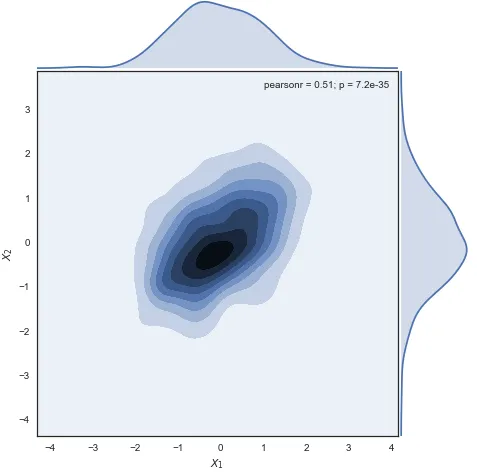
从Seaborn文档中,以下代码段将生成下面的图表:
或者说还有别的方法吗?
感谢您提供的任何建议!
import numpy as np
import pandas as pd
import seaborn as sns
sns.set(style="white")

# Generate a random correlated bivariate dataset
rs = np.random.RandomState(5)
mean = [0, 0]
cov = [(1, .5), (.5, 1)]
x1, x2 = rs.multivariate_normal(mean, cov, 500).T
x1 = pd.Series(x1, name="$X_1$")
x2 = pd.Series(x2, name="$X_2$")

# Show the joint distribution using kernel density estimation
g = sns.jointplot(x1, x2, kind="kde", size=7, space=0)
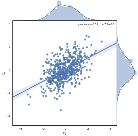
将g = sns.jointplot(x1, x2, kind="kde", size=7, space=0)替换为
g = sns.jointplot(x1, x2, kind="reg", size=7, space=0)将产生如下结果:
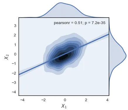
但我想同时绘制密度图和回归线,类似于这样:
通过使用help(sns.jointplot)查看参数,似乎没有简单的方法来实现这一点:
 Parameters
----------
x, y : strings or vectors
    Data or names of variables in ``data``.
data : DataFrame, optional
    DataFrame when ``x`` and ``y`` are variable names.
kind : { "scatter" | "reg" | "resid" | "kde" | "hex" }, optional
    Kind of plot to draw.
stat_func : callable or None, optional
    Function used to calculate a statistic about the relationship and
    annotate the plot. Should map `x` and `y` either to a single value
    or to a (value, p) tuple. Set to ``None`` if you don't want to
    annotate the plot.
color : matplotlib color, optional
    Color used for the plot elements.
size : numeric, optional
    Size of the figure (it will be square).
ratio : numeric, optional
    Ratio of joint axes size to marginal axes height.
space : numeric, optional
    Space between the joint and marginal axes
dropna : bool, optional
    If True, remove observations that are missing from ``x`` and ``y``.
{x, y}lim : two-tuples, optional
    Axis limits to set before plotting.
{joint, marginal, annot}_kws : dicts, optional
    Additional keyword arguments for the plot components.
kwargs : key, value pairings
    Additional keyword arguments are passed to the function used to
    draw the plot on the joint Axes, superseding items in the
    ``joint_kws`` dictionary.
或者说还有别的方法吗?
感谢您提供的任何建议!