在R中可视化二元联合概率质量函数

6

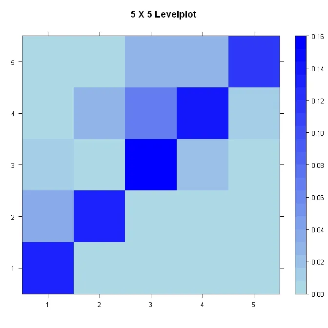
我在R中有一个矩阵,代表着两个变量的联合概率质量函数(pmf),例如:

> matrix(c(.13, .00004, 0, 0, 0, .04, .13, .008, 0, 0, .01, .007, .16, .02, .0004, .004, .025, .070, .14, .01, .001, .007, .028, .028, .12), nrow=5)
        [,1]  [,2]   [,3]  [,4]  [,5]
[1,] 0.13000 0.040 0.0100 0.004 0.001
[2,] 0.00004 0.130 0.0070 0.025 0.007
[3,] 0.00000 0.008 0.1600 0.070 0.028
[4,] 0.00000 0.000 0.0200 0.140 0.028
[5,] 0.00000 0.000 0.0004 0.010 0.120

我想创建一个二维可视化数据的正方形,分成5x5个小正方形,其中每个小正方形的颜色与矩阵中的条目成比例(在上面的情况下,沿对角线最暗)。有没有一种简单的方法生成这种类型的图像?

1
“pmf”是什么?你能否在问题标题和文本中澄清一下,以便那些不熟悉这个术语的人能够理解? - Gavin Simpson
@Gavin Simpson:我编辑了标题和文本,希望现在更加清晰明了。 - Lorin Hochstein
3个回答

4

试试这个:

library(lattice)

#Build the data
x <- matrix(c(.13, .00004, 0, 0, 0, .04, .13, .008, 0, 0, .01, .007, .16, .02, .0004, .004, .025, .070, .14, .01, .001, .007, .028, .028, .12), nrow=5)
xmin <- min(x)
xmax <- max(x)

#Build the plot
pal <- colorRampPalette(c("lightblue", "blue"), space = "rgb")
levelplot(x, main="5 X 5 Levelplot", xlab="", ylab="", col.regions=pal(120), cuts=100, at=seq(xmin, xmax, (xmax-xmin)/20))

enter image description here


3

ggplot可以很容易地处理它。我知道两种简单的方法来实现这一点:

library(ggplot2)
dat <- matrix(c(.13, .00004, 0, 0, 0, .04, .13, .008, 0, 0, .01, .007, .16, .02, .0004, .004, .025, .070, .14, .01, .001, .007, .028, .028, .12), nrow=5)
ggfluctuation(as.table(dat), type = "colour") +
    scale_fill_gradient(low = "white", high = "blue")

#Or with geom_tile
dat.m <- melt(dat)

ggplot(dat.m, aes(X1, X2, fill = value)) + 
    geom_tile(colour = "grey") + scale_fill_gradient(low = "white", high = "blue")

为了完整起见,这里提供一种格点解法(同样简单):
library(lattice)
levelplot(dat)

3
< p > image() 函数可用于:

mat <- matrix(c(.13, .00004, 0, 0, 0, 
                .04, .13, .008, 0, 0,
                .01, .007, .16, .02, .0004,
                .004, .025, .070, .14, .01,
                .001, .007, .028, .028, .12), nrow=5)
image(mat, col = rev(heat.colors(12)))

但是,您需要想出正确的颜色方案来填充每个类/箱。在这里,我只是将默认设置反转,以获得高值的深色。但还有更好的方法。


网页内容由stack overflow 提供, 点击上面的
可以查看英文原文,
原文链接