Python中Seaborn tsplot函数中的标准偏差和误差条

23

Seaborn如何计算误差棒?例如:

import numpy as np; np.random.seed(22)
import seaborn as sns; sns.set(color_codes=True)
x = np.linspace(0, 15, 31)
data = np.sin(x) + np.random.rand(10, 31) + np.random.randn(10, 1)
ax = sns.tsplot(data=data, err_style="ci_bars")
plt.show()

ci_bars(或ci_bands)是如何计算的?

另外,是否可以让tsplot以ci_bars样式绘制,其中误差条或带对应于每个时间点上值的标准偏差?(而不是均值的标准误差或bootstraps)


1
@mwaskom:我的另一个问题是如何在“tsplot”中绘制反映标准差而不是均值标准误差或引导估计的条形图或带状图。这可能吗?对于我的数据,引导估计太窄了,标准差更好地表示了数据。 - lgd
2个回答

19

在Seaborn v0.8.0版本(2017年7月),大多数统计函数现在都可以使用误差条来显示标准差,而不是引导置信区间。只需将ci="sd"即可。

sns.tsplot(data=data, ci="sd") 

对于之前的Seaborn版本,绘制标准差的解决方法是在 seaborn tsplot 上使用 matplotlib errorbar:

import numpy as np;
import seaborn as sns;
import pandas as pd
import matplotlib.pyplot as plt

# create a group of time series
num_samples = 90
group_size = 10
x = np.linspace(0, 10, num_samples)
group = np.sin(x) + np.linspace(0, 2, num_samples) + np.random.rand(group_size, num_samples) + np.random.randn(group_size, 1)
df = pd.DataFrame(group.T, index=range(0,num_samples))

# plot time series with seaborn
ax = sns.tsplot(data=df.T.values) #, err_style="unit_traces")

# Add std deviation bars to the previous plot
mean = df.mean(axis=1)
std  = df.std(axis=1)
ax.errorbar(df.index, mean, yerr=std, fmt='-o') #fmt=None to plot bars only

plt.show()

enter image description here


12

由于tsplot函数没有直接设置误差条值或更改计算方法的方式,我找到的唯一解决方案是对timeseries模块进行猴子补丁:

import seaborn.timeseries

def _plot_std_bars(*args, central_data=None, ci=None, data=None, **kwargs):
    std = data.std(axis=0)
    ci = np.asarray((central_data - std, central_data + std))
    kwargs.update({"central_data": central_data, "ci": ci, "data": data})
    seaborn.timeseries._plot_ci_bars(*args, **kwargs)

def _plot_std_band(*args, central_data=None, ci=None, data=None, **kwargs):
    std = data.std(axis=0)
    ci = np.asarray((central_data - std, central_data + std))
    kwargs.update({"central_data": central_data, "ci": ci, "data": data})
    seaborn.timeseries._plot_ci_band(*args, **kwargs)

seaborn.timeseries._plot_std_bars = _plot_std_bars
seaborn.timeseries._plot_std_band = _plot_std_band

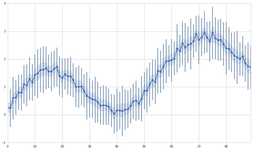
然后,要使用标准偏差误差线绘制图表,请使用

ax = sns.tsplot(data, err_style="std_bars", n_boot=0)
或者
ax = sns.tsplot(data, err_style="std_band", n_boot=0)

用标准差带绘制图表。

编辑:受SO上这个答案的启发,另一种(可能更明智)的方法是使用以下内容代替tsplot

import pandas as pd
import seaborn as sns

df = pd.DataFrame.from_dict({
    "mean": data.mean(axis=0),
    "std": data.std(axis=0)
}).reset_index()

g = sns.FacetGrid(df, size=6)
ax = g.map(plt.errorbar, "index", "mean", "std")
ax.set(xlabel="", ylabel="")

编辑2:既然你问了关于tsplot如何计算置信区间的问题:它使用自助法来估计每个时间点的平均值分布,然后从这些分布中找到低和高百分位数(对应于使用的置信区间)。默认置信区间为68%——相当于平均值的±一个标准差,假设正态分布。相应的低和高百分位数为16%和84%。您可以通过ci关键字参数更改置信区间。


谢谢Martin,好的解决方法。不幸的是,Python解释器在'*args'参数后面抱怨语法。 - luca

网页内容由stack overflow 提供, 点击上面的
可以查看英文原文,
原文链接