Seaborn Relplot未显示误差条

3
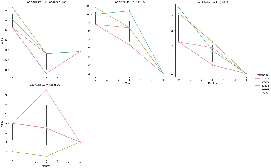
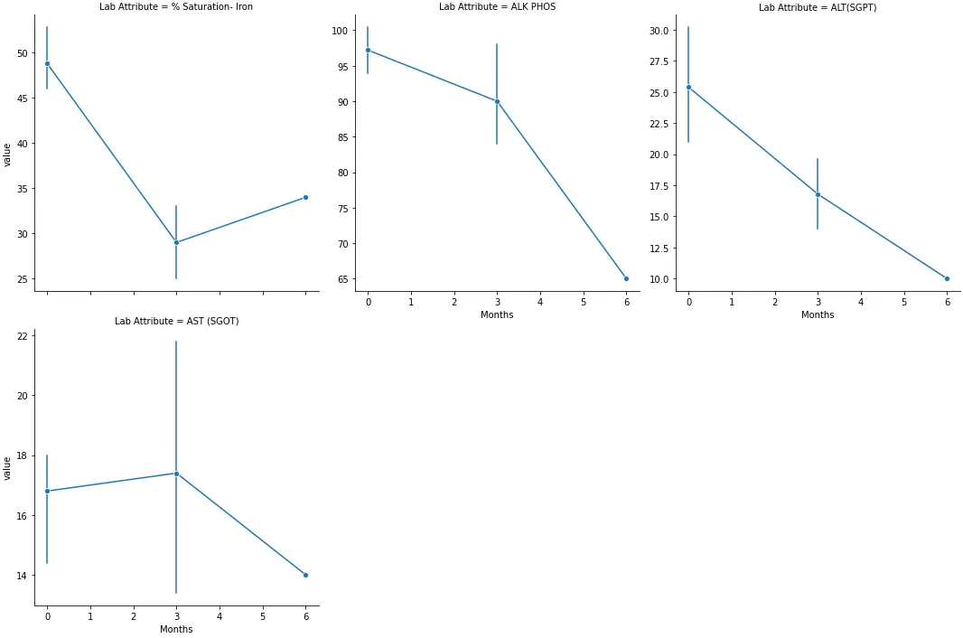
使用这段代码,我创建了一个 Seaborn 图表,以可视化长格式数据集中的多个变量。
import pandas as pd
import seaborn as sns

data = {'Patient ID': [11111, 11111, 11111, 11111, 22222, 22222, 22222, 22222, 33333, 33333, 33333, 33333, 44444, 44444, 44444, 44444, 55555, 55555, 55555, 55555],
        'Lab Attribute': ['% Saturation- Iron', 'ALK PHOS', 'ALT(SGPT)', 'AST (SGOT)', '% Saturation- Iron', 'ALK PHOS', 'ALT(SGPT)', 'AST (SGOT)', '% Saturation- Iron', 'ALK PHOS', 'ALT(SGPT)', 'AST (SGOT)', '% Saturation- Iron', 'ALK PHOS', 'ALT(SGPT)', 'AST (SGOT)', '% Saturation- Iron', 'ALK PHOS', 'ALT(SGPT)', 'AST (SGOT)'],
        'Baseline': [46.0, 94.0, 21.0, 18.0, 56.0, 104.0, 31.0, 12.0, 50.0, 100.0, 33.0, 18.0, 46.0, 94.0, 21.0, 18.0, 46.0, 94.0, 21.0, 18.0],
        '3 Month': [33.0, 92.0, 19.0, 25.0, 33.0, 92.0, 21.0, 11.0, 33.0, 102.0, 18.0, 17.0, 23.0, 82.0, 13.0, 17.0, 23.0, 82.0, 13.0, 17.0],
        '6 Month': [34.0, 65.0, 10.0, 14.0, 34.0, 65.0, 10.0, 14.0, 34.0, 65.0, 10.0, 14.0, 34.0, 65.0, 10.0, 14.0, 34.0, 65.0, 10.0, 14.0]}

df = pd.DataFrame(data)

# reshape the dataframe
dfm = df_labs.melt(id_vars=['Patient_ID', 'Lab_Attribute'], var_name='Months')

# change the Months values to numeric
dfm.Months = dfm.Months.map({'Baseline': 0, '3 Month': 3, '6 Month': 6})

# plot a figure level line plot with seaborn
p = sns.relplot(data=dfm, col='Lab_Attribute', x='Months', y='value', hue='Patient_ID', kind='line', col_wrap=5, marker='o', palette='husl',facet_kws={'sharey': False, 'sharex': True},err_style="bars", ci=95,)

plt.savefig('gmb_nw_labs.jpg')

图表很棒,但由于某种原因,误差条未显示,即使添加了以下内容:
err_style="bars", ci=95,

转换到 sns.replot()

p = sns.relplot(data=dfm, col='Lab_Attribute', x='Months', y='value', hue='Patient_ID', kind='line', col_wrap=5, marker='o', palette='husl',facet_kws={'sharey': False, 'sharex': True},err_style="bars", ci=95,)

有人能告诉我为什么会这样吗?也许我的数据集中数据点太少了?

1个回答

3
  • 每个数据点都被hue分开,因此没有误差线,因为没有合并的数据。删除hue = 'Patient ID',只显示平均线和误差线。
  • 或者,可以将seaborn.lineplot映射到seaborn.relplot上。通过不指定hue,API将创建误差线
    • linestyle=''被指定,因此不会绘制平均线
  • python3.8.12pandas1.3.4matplotlib3.4.3seaborn0.11.2中进行了测试
data = {'Patient ID': [11111, 11111, 11111, 11111, 22222, 22222, 22222, 22222, 33333, 33333, 33333, 33333, 44444, 44444, 44444, 44444, 55555, 55555, 55555, 55555],
        'Lab Attribute': ['% Saturation- Iron', 'ALK PHOS', 'ALT(SGPT)', 'AST (SGOT)', '% Saturation- Iron', 'ALK PHOS', 'ALT(SGPT)', 'AST (SGOT)', '% Saturation- Iron', 'ALK PHOS', 'ALT(SGPT)', 'AST (SGOT)', '% Saturation- Iron', 'ALK PHOS', 'ALT(SGPT)', 'AST (SGOT)', '% Saturation- Iron', 'ALK PHOS', 'ALT(SGPT)', 'AST (SGOT)'],
        'Baseline': [46.0, 94.0, 21.0, 18.0, 56.0, 104.0, 31.0, 12.0, 50.0, 100.0, 33.0, 18.0, 46.0, 94.0, 21.0, 18.0, 46.0, 94.0, 21.0, 18.0],
        '3 Month': [33.0, 92.0, 19.0, 25.0, 33.0, 92.0, 21.0, 11.0, 33.0, 102.0, 18.0, 17.0, 23.0, 82.0, 13.0, 17.0, 23.0, 82.0, 13.0, 17.0],
        '6 Month': [34.0, 65.0, 10.0, 14.0, 34.0, 65.0, 10.0, 14.0, 34.0, 65.0, 10.0, 14.0, 34.0, 65.0, 10.0, 14.0, 34.0, 65.0, 10.0, 14.0]}

df = pd.DataFrame(data)

# reshape the dataframe
dfm = df.melt(id_vars=['Patient ID', 'Lab Attribute'], var_name='Months')

# change the Months values to numeric
dfm.Months = dfm.Months.map({'Baseline': 0, '3 Month': 3, '6 Month': 6})

# plot a figure level line plot with seaborn
p = sns.relplot(data=dfm, col='Lab Attribute', x='Months', y='value', hue='Patient ID', kind='line', col_wrap=3, marker='o', palette='husl', facet_kws={'sharey': False, 'sharex': True}, err_style="bars", ci=95,)
p.map(sns.lineplot, 'Months', 'value',  linestyle='', err_style="bars", color='k')

输入图像描述

  • 未使用 hue='Patient ID' 的原始实现
p = sns.relplot(data=dfm, col='Lab Attribute', x='Months', y='value', kind='line', col_wrap=3, marker='o', palette='husl', facet_kws={'sharey': False, 'sharex': True}, err_style="bars", ci=95)

enter image description here


1
好的,我升级了seaborn和matplotlib,并重新启动了内核,完美解决了问题。再次感谢您今天的帮助。这对我的数据分析技能提升是一个重要的步骤。 - John Conor

网页内容由stack overflow 提供, 点击上面的
可以查看英文原文,
原文链接