我正在寻找一种使用CSS或SVG绘制此圆的底部的方法。我看到了这个答案,但它只适用于完美的半圆,而我需要切掉额外的一段,使其略小于半圆。纯CSS可能不可行,但对我来说修改SVG答案会变得复杂。
<svg class="pie">
  <circle cx="115" cy="115" r="110"></circle>
  <path d="M115,115 L115,5 A110,110 1 0,1 225,115 z"></path>
</svg>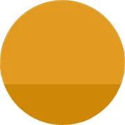
我正在寻找一种使用CSS或SVG绘制此圆的底部的方法。我看到了这个答案,但它只适用于完美的半圆,而我需要切掉额外的一段,使其略小于半圆。纯CSS可能不可行,但对我来说修改SVG答案会变得复杂。
<svg class="pie">
<circle cx="115" cy="115" r="110"></circle>
<path d="M115,115 L115,5 A110,110 1 0,1 225,115 z"></path>
</svg>
为什么不使用两个带有弧线命令的path元素?
<svg width="135" height="135">
  <path d="M125,85 a60,60 0 1,0 -115,0" fill="#E79A16" /><!--Top Half-->
  <path d="M10,85 a60,60 0 0,0 115,0" fill="#D78500" /><!--Bottom Half-->
</svg><svg width="135" height="135">
<path d="M125,80 a60,60 0 1,0 -115,0" fill="#E79A16" /><!--Top Half-->
</svg>
<svg width="135" height="135">
<path d="M10,80 a60,60 0 0,0 115,0" fill="#D78500" /><!--Bottom Half-->
</svg>
<svg width="135" height="135">
<path d="M10,0 a60,60 0 0,0 115,0" fill="#D78500" /><!--Bottom Half-->
</svg>path 的简单方法。
<svg version="1.1" width="64" height="64" xmlns="http://www.w3.org/2000/svg">
    <clipPath id="cut-off">
        <rect x="0" y="0" width="64" height="40"/>
    </clipPath>

    <circle cx="32" cy="32" r="32" fill="#d08807"/>
    <circle cx="32" cy="32" r="32" fill="#e19b22" clip-path="url(#cut-off)"/>
</svg>.partial-circle {
position: relative;
height: 20px;
width: 100px;
overflow: hidden;
}
.partial-circle:before {
content: '';
position: absolute;
height: 100px;
width: 100px;
border-radius: 50%;
bottom: 0;
background: #D08707;
}<div class="partial-circle"></div>您也可以有两个部分:
.partial-circle {
  position: relative;
  width: 100px;
  overflow: hidden;
}
.partial-circle:before {
  content: '';
  position: absolute;
  height: 100px;
  width: 100px;
  border-radius: 50%;
}
.partial-circle.top {
  height: 80px;
}
.partial-circle.bottom {
  height: 20px;
}
.partial-circle.top:before {
  top: 0;
  background: #E19B21;
}
.partial-circle.bottom:before {
  bottom: 0;
  background: #D08707;
}<div class="partial-circle top"></div>
<div class="partial-circle bottom"></div>