R(ggplot)中是否有一种方法可以使用字符代替数字作为轴刻度标记?

3
我有以下代码可以生成一张图表。
Bloom <- read.table("Phenology Example.txt", header = T)

library(ggplot2)
library(reshape2)

x  <- Bloom$Julian_Date
A <- Bloom$Bloom_A
B <- Bloom$Bloom_B
df <- data.frame(x, A, B)

df2 <- melt(data = df, id.vars = "x")

ggplot(data = df2, aes(x = x, y = value, color = variable)) + 
  geom_line() + 
  scale_y_continuous(breaks = round(seq(min(0), max(1), by = 1),1)) +
  labs(title = "Example", 
       x = "Date",
       y = "Status", 
       colour = "Legend") +
  xlim(120,131)

返回布隆过滤器的结果:

    ID    Julian_Date   A       B
1   1         120       0       0
2   2         121       0       0
3   3         122       1       0
4   4         123       1       0
5   5         124       1       0
6   6         125       1       1
7   7         126       1       1
8   8         127       1       1
9   9         128       0       1
10 10         129       0       1
11 11         130       0       1
12 12         131       0       0

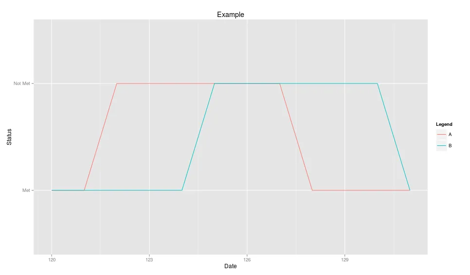
基本上,我的图表沿y轴显示两个值:0(表示在给定日期未满足条件)和1(表示在给定日期满足条件)。有没有办法将y轴上的0和1更改为一个单词或一组单词,例如“已满足”或“未满足”?
这不是什么大问题,但我觉得这样做会更具视觉吸引力,也更容易理解。
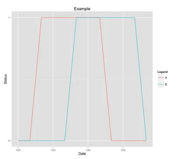
 运行上述代码后的结果图
1个回答

2
你可以将df2$value转换为因子,其中值为Met/Not Met,然后删除+ scale_y_continuous(...),因为ggplot会自动处理它。
或者,你可以使用+ scale_y_discrete(labels = c("Not Met","Met"))。但是为了使用这个,你需要将数据从0,1更改为1,2,否则会得到奇怪的显示。
df2$value <- df2$value + 1 # change data

ggplot(data = df2, aes(x = x, y = value, color = variable)) + 
  geom_line() + 
  scale_y_discrete(labels = c("Met","Not Met")) +
  labs(title = "Example", 
       x = "Date",
       y = "Status", 
       colour = "Legend") +
  xlim(120,131)

plot with discrete scale


我试图描述我在显示方面遇到的问题,但我失去了连接。谢谢你的澄清,我想不出如何改变那种奇怪的现象。 - Adam
没关系,只是很难诊断你无法复现的问题。对于可重现的示例,激励措施效果很好:) - Brandon Bertelsen

网页内容由stack overflow 提供, 点击上面的
可以查看英文原文,
原文链接