使用matplotlib在极坐标图中给'cells'着色

11

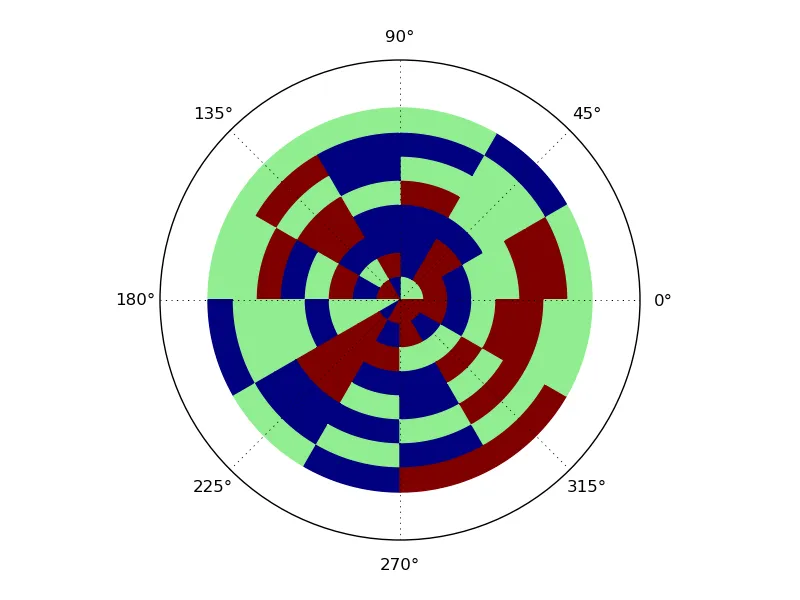
我有一堆均匀分布的点(θ = n*π/6,r = 1...8),每个点都有一个值在[0, 1]之间。我可以使用matplotlib将它们与其值绘制出来,方法如下:

polar(thetas, rs, c=values)

我不想只有个简单的小点,而是想用与该点值相对应的颜色填充相应的“单元格”(即一直到相邻点的一半):

Polar plot with shaded cells

(请注意,这里我的值只是[0,.5,1],实际上它们将是介于0和1之间的所有值。有没有使用matplotlib实现这个(或者类似的东西)的简单方法?也许将其视为2D直方图会更容易?
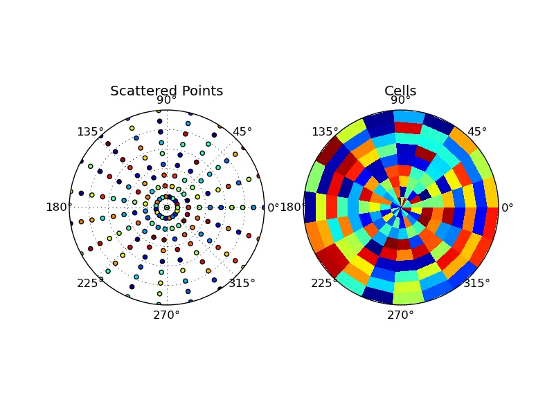
3个回答

13

这可以通过将其视为极坐标堆叠条形图来很好地完成:

import matplotlib.pyplot as plt
import numpy as np
from random import choice

fig = plt.figure()
ax = fig.add_axes([0.1, 0.1, 0.8, 0.8], polar=True)

for i in xrange(12*8):
    color = choice(['navy','maroon','lightgreen'])
    ax.bar(i * 2 * np.pi / 12, 1, width=2 * np.pi / 12, bottom=i / 12,
           color=color, edgecolor = color)
plt.ylim(0,10)
ax.set_yticks([])
plt.show()

生成:

在此输入图片描述


哈哈,确实是个不错的解决方案!只需要根据值选择颜色,但除此之外完全符合我的需求,并且是最短的方式。JAB和Joe的解决方案略微通用一些。 - Manuel Ebert
哦,不错。不过你也可以在 bar() 调用中设置 edgecolor='None',对吧? - JAB
@JAB - 你可能认为这应该可以工作,但它生成了一个完全空白的图表!这一定是个bug(至少在我的版本中是这样)。 - fraxel
那很有趣。不幸的是,我目前没有访问配备了matplotlib的计算机,无法自行测试。 - JAB

12
当然可以!只需在极坐标轴上使用 pcolormesh
例如:
import matplotlib.pyplot as plt
import numpy as np

# Generate some data...
# Note that all of these are _2D_ arrays, so that we can use meshgrid
# You'll need to "grid" your data to use pcolormesh if it's un-ordered points
theta, r = np.mgrid[0:2*np.pi:20j, 0:1:10j]
z = np.random.random(theta.size).reshape(theta.shape)


fig, (ax1, ax2) = plt.subplots(ncols=2, subplot_kw=dict(projection='polar'))


ax1.scatter(theta.flatten(), r.flatten(), c=z.flatten())
ax1.set_title('Scattered Points')

ax2.pcolormesh(theta, r, z)
ax2.set_title('Cells')

for ax in [ax1, ax2]:
    ax.set_ylim([0, 1])
    ax.set_yticklabels([])

plt.show()

输入图像的描述

如果您的数据不是已经在一个规则网格上,那么您需要将其转换为网格形式才能使用pcolormesh。

不过从您的绘图来看,它似乎已经在一个规则的网格上了。在这种情况下,将其转换成网格形式相当简单。如果已经有序,则可能只需调用reshape即可。否则,使用您的z值作为权重进行简单的循环或利用numpy.histogram2d即可完成您所需的操作。


pcolor()也可以使用。 (如果我不花时间尝试使结果矩形平滑,就会首先完成我的帖子...哦,算了。) - JAB
对于常规网格而言,这种方法效率远远不够高。如果你的数据位于常规网格上,请勿使用它。 - Joe Kington
以前你可以通过在极坐标轴的初始化过程中传递一个“resolution”关键字参数来平滑矩形,但现在这个参数被忽略了,显然... - Joe Kington
如果您有带有平滑矩形的示例,请随意发布!这将比我的回答更好。 - Joe Kington
花了太多时间在它上面……但最终(大部分)完成了。作为答案发布。 - JAB

4

嗯,整体来说还比较粗糙,但这里有一个完整的版本,可以补充各个部分。

from matplotlib.pylab import *
ax = subplot(111, projection='polar')

# starts grid and colors
th = array([pi/6 * n for n in range(13)]) # so n = 0..12, allowing for full wrapping
r = array(range(9)) # r = 0..8
c = array([[random_integers(0, 10)/10 for y in range(th.size)] for x in range(r.size)])

# The smoothing
TH = cbook.simple_linear_interpolation(th, 10)

# Properly padding out C so the colors go with the right sectors (can't remember the proper word for such segments of wedges)
# A much more elegant version could probably be created using stuff from itertools or functools
C = zeros((r.size, TH.size))
oldfill = 0
TH_ = TH.tolist()

for i in range(th.size):
    fillto = TH_.index(th[i])

    for j, x in enumerate(c[:,i]):
        C[j, oldfill:fillto].fill(x)

    oldfill = fillto

# The plotting
th, r = meshgrid(TH, r)
ax.pcolormesh(th, r, C)
show()

感谢您的额外努力,我非常感激! - Manuel Ebert
@Nkosinathi:不用客气。幸运的是,虽然我在上面工作时没有想到它,但我意识到我可以将其用于我正在为工作做的任务。 - JAB

网页内容由stack overflow 提供, 点击上面的
可以查看英文原文,
原文链接