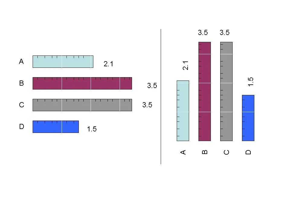
使用ggplot2库的解决方案相当冗长。
首先修改您的数据帧 - 根据柱形图高度中出现0.2的次数重复每个names和height元素。
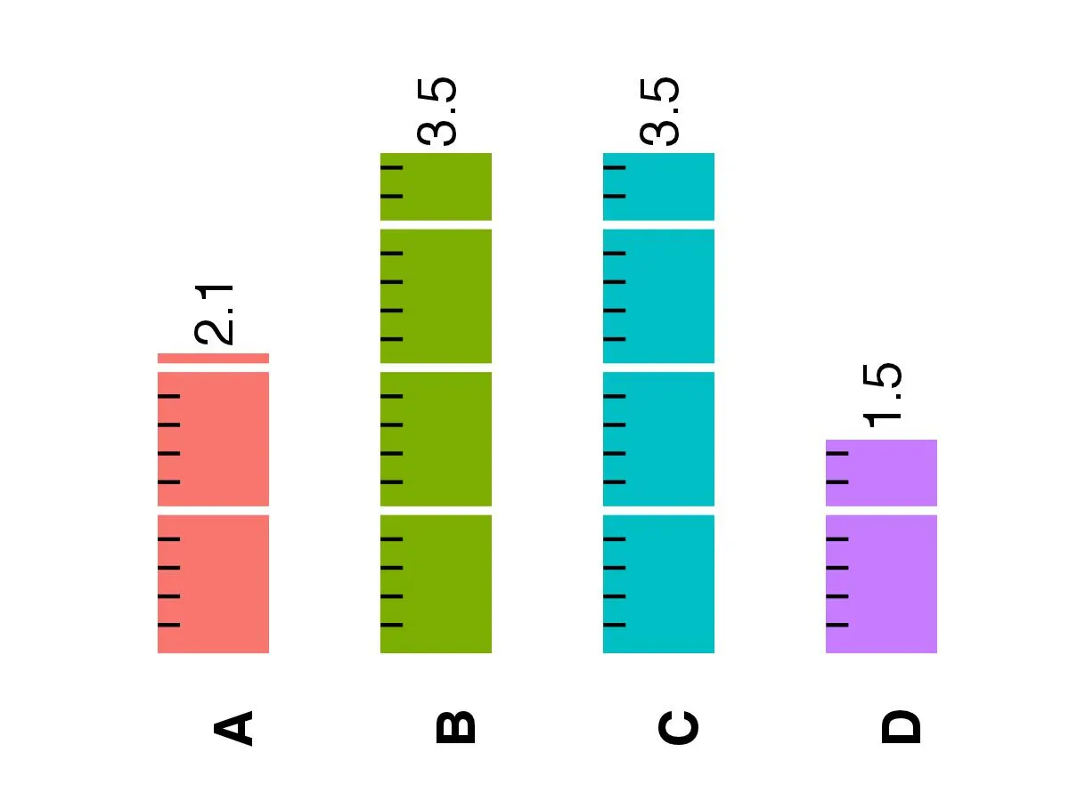
myd <- data.frame (names = c(rep("A",floor(2.1/0.2)), rep("B",floor(3.5/0.2)), rep("C",floor(3.5/0.2)), rep("D",floor(1.5/0.2))),
                   height = c(rep(2.1,floor(2.1/0.2)), rep(3.5,floor(3.5/0.2)), rep(3.5,floor(3.5/0.2)), rep(1.5,floor(1.5/0.2))))
ystart和yend是小刻度线的y坐标,每根条形图按0.2序列计算。 xstart是小刻度线的x坐标。在这里,我假设条形图宽度为0.5。如果宽度较小或较大,则应更改坐标。 xend是根据刻度线宽度0.1计算的。
ystart<-c(seq(0.2,2.1,0.2),seq(0.2,3.5,0.2),seq(0.2,3.5,0.2),seq(0.2,1.5,0.2))
yend=ystart
xstart<-c(rep(0.75,floor(2.1/0.2)),rep(1.75,floor(3.5/0.2)),rep(2.75,floor(3.5/0.2)),rep(3.75,floor(1.5/0.2)))
xend<-xstart+0.1
数据帧中添加了新值。
myd <-data.frame(myd,ystart,yend,xstart,xend)
p <- ggplot(myd, aes(factor(names), height,fill = names))
p <- p + geom_bar(width=0.5)
p <- p + geom_segment(aes(x=xstart,y=ystart,xend=xend,yend=yend))
p <- p + geom_hline(yintercept=c(1,2,3),color="white",lwd=1.1)
p <- p + guides(fill=FALSE)
p <- p + ylim(c(0,4))
p <- p + annotate("text",x=c(1,2,3,4),y=c(2.4,3.8,3.8,1.8),label=c("2.1","3.5","3.5","1.5"),angle=90,fontface="bold",size=5)
p <- p + theme_bw()
p <- p + theme(axis.title=element_blank(),
axis.text.y=element_blank(),
axis.text.x=element_text(angle=90,face="bold",size=rel(1.5)),
axis.ticks=element_blank(),
panel.border=element_blank(),
panel.grid=element_blank())
print(p)
编辑 - 添加函数解决方案。
添加了函数 ruler.func() - 唯一需要的参数是条形图高度的向量。函数的第一部分生成数据框,第二部分制作绘图。
ruler.func<-function(gg){
seq.list<-list()
for(i in 1:length(gg)){
  ystart<-seq(0.2,gg[i],0.2)
  yend<-ystart
  xstart<-rep(i-0.25,length(ystart))
  xend<-xstart+0.1
  nam.val<-c(LETTERS[i],rep(NA,length(ystart)-1))
  numb.val<-c(gg[i],rep(NA,length(ystart)-1))
  seq.list[[i]]<-data.frame(nam.val,numb.val,xstart,xend,ystart,yend)
}
df<-as.data.frame(do.call(rbind, seq.list))
p <- ggplot(df, aes(nam.val))
p <- p + geom_bar(aes(y=numb.val,fill=nam.val),stat="identity",width=0.5,color="black",lwd=1.1)+
    scale_x_discrete(limits=LETTERS[1:length(gg)])+
    geom_segment(aes(x=xstart,y=ystart,xend=xend,yend=yend))+
    geom_hline(yintercept=seq(1,max(gg),1),color="white",lwd=1.1)+
    guides(fill=FALSE)+
    ylim(c(0,max(gg)+0.5))+
    annotate("text",x=seq(1,length(gg),1),y=gg+0.5,label=gg,angle=90,fontface="bold",size=rel(6))+
    theme_bw()+
    theme(axis.title=element_blank(),
               axis.text.y=element_blank(),
               axis.text.x=element_text(angle=90,face="bold",size=rel(1.5)),
               axis.ticks=element_blank(),
               panel.border=element_blank(),
               panel.grid=element_blank())
print(p)
}
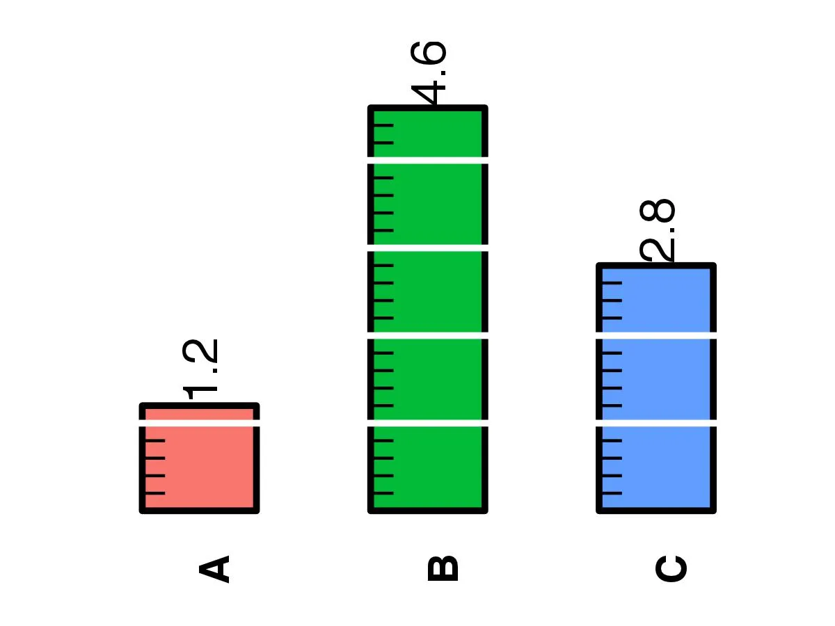
带有数字1.2、4.6和2.8的示例。
ruler.func(c(1.2,4.6,2.8))