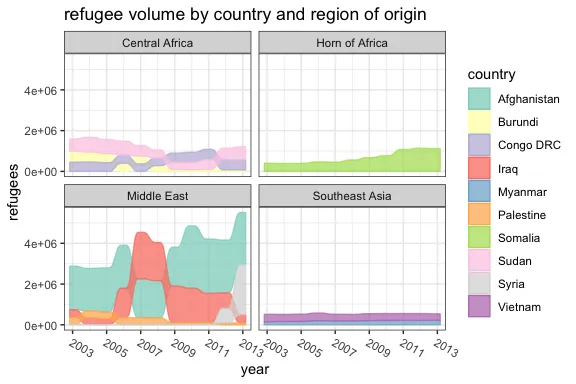
我在R实现中搜索(可能是基于JavaScript的HTML小部件)一个堆叠条形图,它以带状样式呈现,使您可以看到每个类别的评级变化动态。
它看起来像Power BI桌面中的带状图表。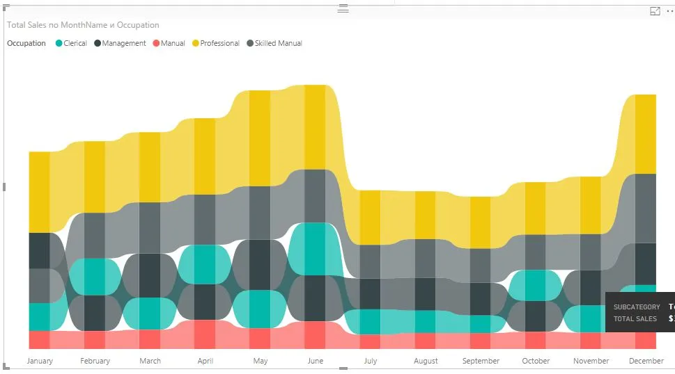 在rseek.org上搜索无结果。
它看起来像Power BI桌面中的带状图表。
在rseek.org上搜索无结果。
在rseek.org上搜索无结果。ggplot2中的geom_ribbon构建类似的图表。以下是一个最简示例:# Sample data
set.seed(2017);
one <- sample(5:15, 10);
two <- rev(one);
df <- cbind.data.frame(
x = rep(1:10, 2),
y = c(one, two),
l = c(one - 1, two - 1),
h = c(one + 1, two + 1),
id = rep(c("one", "two"), each = 10));
require(ggplot2);
ggplot(df, aes(x = x, y = y)) +
geom_ribbon(aes(ymin = l, ymax = h, fill = id), alpha = 0.4) +
scale_fill_manual(values = c("#E69F00", "#56B4E9"));
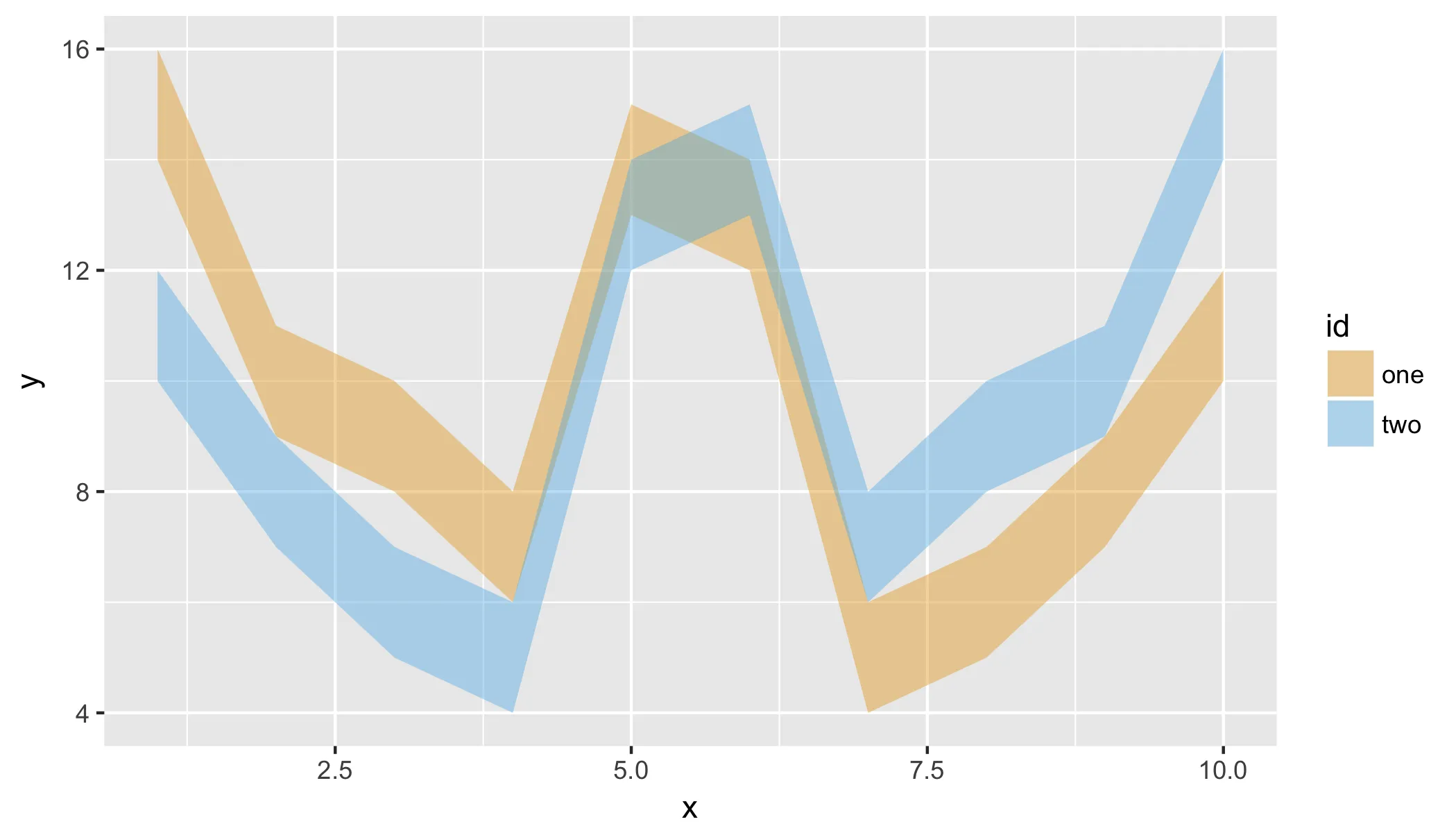
如果需要交互性,您可以将其包装在plotly :: ggplotly中。
geom_ribbon进行绘图。这是一个解决方法,但会给你很大的灵活性。我的示例只是为了让你入门。我认为没有现成的东西可用。R绘图通常更注重数据科学,而不是信息图形。 - Maurits Everssmooth参数geom_sankey_bump来控制图表的外观和感觉,就像Power BI中的带状图表一样。df <- data.frame (model = c("A","B","C","D","E","F","G","H","I","J","A","B","C","D","E","F","G","H","I","J","A","B","C","D","E","F","G","H","I","J","A","B","C","D","E","F","G","H","I","J"),
Year = c(2015,2015,2015,2015,2015,2015,2015,2015,2015,2015,2016,2016,2016,2016,2016,2016,2016,2016,2016,2016,2017,2017,2017,2017,2017,2017,2017,2017,2017,2017,2018,2018,2018,2018,2018,2018,2018,2018,2018,2018),
sales = c(450,678,456,344,984,456,234,244,655,789,234,567,234,567,232,900,1005,1900,450,345,567,235,456,345,144,333,555,777,111,444,222,223,445,776,331,788,980,1003,456,434))
#install.packages("remotes")
#remotes::install_github("davidsjoberg/ggsankey")
library(ggsankey)
library(tidyverse)
ggplot(df, aes(x = Year,
node = model,
fill = model,
value = sales)) +
geom_sankey_bump(space = 0, type = "alluvial", color = "transparent", smooth = 15) +
scale_fill_viridis_d(option = "A", alpha = .8) +
theme_sankey_bump(base_size = 16) +
labs(x = NULL,
y = "Sales ($ ths)",
fill = "Model",
color = NULL) +
theme(legend.position = "bottom") +
labs(title = "Sales per model per year")

有网友提出建议,我试图复制Power BI图表的一些特性。
# Prepare some data
set.seed(1)
df <- data.frame(
  occupation = rep(c("Clerical", "Management", "Manual", "Professional", "Skilled"), 12),
  Month = factor(rep(month.abb, 5), levels = month.abb, ordered = TRUE),
  Sales = sample(200:1000, 60, replace = TRUE)
)

df %>%
  group_by(Month) %>%
  mutate(Max = sum(Sales)) %>%
  ungroup() %>%
  mutate(Max = max(Sales)) %>%
  ggplot(aes(x = Month,
               node = occupation,
               fill = occupation,
               value = Sales)) +
  geom_col(aes(x = Month, y = Max/1.2),
           alpha = 0.5,
           fill = 'grey',
           width = 0.4) +
  geom_sankey_bump(space = 15,
                   type = "alluvial",
                   color = "transparent",
                   smooth = 8,
                   alpha = 0.8) +
  scale_fill_brewer(palette = "Set3") +
  theme_minimal() +
  labs(x = NULL,
       y = "Sales ($ ths)",
       fill = "Occupation",
       color = NULL) +
  theme(legend.position = "top") +
  labs(title = "Sales per occupation per month")

由 reprex 包 (v2.0.1) 创建于2022年7月7日
geom_col(aes(x = Month, y = Sales),...),这将更接近所需的外观。 - tjebohttps://cran.r-project.org/web/packages/ggalluvial/vignettes/ggalluvial.html