我正在尝试制作图表,想知道是否可以在R语言中制作这样的图片?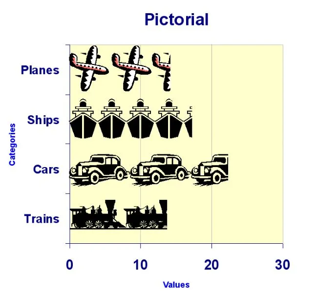
 myd <- data.frame (categories = c("Planes", "Ships", "Cars", "Trains"),
values = c(15, 18, 22, 11))
组件图标在这里:


我正在尝试制作图表,想知道是否可以在R语言中制作这样的图片?
myd <- data.frame (categories = c("Planes", "Ships", "Cars", "Trains"),
values = c(15, 18, 22, 11))
组件图标在这里:
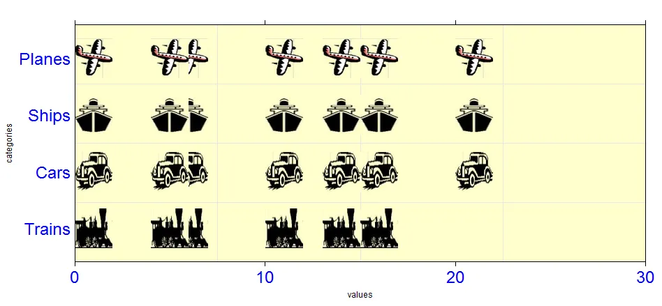
library(lattice)
library(grid)


imgs.names <- c('WNinq','7dqJM','9E3Wj','tStmx')
library(png)
images <- lapply(imgs.names, function(x)
     readPNG(paste(mypath,x,'.png',sep=''),native=TRUE))
## I generate some data because we don't give a reproducible example
x <- c(rep(0,4),rep(10,9),rep(20,3),rep(5,8),rep(4,8),rep(15,4),rep(13,8))
barchart(1:4~x, origin=0, col="yellow",xlim=c(0,30),
             xlab ='values',ylab='categories',title = 'Pictorial',
             scales = list(
               y = list(cex=2,col='blue', at = 1:4,labels = c('Trains','Cars','Ships','Planes')),
               x = list(cex=2,col='blue',at=seq(0,30,by=10))
               ),
             panel=function(x, y, ...) {
                panel.fill(col = rgb(1,1,205/255))    ## I had to pick up the same yellow color!!
                panel.grid()
                lapply(1:4,function(id){
                grid.raster(images[[id]], x=x[which(y==id)],  y=y[which(y==id)],
                           default.units="native",
                           just="left",
                           width =unit(2, "native"),
                           height=unit(0.7, "native"))
                }
            )
          }
         )