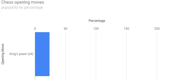
我正在尝试使用https://developers.google.com/chart/interactive/docs/gallery/barchart#top-x构建使用情况条形图。我想知道如何最大化X轴刻度标记的范围?我已经尝试在fiddle https://jsfiddle.net/gbta075L/ 中使用另一篇帖子中的建议set x Axis range in google chart,但没有成功。这是我添加到现有fiddle中的内容:
但似乎并没有起作用。非常感谢您的帮助!
hAxis: {
        viewWindow: {
              max: 200
        },
        ticks: [0,50,100]
}
但似乎并没有起作用。非常感谢您的帮助!