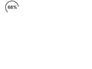
我正在尝试在Flutter中制作弧形进度条。 以下图片是我想要实现的效果
CircularProgressIndicator。我尝试了以下软件包https://pub.dartlang.org/packages/percent_indicator,但未能实现弧形进度条。
任何帮助都将不胜感激。
我正在尝试在Flutter中制作弧形进度条。 以下图片是我想要实现的效果
CircularProgressIndicator。CircularPercentIndicator: @override
Widget build(BuildContext context) {
double yourPercentage = 0.5;
return Scaffold(
body: Center(
child: CircularPercentIndicator(
radius: 100.0,
startAngle: 220,
percent: 0.775 * yourPercentage,
animation: true,
backgroundColor: Colors.transparent,
center: Text("50%"),
),
),
);
}
根据您的需要,只需更改yourPercentage变量即可。
更新(2019年5月16日)
我已更新代码(尚未发布到pub),但您可以按以下方式使用:
在pubspec.yaml中:
 percent_indicator:
    git:
      url: https://github.com/diegoveloper/flutter_percent_indicator.git
代码
    CircularPercentIndicator(
                  radius: 120.0,
                  animation: true,
                  animationDuration: 2000,
                  lineWidth: 10.0,
                  percent: 0.5,
                  reverse: true,
                  arcBackgroundColor: Colors.teal,
                  arcType: ArcType.FULL,
                  center: Text(
                    "20 hours",
                    style: TextStyle(fontWeight: FontWeight.bold, fontSize: 14.0),
                  ),
                  circularStrokeCap: CircularStrokeCap.butt,
                  backgroundColor: Colors.transparent,
                  progressColor: Colors.red,
                ),
import 'dart:math';

import 'package:flutter/material.dart';

class ArcIndicator extends CustomPainter{
        final Color bgColor;
        final Color lineColor;
        final double percent;
        final double width;
       ArcIndicator({
        this.bgColor,
        this.lineColor,
        this.percent,
        this.width
       });
       @override
       void paint(Canvas canvas, Size size) {
         Paint bgLine  = Paint()..color = bgColor
         ..strokeCap=StrokeCap.round
         ..strokeWidth = width
         ..style = PaintingStyle.stroke;
        Paint completedLine  = Paint()..color = lineColor
         ..strokeCap=StrokeCap.round
         ..strokeWidth = width
         ..style = PaintingStyle.stroke;

    Offset offset = Offset(size.width/2, size.height /2);
    double radius = min(size.width /2 ,size.height/2);
    canvas.drawArc(
        Rect.fromCircle(center: offset,radius: radius),
        2.5,
        2*pi*0.7,
        false,
        bgLine);
      double sweepAngle = 2*pi*percent;
      canvas.drawArc(
      Rect.fromCircle(center: offset,radius: radius),
      2.5,
      sweepAngle,
      false,
       completedLine);
      }

     @override
     bool shouldRepaint(CustomPainter oldDelegate) {
      return true;
     }

     }
circularProgressIndicator Widget 和一个 Text Widget,并向 circularProgressIndicator 提供值,使其弧形进度条。import 'package:flutter/material.dart';
class DownloadProgressIndicator extends StatelessWidget {
DownloadProgressIndicator({
this.color =Colors.blue,
this.backgroundColor = Colors.black12,
this.content,
this.value,
this.strokeWidth = 4.0,
});
final Color color;
final Color backgroundColor;
final Widget content;
final double value;
final double strokeWidth;
@override
Widget build(BuildContext context) {
return Stack(
fit: StackFit.expand,
children: <Widget>[
backgroundColor != null ?
CircularProgressIndicator(
valueColor: AlwaysStoppedAnimation(backgroundColor),
value: 1,
strokeWidth: strokeWidth,
): Container(),
CircularProgressIndicator(
valueColor: AlwaysStoppedAnimation(color),
value: value,
strokeWidth: strokeWidth,
),
content != null ?
Center(
child: content,
) : Container(),
],
);
}
}
https://pub.dev/packages/arc_progress_bar_new
你就这样称呼它: ArcProgressBar(
percentage: _progressPercentage,
arcThickness: 5,
innerPadding: 16,
animateFromLastPercent: true,
handleSize: 10,
backgroundColor: Colors.black12,
foregroundColor: Colors.black
)