我想在一个图中绘制三个子图。该图应该具有2x2的子图布局,其中第一个子图应该占据前两个子图单元格(即整个第一行的子图单元格),其他子图应该位于第一个子图下面的单元格3和4中。
我知道MATLAB可以通过使用subplot命令来实现:
subplot(2,2,[1,2]) % the plot will span subplots 1 and 2
在pyplot中,是否也可以使单个坐标轴跨越多个子图?pyplot.subplot的文档没有提到这一点。
有人有简单的解决方案吗?
我想在一个图中绘制三个子图。该图应该具有2x2的子图布局,其中第一个子图应该占据前两个子图单元格(即整个第一行的子图单元格),其他子图应该位于第一个子图下面的单元格3和4中。
我知道MATLAB可以通过使用subplot命令来实现:
subplot(2,2,[1,2]) % the plot will span subplots 1 and 2
在pyplot中,是否也可以使单个坐标轴跨越多个子图?pyplot.subplot的文档没有提到这一点。
有人有简单的解决方案吗?
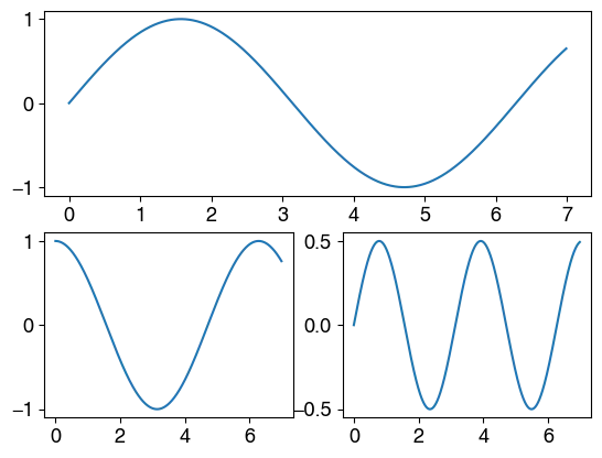
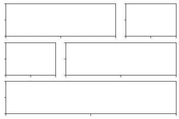
你可以简单地这样做:
import numpy as np
import matplotlib.pyplot as plt

x = np.arange(0, 7, 0.01)

plt.subplot(2, 1, 1)
plt.plot(x, np.sin(x))

plt.subplot(2, 2, 3)
plt.plot(x, np.cos(x))

plt.subplot(2, 2, 4)
plt.plot(x, np.sin(x)*np.cos(x))
即,第一个图是在上半部分绘制的(该图仅分为2x1 = 2个单元格),后面的两个较小的图是在2x2=4个单元格网格中完成的。
subplot() 的第三个参数是图形在该网格中的位置(以英语阅读方向为准,第一个单元格位于左上角):
例如在第二个子图中 (subplot(2, 2, 3)),轴将进入2x2矩阵的第三部分,即位于左下角。
axes_grid1)中有描述:https://matplotlib.org/2.0.2/mpl_toolkits/axes_grid/users/overview.html#axes-grid1。 - Eric O. Lebigot使用GridSpec制作多列/行子图布局展示了使用GridSpec实现此目的的方法。一个包含三个子图的简化版本如下所示:
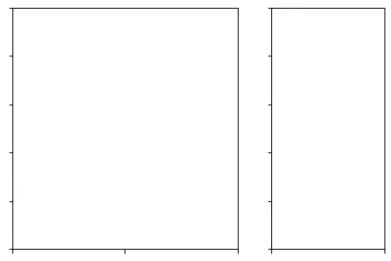
import matplotlib.pyplot as plt

fig = plt.figure()

gs = fig.add_gridspec(2,2)
ax1 = fig.add_subplot(gs[0, 0])
ax2 = fig.add_subplot(gs[0, 1])
ax3 = fig.add_subplot(gs[1, :])

plt.show()
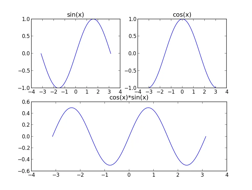
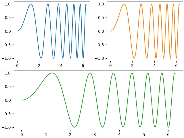
subplot(611)和subplot(612)...因为subplot没有任何关于“跨度”的概念)。 - Trevor Boyd Smith要在一个坐标轴中拥有多个子图,您可以简单地这样做:
from matplotlib import pyplot as plt
import numpy as np

b=np.linspace(-np.pi, np.pi, 100)

a1=np.sin(b)

a2=np.cos(b)

a3=a1*a2

plt.subplot(221)
plt.plot(b, a1)
plt.title('sin(x)')

plt.subplot(222)
plt.plot(b, a2)
plt.title('cos(x)')

plt.subplot(212)
plt.plot(b, a3)
plt.title('sin(x)*cos(x)')

plt.show()
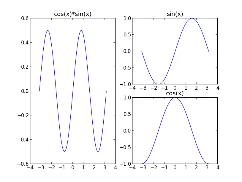
另一种方法是
plt.subplot(222)
plt.plot(b, a1)
plt.title('sin(x)')

plt.subplot(224)
plt.plot(b, a2)
plt.title('cos(x)')

plt.subplot(121)
plt.plot(b, a3)
plt.title('sin(x)*cos(x)')

plt.show()
matplotlib.pyplot 的 subplot2grid 模块。
https://matplotlib.org/stable/api/gridspec_api.html
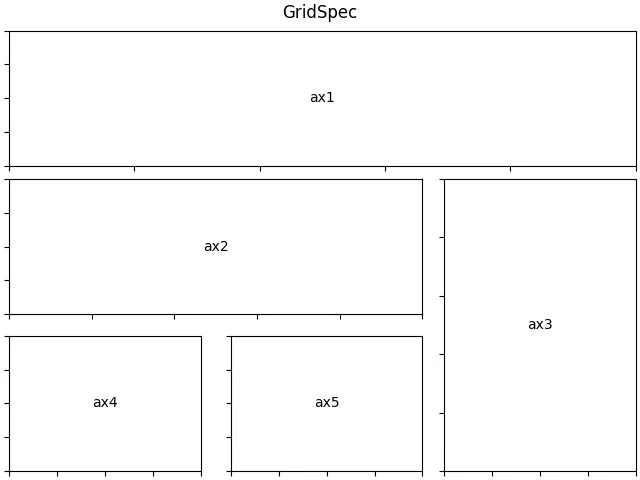
一个GridSpec的实例:使用Gridspec制作多列/行子图布局的示例。import matplotlib.pyplot as plt
from matplotlib.gridspec import GridSpec
def format_axes(fig):
for i, ax in enumerate(fig.axes):
ax.text(0.5, 0.5, "ax%d" % (i+1), va="center", ha="center")
ax.tick_params(labelbottom=False, labelleft=False)
fig = plt.figure(layout="constrained")
gs = GridSpec(3, 3, figure=fig)
ax1 = fig.add_subplot(gs[0, :])
# identical to ax1 = plt.subplot(gs.new_subplotspec((0, 0), colspan=3))
ax2 = fig.add_subplot(gs[1, :-1])
ax3 = fig.add_subplot(gs[1:, -1])
ax4 = fig.add_subplot(gs[-1, 0])
ax5 = fig.add_subplot(gs[-1, -2])
fig.suptitle("GridSpec")
format_axes(fig)
plt.show()
更现代的答案是:最简单的方法可能是使用 subplots_mosaic: https://matplotlib.org/stable/tutorials/provisional/mosaic.html
import matplotlib.pyplot as plt
import numpy as np

# Some example data to display
x = np.linspace(0, 2 * np.pi, 400)
y = np.sin(x ** 2)

fig, axd = plt.subplot_mosaic([['left', 'right'],['bottom', 'bottom']],
                              constrained_layout=True)
axd['left'].plot(x, y, 'C0')
axd['right'].plot(x, y, 'C1')
axd['bottom'].plot(x, y, 'C2')
plt.show()
在matplotlib中,有三种主要选项可以在一个图中制作单独的图:
到目前为止,这些帖子已经讨论了前两个选项,但它们并没有提到第三个选项,这是更现代的方法,基于前两个选项。请参见具体文档 使用subplots和GridSpec组合两个子图。更新
一个更好的改进可能是在@Jody Klymak的帖子中提到的临时subplot_mosaic 方法。它使用一种结构化、视觉化的方法来映射子图,而不是混淆的数组索引。但它仍然基于上述后选项。
我可以想到另外两种更加灵活的解决方案。
subplot_mosaic。f, axes = plt.subplot_mosaic('AAB;CDD;EEE')
# axes = {'A': ..., 'B': ..., ...}
作用:
subplots的gridspec_kw。但是当不同行需要不同的宽度比例时,这种方式也不方便。f, (a0, a1) = plt.subplots(1, 2, gridspec_kw={'width_ratios': [2, 1]})
效果:
我认为其他答案中的subplot方法有点死板。例如,你不能轻松地创建两行宽度比为1:2和2:1的子图。然而,当你需要覆盖一些subplots的布局时,它可以帮助你。
subplot_mosaic这个函数,太棒了! :) 非常感谢! - shredEngineer