我在我的@Composable函数中使用Scaffold。在content = {内部,我正在使用LazyColumn。我想要将Top Start和Top End对齐到角落。就像这样:
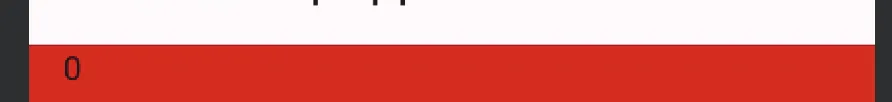
期望输出

我尝试了从这里复制的这段代码,但它没有起作用。
package com.example.scrollcompose

import android.os.Bundle
import androidx.activity.ComponentActivity
import androidx.activity.compose.setContent
import androidx.compose.foundation.background
import androidx.compose.foundation.layout.Arrangement
import androidx.compose.foundation.layout.fillMaxWidth
import androidx.compose.foundation.layout.padding
import androidx.compose.foundation.lazy.LazyColumn
import androidx.compose.foundation.shape.RoundedCornerShape
import androidx.compose.material.icons.Icons
import androidx.compose.material.icons.filled.Favorite
import androidx.compose.material.icons.filled.Menu
import androidx.compose.material3.*
import androidx.compose.runtime.Composable
import androidx.compose.ui.Modifier
import androidx.compose.ui.draw.clip
import androidx.compose.ui.graphics.Color
import androidx.compose.ui.text.style.TextOverflow
import androidx.compose.ui.tooling.preview.Preview
import androidx.compose.ui.unit.dp
import com.example.scrollcompose.ui.theme.ScrollComposeTheme

class MainActivity : ComponentActivity() {
    override fun onCreate(savedInstanceState: Bundle?) {
        super.onCreate(savedInstanceState)
        setContent {
            ScrollComposeTheme {
                // A surface container using the 'background' color from the theme
                GreetingView()
            }
        }
    }
}

@OptIn(ExperimentalMaterial3Api::class)
@Composable
fun GreetingView() {
    val scrollBehavior = TopAppBarDefaults.exitUntilCollapsedScrollBehavior()
    Scaffold(
        topBar = {
            MediumTopAppBar(
                title = {
                    Text(
                        "Medium TopAppBar",
                        maxLines = 1,
                        overflow = TextOverflow.Ellipsis
                    )
                },
                navigationIcon = {
                    IconButton(onClick = { /* doSomething() */ }) {
                        Icon(
                            imageVector = Icons.Filled.Menu,
                            contentDescription = "Localized description"
                        )
                    }
                },
                actions = {
                    IconButton(onClick = { /* doSomething() */ }) {
                        Icon(
                            imageVector = Icons.Filled.Favorite,
                            contentDescription = "Localized description"
                        )
                    }
                },
                scrollBehavior = scrollBehavior
            )
        },
        content = { innerPadding ->
            LazyColumn(
                modifier = Modifier
                    .clip(shape = RoundedCornerShape(15.dp, 15.dp, 0.dp, 0.dp))
                    .background(Color.Red),
                contentPadding = innerPadding,
                verticalArrangement = Arrangement.spacedBy(8.dp)
            ) {
                val list = (0..40).map { it.toString() }
                items(count = list.size) {
                    Text(
                        text = list[it],
                        style = MaterialTheme.typography.bodyLarge,
                        modifier = Modifier
                            .fillMaxWidth()
                            .padding(horizontal = 16.dp)
                    )
                }
            }
        }
    )
}

@Preview(showBackground = true)
@Composable
fun DefaultPreview() {
    ScrollComposeTheme {
        GreetingView()
    }
}
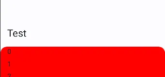
实际输出