我想要做一个堆叠区域图,其中一些组是正数,因此会出现在x轴之上(堆叠),而其他一些组是负数,因此会出现在x轴之下。目前,当我进行堆叠绘图时,它只添加实际值,因此具有负值的组不会出现在图中,但所有其他区域都向下移动。基本上,我想将两个区域图结合起来,一个用于x轴之上的正数组,另一个用于x轴之下的负数组。
Python中的堆叠面积图(包含正负值)
4
- R_McAlister
2
1你能让我们看看你现在的代码吗?我有一种感觉,我可以解决这个问题,但不是从头开始。 - wizzwizz4
1请添加您已经尝试过的代码。 - Sumedh Junghare
2个回答
5
假设您有一个名为
df的pandas数据框,其中分组作为列,则可以执行以下操作:import matplotlib.pyplot as plt
fig, ax = plt.subplots()
# split dataframe df into negative only and positive only values
df_neg, df_pos = df.clip(upper=0), df.clip(lower=0)
# stacked area plot of positive values
df_pos.plot.area(ax=ax, stacked=True, linewidth=0.)
# reset the color cycle
ax.set_prop_cycle(None)
# stacked area plot of negative values, prepend column names with '_' such that they don't appear in the legend
df_neg.rename(columns=lambda x: '_' + x).plot.area(ax=ax, stacked=True, linewidth=0.)
# rescale the y axis
ax.set_ylim([df_neg.sum(axis=1).min(), df_pos.sum(axis=1).max()])
- kadee
2
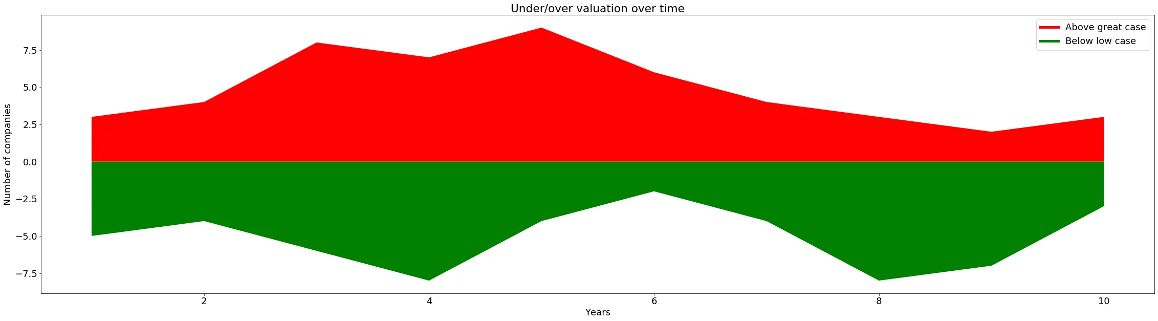
可能不完全符合您的要求,但我成功地使用负值和正值制作了一个区域图。以下代码在Python 3.7 / Windows 10 / Spyder IDE上运行:
import matplotlib.pyplot as plt

x_axis = [1,2,3,4,5,6,7,8,9,10]
cheap = [-5,-4,-6,-8,-4,-2,-4,-8,-7,-3]
expensive = [3,4,8,7,9,6,4,3,2,3]


fig_size = plt.rcParams["figure.figsize"] #set chart size (longer than taller)
fig_size[0] = 39
fig_size[1] = 10
plt.rcParams["figure.figsize"] = fig_size
plt.rcParams.update({'font.size': 18})

plt.stackplot(x_axis, expensive, colors=['r'])
plt.stackplot(x_axis, cheap, colors=['g'])

plt.plot([],[],color='r', label='Above great case', linewidth=5)
plt.plot([],[],color='g', label='Below low case', linewidth=5)
plt.legend()

plt.xlabel('Years')
plt.ylabel('Number of companies')
plt.title('Under/over valuation over time')
plt.show()
你应该看到的图表:
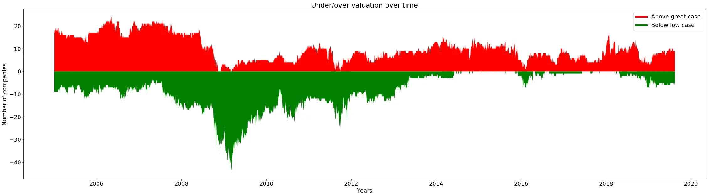
 这个程序实际上被用来绘制一个有成千上万个x轴数据点的图表。我之前尝试过条形图,但是它绘制的时间比这个面积版本要长得多。下面是一个真实图表的样本:
- Rational-IM
网页内容由stack overflow 提供, 点击上面的可以查看英文原文,
原文链接
原文链接