我正在尝试可视化一些关于进程运行或空闲时间的数据。对于每个进程,我有 a_x_axis 表示进程开始运行的时间和 a_live_for 表示它从唤醒后存活的时间。每个进程有两个数据点。我想通过连接第一个绿色点和第一个红色点、第二个绿色点和第二个红色点等方式来用线连接这两个点,以便在大型数据集中查看每个进程的存活和空闲时间。我查看了散点图示例,但找不到解决此问题的方法。
import matplotlib.pyplot as plt

a_x_axis = [32, 30, 40, 50, 60, 78]
a_live = [1, 3, 2, 1, 2, 4]

a_alive_for = [a + b for a, b in zip(a_x_axis, a_live)]

b_x_axis = [22, 25, 45, 55, 60, 72]
b_live = [1, 3, 2, 1, 2, 4]
b_alive_for = [a + b for a, b in zip(b_x_axis, b_live)]

a_y_axis = []
b_y_axis = []

for i in range(0, len(a_x_axis)):
    a_y_axis.append('process-1')
    b_y_axis.append('process-2')


print("size of a: %s" % len(a_x_axis))
print("size of a: %s" % len(a_y_axis))
plt.xlabel('time (s)')
plt.scatter(a_x_axis, [1]*len(a_x_axis))
plt.scatter(a_alive_for, [1]*len(a_x_axis))

plt.scatter(b_x_axis, [2]*len(b_x_axis))
plt.scatter(b_alive_for, [2]*len(b_x_axis))

plt.show()
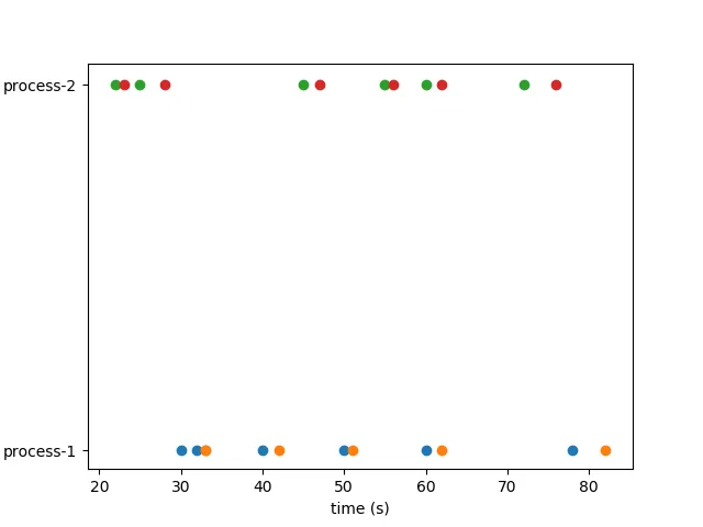
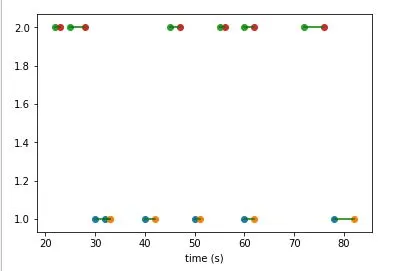
a_x_axis值与第一个a_alive_for值相连,第二个值与第二个值相连。在图中,将第一个绿点与第一个红点连接起来,第二个绿点与第二个红点连接起来,以此类推。 - Zeeshan Hayat