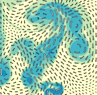
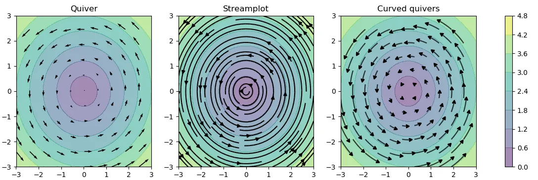
我想在Python中绘制一个带有曲线箭头的向量场,就像在vfplot(见下文)或IDL中可以做的那样。
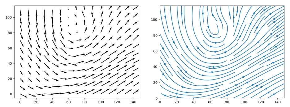
quiver()接近,但是它限制了直线向量的使用(见下方左图),而streamplot()似乎不能对箭头长度或箭头位置进行有意义的控制(见下方右图),即使更改integration_direction、density和maxlength也是如此。
那么,有没有Python库可以做到这一点?或者有没有让Matplotlib实现它的方法?
我想在Python中绘制一个带有曲线箭头的向量场,就像在vfplot(见下文)或IDL中可以做的那样。
quiver()接近,但是它限制了直线向量的使用(见下方左图),而streamplot()似乎不能对箭头长度或箭头位置进行有意义的控制(见下方右图),即使更改integration_direction、density和maxlength也是如此。
那么,有没有Python库可以做到这一点?或者有没有让Matplotlib实现它的方法?
 ... (to line 195)
    # Add arrows half way along each trajectory.
    s = np.cumsum(np.sqrt(np.diff(tx) ** 2 + np.diff(ty) ** 2))
    n = np.searchsorted(s, s[-1] / 2.)
    arrow_tail = (tx[n], ty[n])
    arrow_head = (np.mean(tx[n:n + 2]), np.mean(ty[n:n + 2]))
 ... (after line 196)
 ... (to line 195)
    # Add arrows half way along each trajectory.
    s = np.cumsum(np.sqrt(np.diff(tx) ** 2 + np.diff(ty) ** 2))
    n = np.searchsorted(s, s[-1]) ### THIS IS THE EDITED LINE! ###
    arrow_tail = (tx[n], ty[n])
    arrow_head = (np.mean(tx[n:n + 2]), np.mean(ty[n:n + 2]))
 ... (after line 196)
*linewidth* : numeric or 2d array
        vary linewidth when given a 2d array with the same shape as velocities.
线宽可以是一个numpy.ndarray,如果您能预先计算所需箭头的宽度,则可以在绘制箭头时修改笔画宽度。看起来这部分已经为您完成。
因此,结合缩短箭头的最大长度、增加密度和添加起始点,以及调整将箭头放在末尾而不是中间的函数,您可以获得所需的图形。
通过这些修改和以下代码,我能够获得更接近您想要的结果:
import numpy as np
import matplotlib.pyplot as plt
import matplotlib.gridspec as gridspec
import matplotlib.patches as pat
w = 3
Y, X = np.mgrid[-w:w:100j, -w:w:100j]
U = -1 - X**2 + Y
V = 1 + X - Y**2
speed = np.sqrt(U*U + V*V)
fig = plt.figure(figsize=(14, 18))
gs = gridspec.GridSpec(nrows=3, ncols=2, height_ratios=[1, 1, 2])
grains = 10
tmp = tuple([x]*grains for x in np.linspace(-2, 2, grains))
xs = []
for x in tmp:
xs += x
ys = tuple(np.linspace(-2, 2, grains))*grains
seed_points = np.array([list(xs), list(ys)])
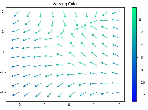
# Varying color along a streamline
ax1 = fig.add_subplot(gs[0, 1])
strm = ax1.streamplot(X, Y, U, V, color=U, linewidth=np.array(5*np.random.random_sample((100, 100))**2 + 1), cmap='winter', density=10,
minlength=0.001, maxlength = 0.07, arrowstyle='fancy',
integration_direction='forward', start_points = seed_points.T)
fig.colorbar(strm.lines)
ax1.set_title('Varying Color')
plt.tight_layout()
plt.show()
简而言之:复制源代码并将箭头放在每个路径的末尾,而不是中间。然后使用您的streamplot而不是matplotlib streamplot。
编辑:我已经使线宽度变化。
从David Culbreth的修改开始,我重写了streamplot函数的部分代码以实现所需的行为。这些改进过多,无法在此一一列举,但包括长度归一化方法和禁用轨迹重叠检查等。我附加了两个新的曲线箭头图函数与原始的streamplot和quiver的比较图像。
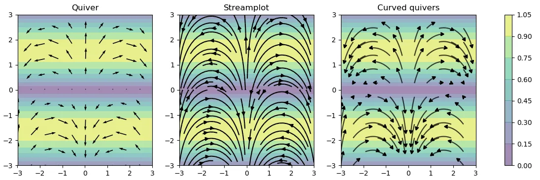
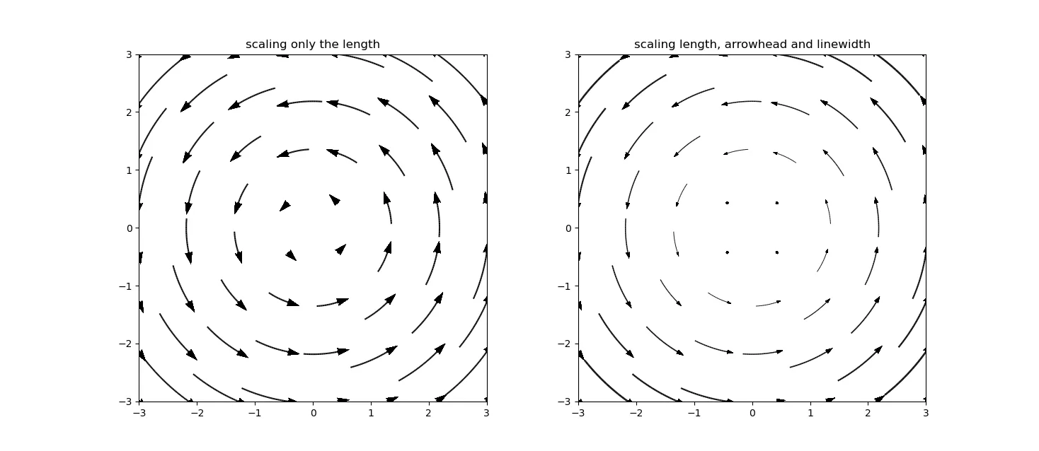
以下是在vanilla pyplot中获得所需输出的方法(即不修改streamplot函数或任何复杂操作)。 作为提醒,目标是使用弯曲的箭头可视化矢量场,其长度与矢量的范数成比例。
技巧如下:
import matplotlib.pyplot as plt
import numpy as np
w = 3
Y, X = np.mgrid[-w:w:8j, -w:w:8j]

U = -Y
V = X
norm = np.sqrt(U**2 + V**2)
norm_flat = norm.flatten()

start_points = np.array([X.flatten(),Y.flatten()]).T

plt.clf()
scale = .2/np.max(norm)

plt.subplot(121)
plt.title('scaling only the length')
for i in range(start_points.shape[0]):
    plt.streamplot(X,Y,U,V, color='k', start_points=np.array([start_points[i,:]]),minlength=.95*norm_flat[i]*scale, maxlength=1.0*norm_flat[i]*scale,
                integration_direction='backward', density=10, arrowsize=0.0)
plt.quiver(X,Y,U/norm, V/norm,scale=30)
plt.axis('square')


plt.subplot(122)
plt.title('scaling length, arrowhead and linewidth')
for i in range(start_points.shape[0]):
    plt.streamplot(X,Y,U,V, color='k', start_points=np.array([start_points[i,:]]),minlength=.95*norm_flat[i]*scale, maxlength=1.0*norm_flat[i]*scale,
                integration_direction='backward', density=10, arrowsize=0.0, linewidth=.5*norm_flat[i])
plt.quiver(X,Y,U/np.max(norm), V/np.max(norm),scale=30)

plt.axis('square')
这是结果:
quiver(),因为输入参数是相同的。 - Jason仅查看streamplot()文档,可在此处找到链接--如果您使用类似于streamplot( ... ,minlength = n/2, maxlength = n)的东西,其中n是所需长度--您将需要稍微调整这些数字以获得所需的图形。
您可以使用start_points控制点,如@JohnKoch提供的示例所示。
以下是我使用streamplot()控制长度的示例--它基本上是从上面的示例中复制/粘贴/裁剪而来的。
import numpy as np
import matplotlib.pyplot as plt
import matplotlib.gridspec as gridspec
import matplotlib.patches as pat

w = 3
Y, X = np.mgrid[-w:w:100j, -w:w:100j]
U = -1 - X**2 + Y
V = 1 + X - Y**2
speed = np.sqrt(U*U + V*V)

fig = plt.figure(figsize=(14, 18))
gs = gridspec.GridSpec(nrows=3, ncols=2, height_ratios=[1, 1, 2])

grains = 10
tmp = tuple([x]*grains for x in np.linspace(-2, 2, grains))
xs = []
for x in tmp:
    xs += x
ys = tuple(np.linspace(-2, 2, grains))*grains


seed_points = np.array([list(xs), list(ys)])
arrowStyle = pat.ArrowStyle.Fancy()
# Varying color along a streamline
ax1 = fig.add_subplot(gs[0, 1])
strm = ax1.streamplot(X, Y, U, V, color=U, linewidth=1.5, cmap='winter', density=10,
                      minlength=0.001, maxlength = 0.1, arrowstyle='->',
                      integration_direction='forward', start_points = seed_points.T)
fig.colorbar(strm.lines)
ax1.set_title('Varying Color')

plt.tight_layout()
plt.show()
编辑:虽然还不是我们想要的完美样式,但我把它变得更漂亮了。
我尝试在matplotlib上开启一个PR,以包含Kieran Hunt在他上面的回答中更新和简化的代码版本。然而,它被认为是非核心可视化,因此必须成为第三方贡献。对于那些感兴趣的人,请查看相应的matplotlib github问题