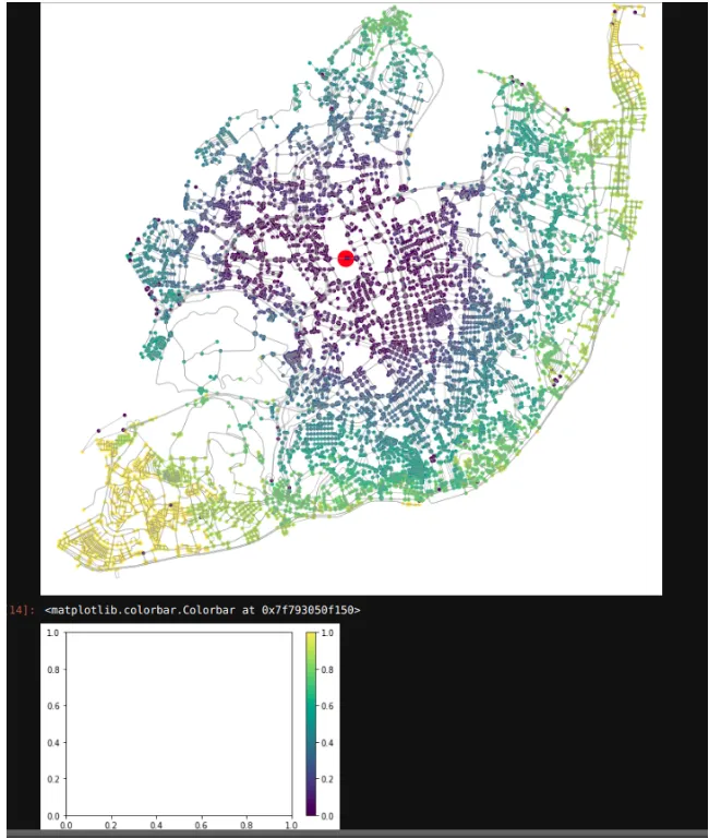
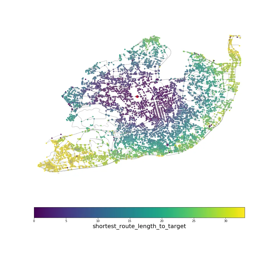
目前我已经根据网络中节点到特定目标的距离创建了一个颜色映射。唯一无法做到的是颜色条。我希望颜色条可以显示颜色所表示的时间。
时间数据在data['time']中。
每种颜色都表示从节点到目标所需的时间长度。我已经定义了汽车的速度。
例如,一个范围从0到60分钟的颜色条。但是在这种情况下,它将达到data['time']的最大值。
这是我尝试过的:
import networkx as nx
import matplotlib.pyplot as plt
import osmnx as ox
import pandas as pd
from shapely.wkt import loads as load_wkt
import numpy as np
import matplotlib.cm as cm
ox.config(log_console=True, use_cache=True)

place = {'city': 'Lisbon', 'country': 'Portugal'}
G = ox.graph_from_place(place, network_type='drive')
hospitals = ox.pois_from_place(place, amenities=['hospital'])

hosp_1 = hospitals.iloc[21]['geometry']  # Hospital Santa Maria

coord_1 = (38.74817825481225, -9.160815118526642)  # Coordinate Hospital Santa Maria
target_1 = ox.get_nearest_node(G, coord_1)

nodes, edges = ox.graph_to_gdfs(G, nodes=True, edges=True)  # Transforms nodes and edges into Geodataframes

travel_speed = 20  # km/h
meters_per_minute = travel_speed * 1000 / 60

nodes['shortest_route_length_to_target'] = 0
route_lengths = []
i = 0
# print(G.edges(data=True))
for u, v, k, data in G.edges(data=True, keys=True):

    data['time'] = data['length'] / meters_per_minute


for node in G.nodes:
    try:
        route_length = nx.shortest_path_length(G, node, target_1, weight='time')
        route_lengths.append(route_length)
        nodes['shortest_route_length_to_target'][node] = route_length

    except nx.exception.NetworkXNoPath:
        continue


def get_colors(n, cmap='viridis', start=0., stop=1., alpha=1.):

    colors = [cm.get_cmap(cmap)(x) for x in np.linspace(start, stop, n)]
    colors = [(r, g, b, alpha) for r, g, b, _ in colors]
    return colors


def get_node_colors_by_attr(G, attr, num_bins=None, cmap='viridis', start=0, stop=1, na_color='none'):

    if num_bins is None:
        num_bins = len(G.nodes())
    bin_labels = range(num_bins)
    # attr_values = pd.Series([data[attr] for node, data in G.nodes(data=True)])
    attr_values = pd.Series(nodes[attr].values)  # Cretaes a dataframe ith the attribute of each node
    # print(attr_values)
    cats = pd.qcut(x=attr_values, q=num_bins, labels=bin_labels)  # Puts the values in bins
    # print(cats)
    colors = get_colors(num_bins, cmap, start, stop)  #List of colors of each bin
    node_colors = [colors[int(cat)] if pd.notnull(cat) else na_color for cat in cats]

    return node_colors


nc = get_node_colors_by_attr(G, attr='shortest_route_length_to_target', num_bins=10)
ns = [80 if node == target_1 else 20 for node in G.nodes()]
k = 0

for node in G.nodes():

    if node == target_1:

        nc[k] = str('red')
        k += 1
    else:
        k += 1


G = ox.project_graph(G)
cmap = plt.cm.get_cmap('viridis')
norm=plt.Normalize(vmin=0, vmax=1)
sm = mpl.cm.ScalarMappable(norm=norm, cmap=cmap)
sm.set_array([])

fig, ax = ox.plot_graph(G, node_color=nc, node_size=ns, edge_linewidth=0.5, fig_height = 13, fig_width =13, bgcolor = 'white')
plt.colorbar(sm)
我得到的图形如下: