更新于Swift 5&iOS 13.4+,具有Press States!
对于具有深色和白色背景颜色的按钮以及没有按下状态更新的任何示例都不起作用,因此我构建了LargeButton视图,您可以在下面看到。希望这有所帮助,使用起来应该非常简单!
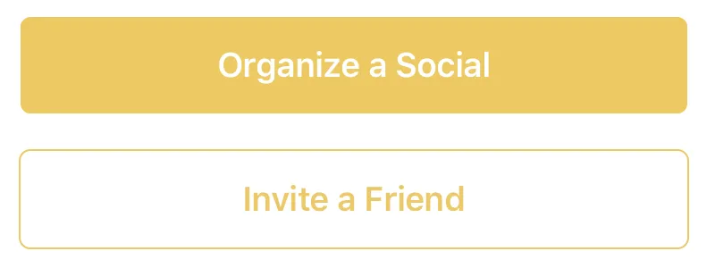
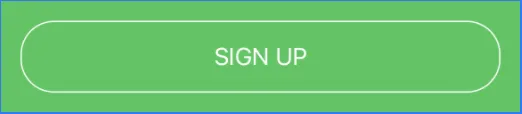
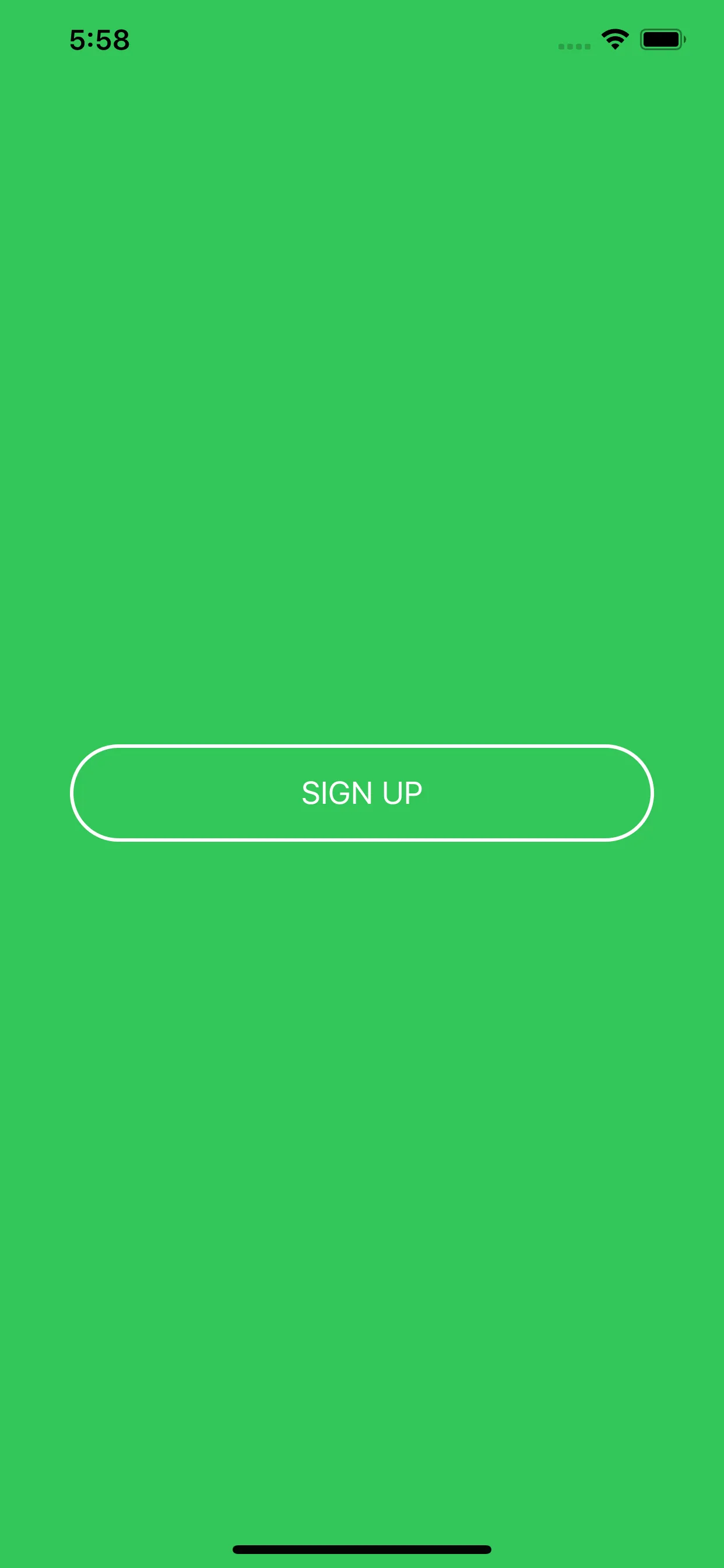
示例照片
示例使用
// White button with green border.
LargeButton(title: "Invite a Friend",
            backgroundColor: Color.white,
            foregroundColor: Color.green) {
                        print("Hello World")
                    }

// Yellow button without a border
LargeButton(title: "Invite a Friend",
            backgroundColor: Color.yellow) {
                        print("Hello World")
                    }
代码
struct LargeButtonStyle: ButtonStyle {
let backgroundColor: Color
let foregroundColor: Color
let isDisabled: Bool
func makeBody(configuration: Self.Configuration) -> some View {
let currentForegroundColor = isDisabled || configuration.isPressed ? foregroundColor.opacity(0.3) : foregroundColor
return configuration.label
.padding()
.foregroundColor(currentForegroundColor)
.background(isDisabled || configuration.isPressed ? backgroundColor.opacity(0.3) : backgroundColor)
.cornerRadius(6)
.overlay(
RoundedRectangle(cornerRadius: 6)
.stroke(currentForegroundColor, lineWidth: 1)
)
.padding([.top, .bottom], 10)
.font(Font.system(size: 19, weight: .semibold))
}
}
struct LargeButton: View {
private static let buttonHorizontalMargins: CGFloat = 20
var backgroundColor: Color
var foregroundColor: Color
private let title: String
private let action: () -> Void
private let disabled: Bool
init(title: String,
disabled: Bool = false,
backgroundColor: Color = Color.green,
foregroundColor: Color = Color.white,
action: @escaping () -> Void) {
self.backgroundColor = backgroundColor
self.foregroundColor = foregroundColor
self.title = title
self.action = action
self.disabled = disabled
}
var body: some View {
HStack {
Spacer(minLength: LargeButton.buttonHorizontalMargins)
Button(action:self.action) {
Text(self.title)
.frame(maxWidth:.infinity)
}
.buttonStyle(LargeButtonStyle(backgroundColor: backgroundColor,
foregroundColor: foregroundColor,
isDisabled: disabled))
.disabled(self.disabled)
Spacer(minLength: LargeButton.buttonHorizontalMargins)
}
.frame(maxWidth:.infinity)
}
}


