我目前正在使用Flutter开发Android应用程序。如何添加一个圆角按钮?
在Flutter中创建一个带有圆角的按钮/带有边框半径的按钮
564
- Kingsley CA
1
这里提到了多种方法 https://mightytechno.com/rounded-button-flutter/ - Ishan Fernando
39个回答
1017
1. 解决方案概述
FlatButton 和 RaisedButton 已经过时了。
因此,您可以在 TextButton 和 ElevatedButton 中使用位于 style 属性中的 shape。
自 Flutter 2.0 以来,有一些更改:
style:属性类型已更改为ButtonStyleshape:属性类型已更改为MaterialStateProperty<T>
2. 圆角按钮
在 style 属性中存在 shape 属性:
style: ButtonStyle(
  shape: MaterialStateProperty.all<RoundedRectangleBorder>(
    RoundedRectangleBorder(
      borderRadius: BorderRadius.circular(18.0),
      side: BorderSide(color: Colors.red)
    )
  )
)

方形按钮
要创建一个方形按钮,您可以使用 ElevatedButton 或添加以下内容:
style: ButtonStyle(
  shape: MaterialStateProperty.all<RoundedRectangleBorder>(
    RoundedRectangleBorder(
      borderRadius: BorderRadius.zero,
      side: BorderSide(color: Colors.red)
    )
  )
)

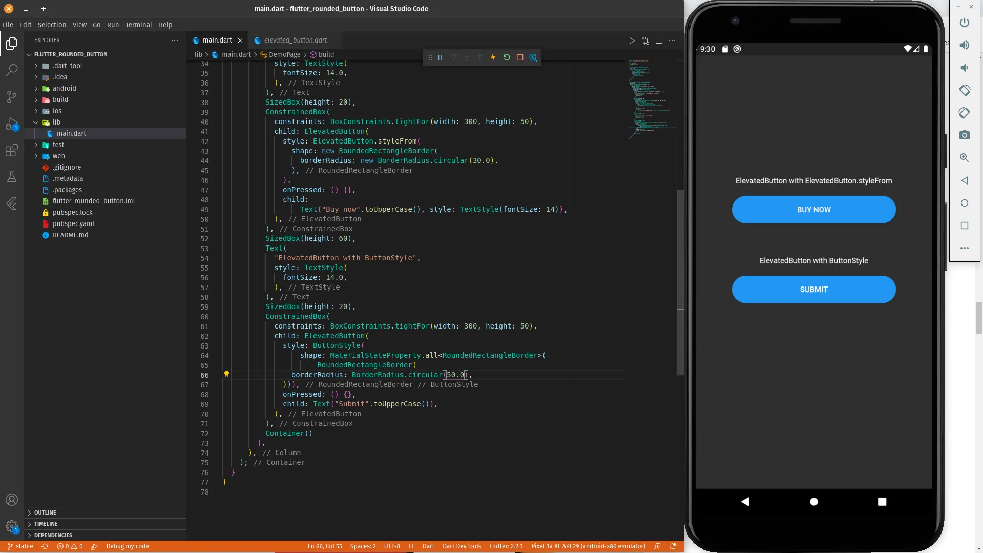
完整示例
Row(
  mainAxisAlignment: MainAxisAlignment.end,
  children: [
    TextButton(
      child: Text(
        "Add to cart".toUpperCase(),
        style: TextStyle(fontSize: 14)
      ),
      style: ButtonStyle(
        padding: MaterialStateProperty.all<EdgeInsets>(EdgeInsets.all(15)),
        foregroundColor: MaterialStateProperty.all<Color>(Colors.red),
        shape: MaterialStateProperty.all<RoundedRectangleBorder>(
          RoundedRectangleBorder(
            borderRadius: BorderRadius.circular(18.0),
            side: BorderSide(color: Colors.red)
          )
        )
      ),
      onPressed: () => null
    ),
    SizedBox(width: 10),
    ElevatedButton(
      child: Text(
        "Buy now".toUpperCase(),
        style: TextStyle(fontSize: 14)
      ),
      style: ButtonStyle(
        foregroundColor: MaterialStateProperty.all<Color>(Colors.white),
        backgroundColor: MaterialStateProperty.all<Color>(Colors.red),
        shape: MaterialStateProperty.all<RoundedRectangleBorder>(
          RoundedRectangleBorder(
            borderRadius: BorderRadius.zero,
            side: BorderSide(color: Colors.red)
          )
        )
      ),
      onPressed: () => null
    )
  ]
)
- Abror Esonaliev
2
4这段代码可以运行,但是我们能不能删除
shape: MaterialStateProperty.all<RoundedRectangleBorder>(...) 这部分,并直接将 RoundedRectangleBorder(...) 赋值给 shape 属性? - fpsColton4@fpsColton 当然,事实上我甚至无法通过
MaterialStateProperty 运作它,只能使用 RoundedRectangleBorder(...)。否则就会出现错误,看起来像这样:The argument type 'MaterialStateProperty<RoundedRectangleBorder>' can't be assigned to the parameter type 'OutlinedBorder?'。 - Konstantin Kozirev432
更新
由于左侧按钮已被弃用,请使用右侧按钮。
Deprecated    -->   Recommended

RaisedButton  -->   ElevatedButton
OutlineButton -->   OutlinedButton
FlatButton    -->   TextButton
ElevatedButton
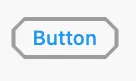
使用
StadiumBorder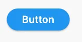
ElevatedButton(
  onPressed: () {},
  child: Text('Button'),
  style: ElevatedButton.styleFrom(shape: StadiumBorder()),
)
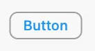
使用 RoundedRectangleBorder

ElevatedButton(
  onPressed: () {},
  child: Text('Button'),
  style: ElevatedButton.styleFrom(
    shape: RoundedRectangleBorder(
      borderRadius: BorderRadius.circular(12), // <-- Radius
    ),
  ),
)
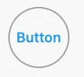
使用CircleBorder
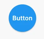
ElevatedButton(
  onPressed: () {},
  child: Text('Button'),
  style: ElevatedButton.styleFrom(
    shape: CircleBorder(),
    padding: EdgeInsets.all(24),
  ),
)
使用BeveledRectangleBorder
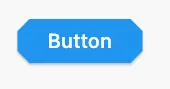
ElevatedButton(
  onPressed: () {},
  child: Text('Button'),
  style: ElevatedButton.styleFrom(
    shape: BeveledRectangleBorder(
      borderRadius: BorderRadius.circular(12)
    ),
  ),
)
OutlinedButton
使用
StadiumBorder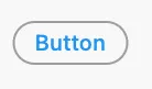
OutlinedButton(
  onPressed: () {},
  child: Text('Button'),
  style: OutlinedButton.styleFrom(
    shape: StadiumBorder(),
  ),
)
使用RoundedRectangleBorder
OutlinedButton(
  onPressed: () {},
  child: Text('Button'),
  style: OutlinedButton.styleFrom(
    shape: RoundedRectangleBorder(
      borderRadius: BorderRadius.circular(12),
    ),
  ),
)
CircleBorder:
OutlinedButton(
  onPressed: () {},
  child: Text('Button'),
  style: OutlinedButton.styleFrom(
    shape: CircleBorder(),
    padding: EdgeInsets.all(24),
  ),
)
使用BeveledRectangleBorder
OutlinedButton(
  onPressed: () {},
  child: Text('Button'),
  style: OutlinedButton.styleFrom(
    shape: BeveledRectangleBorder(
      borderRadius: BorderRadius.circular(12),
    ),
  ),
)
TextButton
TextButton 与 ElevatedButton 和 OutlinedButton 相似,但是只有在按钮被按下时才能看到形状。
- CopsOnRoad
289
您可以使用ElevatedButton小部件。该凸起按钮小部件具有一个shape属性,您可以按照以下代码片段中所示使用。
ElevatedButton(
      style: ButtonStyle(
          shape: MaterialStateProperty.all<RoundedRectangleBorder>(
              RoundedRectangleBorder(
                  borderRadius: BorderRadius.circular(18.0),
                  side: BorderSide(
                      color: Colors.teal,
                      width: 2.0,
                  ),
              ),
          ),
      ),
      child: Text('Submit'),
      onPressed: () {},
),
- Dhrumil Shah - dhuma1981
1
2RaisedButton已被弃用,不再使用。请使用ElevatedButton,并按照Peter的建议使用ButtonStyle。 - Ashutosh Singh
74
自2020年9月起,Flutter 1.22.0版本:
“RaisedButton”和“FlatButton”都已过时。
最新的解决方案是使用新的按钮:
1. ElevatedButton:
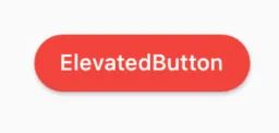
代码:
ElevatedButton(
  child: Text("ElevatedButton"),
  onPressed: () => print("it's pressed"),
  style: ElevatedButton.styleFrom(
    primary: Colors.red,
    onPrimary: Colors.white,
    shape: RoundedRectangleBorder(
      borderRadius: BorderRadius.circular(32.0),
    ),
  ),
)
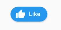
别忘了,还有一个.icon构造器可以轻松添加图标:
ElevatedButton.icon(
  icon: Icon(Icons.thumb_up),
  label: Text("Like"),
  onPressed: () => print("it's pressed"),
  style: ElevatedButton.styleFrom(
    shape: RoundedRectangleBorder(
      borderRadius: BorderRadius.circular(32.0),
    ),
  ),
)
2. OutlinedButton:
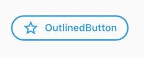
代码:
OutlinedButton.icon(
  icon: Icon(Icons.star_outline),
  label: Text("OutlinedButton"),
  onPressed: () => print("it's pressed"),
  style: ElevatedButton.styleFrom(
    side: BorderSide(width: 2.0, color: Colors.blue),
    shape: RoundedRectangleBorder(
      borderRadius: BorderRadius.circular(32.0),
    ),
  ),
)
3. TextButton:
如果您不想要轮廓或填充颜色,您可以始终使用TextButton。
- WSBT
45
你可以简单地使用 RaisedButton
Padding(
  padding: EdgeInsets.only(left: 150.0, right: 0.0),
  child: RaisedButton(
    textColor: Colors.white,
    color: Colors.black,
    child: Text("Search"),
    onPressed: () {},
    shape: new RoundedRectangleBorder(
      borderRadius: new BorderRadius.circular(30.0),
    ),
  ),
)
输出:
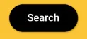
更多信息:RSCoder
- Rahul Shukla
1
'RaisedButton'已被弃用,不应该再使用。请改用'ElevatedButton'。在flutter.dev/go/material-button-migration-guide中查看迁移指南。此功能在v1.26.0-18.0.pre之后被弃用。 - M Karimi
40
你可以简单地使用RaisedButton,或者你可以使用InkWell来获取自定义按钮和其他属性,例如onDoubleTap, onLongPress,等等。:
new InkWell(
  onTap: () => print('hello'),
  child: new Container(
    //width: 100.0,
    height: 50.0,
    decoration: new BoxDecoration(
      color: Colors.blueAccent,
      border: new Border.all(color: Colors.white, width: 2.0),
      borderRadius: new BorderRadius.circular(10.0),
    ),
    child: new Center(child: new Text('Click Me', style: new TextStyle(fontSize: 18.0, color: Colors.white),),),
  ),
),
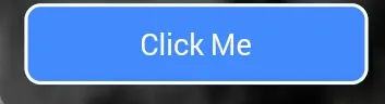
如果你想要在InkWell小部件中使用splashColor和highlightColor属性,那么请使用Material小部件作为InkWell小部件的父级,而不是装饰容器(删除装饰属性)。在这里了解更多。
- Blasanka
2
4如果您希望
InkWell 剪裁到圆角,则需要将 borderRadius: BorderRadius.circular(10.0) 添加到 InkWell 小部件中,否则它将延伸到边界矩形的边缘。 - Victor Rendina1@VictorRendina,我一直在寻找一种使涟漪变圆的方法,感谢您的评论。将其作为单独的答案添加到Inkwell问题中,因为许多人没有提到这一点。 - Extremis II
21
以下是创建圆角按钮的不同方法:
使用ElevatedButton和ElevatedButton.styleFrom属性
ElevatedButton(
          style: ElevatedButton.styleFrom(
            shape: RoundedRectangleBorder(
              borderRadius: BorderRadius.circular(30.0),
            ),
          ),
          onPressed: () {},
          child:
              Text("Buy now".toUpperCase(), style: TextStyle(fontSize: 14)),
        ),
使用ButtonStyle的ElevatedButton
ElevatedButton(
          style: ButtonStyle(
              shape: MaterialStateProperty.all<RoundedRectangleBorder>(
                  RoundedRectangleBorder(
            borderRadius: BorderRadius.circular(50.0),
          ))),
          onPressed: () {},
          child: Text("Submit".toUpperCase()),
        ),
一个圆形按钮的实际演示可以在以下Dartpad链接中找到:
Rounded Button Demo Examples on DartPad
- Javeed Ishaq
15
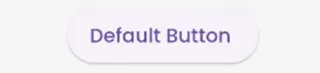
在新的更新中,Flutter 3.0采用了Material 3的指南。
根据这些指南,按钮的默认边框是圆角的。
默认按钮。
请参考按钮样式的链接:https://m3.material.io/components/all-buttons。
根据这些指南,按钮的默认边框是圆角的。
默认按钮。
  ElevatedButton(
          onPressed: () {}, child: const Text("Default Button ")),
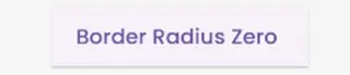
 ElevatedButton(
          style: ElevatedButton.styleFrom(
              shape: const RoundedRectangleBorder(
                  borderRadius: BorderRadius.zero)),
          onPressed: () {},
          child: const Text("Border Radius Zero ")),
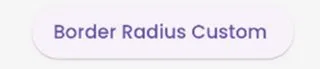
  ElevatedButton(
          style: ElevatedButton.styleFrom(
              shape: RoundedRectangleBorder(
                  borderRadius: BorderRadius.circular(50))),
          onPressed: () {},
          child: const Text("Border Radius Custom ")),
请参考按钮样式的链接:https://m3.material.io/components/all-buttons。
- BouncyBits
9
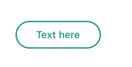
使用TextButton替代。
自2020年10月起,已经宣布FlatButton、RaisedButton和OutlineButton这样的按钮被弃用。这是Flutter开发团队为简化和使Flutter API保持一致而进行的努力,您可以通过使用style属性自定义其样式。
      TextButton(
        child: Padding(
          padding: const EdgeInsets.only(left: 10.0, right: 10.0),
          child: Text('Text here',
              style: TextStyle(
                  color: Colors.teal,
                  fontSize: 14,
                  fontWeight: FontWeight.w500)),
        ),
        style: TextButton.styleFrom(
          primary: Colors.teal,
          onSurface: Colors.yellow,
          side: BorderSide(color: Colors.teal, width: 2),
          shape: const RoundedRectangleBorder(
              borderRadius: BorderRadius.all(Radius.circular(25))),
        ),
        onPressed: () {
          print('Pressed');
        },
      ),
- yobo zorle
9
您可以使用以下代码来制作一个具有渐变颜色的圆角按钮。
 Container(
          width: 130.0,
          height: 43.0,
          decoration: BoxDecoration(
            borderRadius: BorderRadius.circular(30.0),
            gradient: LinearGradient(
              // Where the linear gradient begins and ends
              begin: Alignment.topRight,
              end: Alignment.bottomLeft,
              // Add one stop for each color. Stops should increase from 0 to 1
              stops: [0.1, 0.9],
              colors: [
                // Colors are easy thanks to Flutter's Colors class.
                Color(0xff1d83ab),
                Color(0xff0cbab8),
              ],
            ),
          ),
          child: FlatButton(
            child: Text(
              'Sign In',
              style: TextStyle(
                fontSize: 16.0,
                fontFamily: 'Righteous',
                fontWeight: FontWeight.w600,
              ),
            ),
            textColor: Colors.white,
            color: Colors.transparent,
            shape:
                RoundedRectangleBorder(borderRadius: BorderRadius.circular(30.0)),
            onPressed: () {

            },
          ),
        );
- Tahseen Quraishi
网页内容由stack overflow 提供, 点击上面的可以查看英文原文,
原文链接
原文链接