我目前正在使用Flutter开发Android应用程序。如何添加一个圆角按钮?
在Flutter中创建一个带有圆角的按钮/带有边框半径的按钮
564
- Kingsley CA
1
这里提到了多种方法 https://mightytechno.com/rounded-button-flutter/ - Ishan Fernando
39个回答
8
您可以使用以下代码:
ElevatedButton(
      onPressed: () {},
      style: ElevatedButton.styleFrom(
        shape: RoundedRectangleBorder(
            borderRadius: BorderRadius.all(Radius.circular(borderRadius))),
      ),
      child: Text("ok"),
    )
- softweng
7
为了在你的“按钮”中使用任何形状,请确保在“Button”小部件内执行所有代码:
如果你想让它变成一个正方形,可以使用
按钮如下: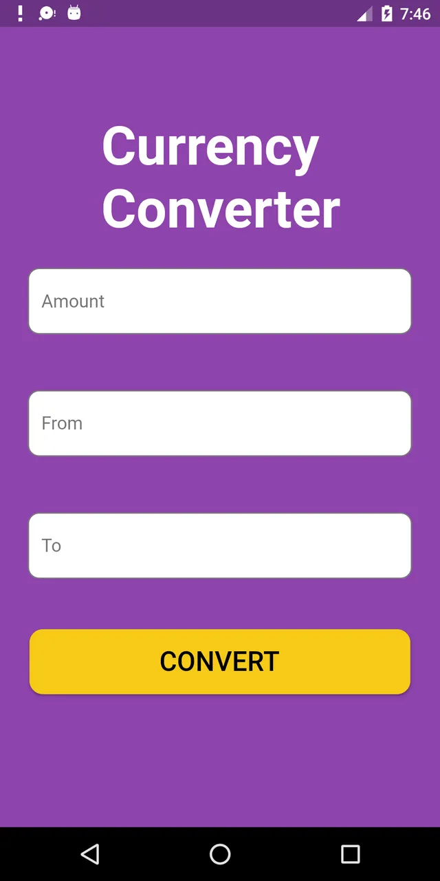 以下是该UI屏幕的完整源代码:
 **shape: RoundedRectangleBorder(
        borderRadius: new BorderRadius.circular(18.0),
        side: BorderSide(color: Colors.red) ),**
如果你想让它变成一个正方形,可以使用
BorderRadius.circular(0.0)。它会自动将其变成一个正方形。按钮如下:
以下是该UI屏幕的完整源代码: Scaffold(
backgroundColor: Color(0xFF8E44AD),
body: new Center(
child: Column(
children: <Widget>[
Container(
margin: EdgeInsets.fromLTRB(90, 10, 20, 0),
padding: new EdgeInsets.only(top: 92.0),
child: Text(
"Currency Converter",
style: TextStyle(
fontSize: 48,
fontWeight: FontWeight.bold,
color: Colors.white,
),
),
),
Container(
margin: EdgeInsets.only(),
padding: EdgeInsets.all(25),
child: TextFormField(
decoration: new InputDecoration(
filled: true,
fillColor: Colors.white,
labelText: "Amount",
border: OutlineInputBorder(
borderRadius: BorderRadius.circular(10),
),
),
),
),
Container(
padding: EdgeInsets.all(25),
child: TextFormField(
decoration: new InputDecoration(
filled: true,
fillColor: Colors.white,
labelText: "From",
border: OutlineInputBorder(
borderRadius: BorderRadius.circular(10),
),
),
),
),
Container(
padding: EdgeInsets.all(25),
child: TextFormField(
decoration: new InputDecoration(
filled: true,
fillColor: Colors.white,
labelText: "To",
border: OutlineInputBorder(
borderRadius: BorderRadius.circular(10),
)),
),
),
SizedBox(height: 20.0),
MaterialButton(
height: 58,
minWidth: 340,
shape: RoundedRectangleBorder(
borderRadius: new BorderRadius.circular(12)),
onPressed: () {},
child: Text(
"CONVERT",
style: TextStyle(
fontSize: 24,
color: Colors.black,
),
),
color: Color(0xFFF7CA18),
),
],
),
),
),
);
- Tushar Nikam
6
你可以通过将透明颜色传递到
BoxDecoration 中的颜色属性来使用此代码创建透明圆角按钮。
例如:color: Colors.transparent。
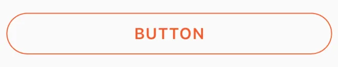
还要注意,此按钮仅使用了Container和GestureDetector小部件。Container(
height: 50.0,
child: GestureDetector(
onTap: () {},
child: Container(
decoration: BoxDecoration(
border: Border.all(
color: Color(0xFFF05A22),
style: BorderStyle.solid,
width: 1.0,
),
color: Colors.transparent,
borderRadius: BorderRadius.circular(30.0),
),
child: Row(
mainAxisAlignment: MainAxisAlignment.center,
children: <Widget>[
Center(
child: Text(
"BUTTON",
style: TextStyle(
color: Color(0xFFF05A22),
fontFamily: 'Montserrat',
fontSize: 16,
fontWeight: FontWeight.w600,
letterSpacing: 1,
),
),
)
],
),
),
),
)
- mjhansen3
5
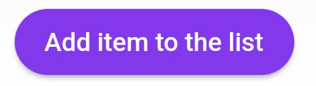
在使用 Null 安全之后,请使用 ElevatedButton 而不是 RaisedButton,因为根据文档 RaisedButton 已经被弃用。
             child: ElevatedButton(
                onPressed: () {},
                child: const Text('Add item to the list'),
                style: ButtonStyle(
                  backgroundColor:
                      MaterialStateProperty.all<Color>(Common.buttonColor),
                  shape: MaterialStateProperty.all<RoundedRectangleBorder>(
                    RoundedRectangleBorder(
                      borderRadius: BorderRadius.circular(18.0),
                    ),
                  ),
                ),
              ),
- Mohamed Reda
5
如果有人正在寻找完整的圆形按钮,那么我是这样实现的:
Center(
            child: SizedBox.fromSize(
              size: Size(80, 80), // Button width and height
              child: ClipOval(
                child: Material(
                  color: Colors.pink[300], // Button color
                  child: InkWell(
                    splashColor: Colors.yellow, // splash color
                    onTap: () {}, // Button pressed
                    child: Column(
                      mainAxisAlignment: MainAxisAlignment.center,
                      children: <Widget>[
                        Icon(Icons.linked_camera), // Icon
                        Text("Picture"), // Text
                      ],
                    ),
                  ),
                ),
              ),
            ),
          )
- Speedy11
4
如果您想使用
MaterialButton,则可以像这样添加Shape中提供的RoundedRectangleBorder:MaterialButton(
onPressed: () {},
minWidth: MediaQuery.of(context).size.width * 0.4,
height: 34,
color: colorWhite,
highlightColor: colorSplash,
splashColor: colorSplash,
visualDensity: VisualDensity.compact,
shape: RoundedRectangleBorder(
borderRadius: BorderRadius.circular(4),
side: BorderSide(
color: colorGrey,
width: 0.6,
),
),
child: Text("CANCEL"),
),
- Nachiket Gohil
4
创建圆角按钮的最简单方法之一是使用 FlatButton,并通过设置其 shape 属性来指定圆角度数。请参考以下代码:
FlatButton(
  padding: EdgeInsets.all(30.0),
  color: Colors.black,
  shape: RoundedRectangleBorder(
    borderRadius: BorderRadius.circular(20.0)),
  child: child: Text(
    "Button",
    style: TextStyle(color: Colors.white),
  ),
  onPressed: () {
    print('Button pressed');
  },
),BorderRadius.circular() 中的值。- Hadi Mir
4
你也可以使用
ButtonTheme():
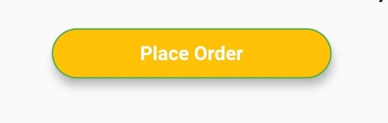
ButtonTheme(
    minWidth: 200.0,
    shape: RoundedRectangleBorder(
        borderRadius: BorderRadius.circular(18.0),
        side: BorderSide(color: Colors.green)),
    child: RaisedButton(
        elevation: 5.0,
        hoverColor: Colors.green,
        color: Colors.amber,
        child: Text(
            "Place Order",
            style: TextStyle(
                     color: Colors.white, fontWeight: FontWeight.bold),
        ),
        onPressed: () {},
    ),
),
- Abir Ahsan
4
RaisedButton(
          child: Text("Button"),
          onPressed: (){},
          shape: RoundedRectangleBorder(borderRadius: new BorderRadius.circular(30.0),
          side: BorderSide(color: Colors.red))
        )
- shilpa navale
2
4
以下是您问题的代码。您只需在boxdecoration中选择一个具有边界半径的简单容器即可。
new Container(
    alignment: Alignment.center,
    decoration: BoxDecoration(
        borderRadius: BorderRadius.all(Radius.circular(15.0)),
        color: Colors.blue,
    ),

    child: Row(
        mainAxisAlignment: MainAxisAlignment.center,
        children: <Widget>[
            Padding(
                padding: const EdgeInsets.all(10.0),
                child: new Text(
                    "Next",
                    style: new TextStyle(
                        fontWeight: FontWeight.w500,
                        color: Colors.white,
                        fontSize: 15.0,
                    ),
                ),
            ),
        ],
    ),
),
- Paras Sharma
网页内容由stack overflow 提供, 点击上面的可以查看英文原文,
原文链接
原文链接