通过使用HTML5数据属性,然后将该属性提取出来并将其样式化为伪元素,我们可以通过CSS创建完全定制的工具提示。
问题是文章中的链接已经失效,我不是很懂Html/Css,无法理解如何操作。有人可以帮忙吗?
通过使用HTML5数据属性,然后将该属性提取出来并将其样式化为伪元素,我们可以通过CSS创建完全定制的工具提示。
问题是文章中的链接已经失效,我不是很懂Html/Css,无法理解如何操作。有人可以帮忙吗?
.tooltip {
  display: inline;
  position: relative;
}

.tooltip:hover {
  color: #c00;
  text-decoration: none;
}

.tooltip:hover:after {
  background: #111;
  background: rgba(0, 0, 0, .8);
  border-radius: .5em;
  bottom: 1.35em;
  color: #fff;
  content: attr(title);
  display: block;
  left: 1em;
  padding: .3em 1em;
  position: absolute;
  text-shadow: 0 1px 0 #000;
  white-space: nowrap;
  z-index: 98;
}

.tooltip:hover:before {
  border: solid;
  border-color: #111 transparent;
  border-color: rgba(0, 0, 0, .8) transparent;
  border-width: .4em .4em 0 .4em;
  bottom: 1em;
  content: "";
  display: block;
  left: 2em;
  position: absolute;
  z-index: 99;
}<p>Vestibulum mollis mauris <a href="#" class="tooltip" title="Sample tooltip">pellentesque</a></p>data-title)代替title属性,以防止浏览器显示默认工具提示。 - roibeart <span
class="tooltip"
data-tooltip-position="right"
data-tooltip="Only gmail will be accepted!">?</span>
And here is final code snippet:
body {
margin: 0;
background-color: #359;
}
.form-box {
position: relative;
width: 400px;
padding: 50px 60px;
margin: 5% auto;
background-color: rgb(240, 230, 255);
border-radius: 10px;
text-align: center;
}
.form-box > input[type='text'] {
box-sizing: border-box;
padding: 8px;
border-radius: 5px;
outline: none;
border: 2px solid #aaa;
transition: all 0.2s ease-out;
}
.form-box > input:focus {
border-color: dodgerblue;
box-shadow: 0 0 8px 0 dodgerblue;
}
/* Tooltip Styles */
.tooltip {
position: relative;
padding: 5px 10px;
margin-left: 15px;
margin-right: 15px;
background-color: rgb(56, 56, 56);
border-radius: 50%;
color: #fff;
cursor: help;
transition: all 0.2s ease-out;
}
.tooltip:hover {
box-shadow: 0 0 6px 0 black;
}
.tooltip::before, .tooltip::after {
position: absolute;
left: 50%;
opacity: 0;
transition: all 0.2s ease-out;
}
.tooltip::before {
content: "";
border-width: 5px 4px 0 5px;
border-style: solid;
border-color: rgba(56, 56, 56, 0.8) transparent;
margin-left: -4px;
top: -8px;
}
.tooltip::after {
content: attr(data-tooltip);
top: -8px;
width: 150px;
margin-left: -75px;
padding: 5px;
font-size: 12px;
background-color: rgba(56, 56, 56, 0.8);
border-radius: 4px;
transform: translate3d(0, -100%, 0);
pointer-events: none;
}
/* 4 tooltip positions */
.tooltip[data-tooltip-position='left']::before {
margin-left: -21px;
top: 12px;
transform: rotate(-90deg);
}
.tooltip[data-tooltip-position='left']::after {
transform: translate3d(-65%, 40%, 0);
}
.tooltip[data-tooltip-position='right']::before {
margin-left: 14px;
top: 12px;
transform: rotate(90deg);
}
.tooltip[data-tooltip-position='right']::after {
transform: translate3d(60%, 40%, 0);
}
.tooltip[data-tooltip-position='bottom']::before {
margin-left: -4px;
top: 32px;
transform: rotate(-180deg);
}
.tooltip[data-tooltip-position='bottom']::after {
transform: translate3d(0, 186%, 0);
}
/* end of 4 tooltip positions */
.tooltip:hover::before, .tooltip:hover::after {
opacity: 1;
}<div class="form-box">
<span
class="tooltip"
data-tooltip-position="left"
data-tooltip="Only gmail will be accepted!">?</span>
<span
class="tooltip"
data-tooltip-position="up"
data-tooltip="Only gmail will be accepted!">?</span>
<input type="text" class="input" placeholder="Email">
<span
class="tooltip"
data-tooltip-position="bottom"
data-tooltip="Only gmail will be accepted!">?</span>
  <span
    class="tooltip"
    data-tooltip-position="right"
    data-tooltip="Only gmail will be accepted!">?</span>
</div>a {
position: relative; /* to position the tooltip relative to the anchor tag */
}
a:hover { /* for achieving the arrow shape at the bottom of the tooltip */
text-decoration: none;
}
a::after,
a::before {
position: absolute;
display: none; /* initially hide it from view */
}
a::before {
content: '';
top: -2px;
left: 6px;
height: 0px;
width: 0px;
/* the arrow */
border-left: 5px solid transparent;
border-top: 5px solid #ffe4b5;
border-right: 5px solid transparent;
}
a::after {
content: attr(data-tooltip); /* set content of pseudo element as the value of data-tooltip attribute */
top: -25px;
left: -5px;
background: #ffe4b5;
border-radius: 4px; /* just a bit of extra styling */
padding: 2px 6px;
white-space: nowrap;
color: black;
}
a:hover::after,
a:hover::before {
display: block; /* display both tooltip and arrow mark when a is hovered on */
}
/* Just for demo */
* {
font-family: Calibri;
}
.wrapper {
margin: 25px;
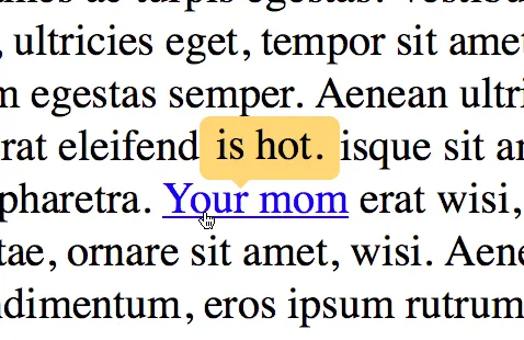
}<script src="https://cdnjs.cloudflare.com/ajax/libs/prefixfree/1.0.7/prefixfree.min.js"></script>
<!-- the data-tooltip attribute in the a tag has the tooltip's contents -->
<div class='wrapper'>Some long long text blah blah with some <a href='#' data-tooltip='Tooltip'>link</a> inside it.
<br/>Some more text blah blah with some <a href='#' data-tooltip='Long Tooltip'>link</a> inside it</div>您还可以使用title属性作为工具提示内容。这将使在旧浏览器中回退变得容易。另外,我使用了一些通用选择器,您可以将其更具体化。
高级示例:下面是一个更高级的工具提示版本,使用CSS3属性实现边框和过渡效果。
a {
  position: relative;
}
a:hover {
  text-decoration: none;
}
a::after,
a::before {
  position: absolute;
  visibility: hidden;
  background: #ffe4b5;
  border: 1px solid #f3b445;
  opacity: 0;
  transition: all 0.4s ease-out;
}
a:hover::after,
a:hover::before {
  visibility: visible;
  opacity: 1;
}
a::before {
  content: '';
  top: -3px;
  left: 6px;
  height: 4px;
  width: 4px;
  border-color: transparent #f3b445 #f3b445 transparent;
  transform: rotate(45deg);
  z-index: 2;
}
a::after {
  content: attr(data-tooltip);
  top: -25px;
  left: -5px;
  border-radius: 4px;
  padding: 2px 6px;
  white-space: nowrap;
  color: black;
}
/* Just for demo */

* {
  font-family: Calibri;
}
.wrapper {
  margin: 25px;
}<script src="https://cdnjs.cloudflare.com/ajax/libs/prefixfree/1.0.7/prefixfree.min.js"></script>
<div class='wrapper'>Some long long text blah blah with some <a href='#' data-tooltip='Tooltip'>link</a> inside it.
<br/>Some more text blah blah with some <a href='#' data-tooltip='Long Tooltip'>link</a> inside it</div>注意事项: