我正在使用优秀的绘图库bayesplot来可视化由rstanarm估计的模型的后验概率区间。我想通过将系数的后验区间绘制到同一图中,对不同模型的抽样结果进行图形化比较。
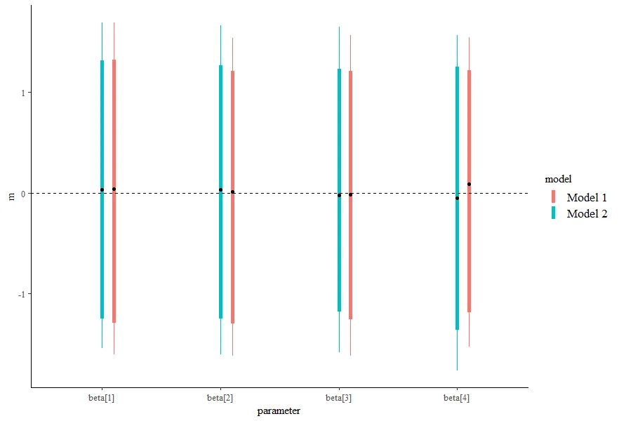
例如,假设我有三个参数beta1,beta2,beta3从两个不同模型的后验分布中各有1000次抽样:
# load the plotting library
library(bayesplot)
#> This is bayesplot version 1.6.0
#> - Online documentation and vignettes at mc-stan.org/bayesplot
#> - bayesplot theme set to bayesplot::theme_default()
#>    * Does _not_ affect other ggplot2 plots
#>    * See ?bayesplot_theme_set for details on theme setting
library(ggplot2)

# generate fake posterior draws from model1
fdata <- matrix(rnorm(1000 * 3), ncol = 3)
colnames(fdata) <- c('beta1', 'beta2', 'beta3')

# fake posterior draws from model 2
fdata2 <- matrix(rnorm(1000 * 3, 1, 2), ncol = 3)
colnames(fdata2) <- c('beta1', 'beta2', 'beta3')
Bayesplot可以为单个模型绘制出精美的可视化图表,它是基于ggplot2的,因此我可以按照自己的意愿进行定制:
# a nice plot of 1
color_scheme_set("orange")
mcmc_intervals(fdata) + theme_minimal() + ggtitle("Model 1")

# a nice plot of 2
color_scheme_set("blue")
mcmc_intervals(fdata2) + ggtitle("Model 2")

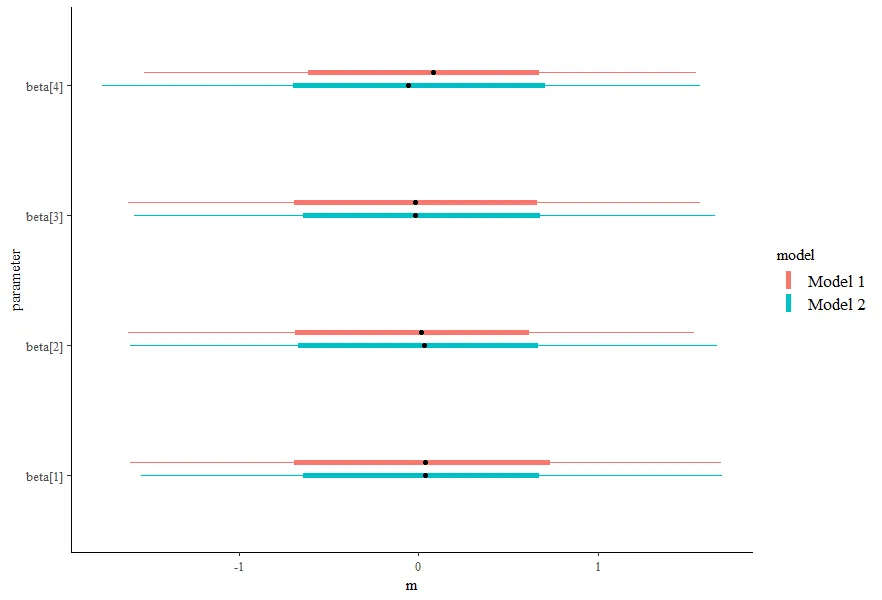
我希望实现的目标是将这两个模型绘制在同一张图上,对于每个系数,我有两个区间,并通过将颜色映射到模型来区分哪个区间是哪个。然而,我无法弄清楚如何做到这一点。以下是一些不起作用的方法:
# doesnt work
mcmc_intervals(fdata) + mcmc_intervals(fdata2)
#> Error: Don't know how to add mcmc_intervals(fdata2) to a plot

# appears to pool
mcmc_intervals(list(fdata, fdata2))

你有什么想法能帮我完成这个任务吗?或者如何手动给出先验抽样矩阵,也可以。
该文档由reprex包 (v0.2.1)创建于2018-10-18