我想创建一个简单的按钮模板,里面含有图像和文字。但是我希望保留系统按钮的外观和感觉。
请问应该如何一步一步地创建它呢?
P.S.:我已经尝试使用 WPF 中的 CustomControl 和 BasedOn 属性。
我想创建一个简单的按钮模板,里面含有图像和文字。但是我希望保留系统按钮的外观和感觉。
请问应该如何一步一步地创建它呢?
P.S.:我已经尝试使用 WPF 中的 CustomControl 和 BasedOn 属性。
<ResourceDictionary
    xmlns="http://schemas.microsoft.com/winfx/2006/xaml/presentation"
    xmlns:x="http://schemas.microsoft.com/winfx/2006/xaml"
    xmlns:ap="clr-namespace:MyProject.Namespace.Path.To.ButtonProperties">
    ...
    <Style x:Key="ImageButton" TargetType="Button">
        <Setter Property="ContentTemplate">
            <Setter.Value>
                <DataTemplate>
                    <StackPanel Orientation="Horizontal">
                        <Image Source="{Binding Path=(ap:ButtonProperties.Image), RelativeSource={RelativeSource FindAncestor, AncestorType={x:Type Button}}}"></Image>
                        <ContentPresenter Content="{Binding Path=Content, RelativeSource={RelativeSource FindAncestor, AncestorType={x:Type Button}}}"></ContentPresenter>
                    </StackPanel>
                </DataTemplate>
            </Setter.Value>
        </Setter>
    </Style>
    ...
</ResourceDictionary>
并且
public class ButtonProperties
{
    public static ImageSource GetImage(DependencyObject obj)
    {
        return (ImageSource)obj.GetValue(ImageProperty);
    }

    public static void SetImage(DependencyObject obj, ImageSource value)
    {
        obj.SetValue(ImageProperty, value);
    }

    public static readonly DependencyProperty ImageProperty =
        DependencyProperty.RegisterAttached("Image", typeof(ImageSource), typeof(ButtonProperties), new UIPropertyMetadata((ImageSource)null));
}
然后在标记中:
<Button Style="{StaticResource ImageButton}" ap:ButtonProperties.Image="{StaticResource MyImage}" Content="Test">
</Button>
这个例子看起来相当难看,但你可以轻松地将 StackPanel 更改为 Grid 或类似的东西来限制图像比例。使用 ContentPresenter 可以保留按钮的行为,从而使您可以放置任何 UIElement 内部,并保留命令支持等。
<UserControl Name="ImageButton" x:Class="WpfApp.ImageButtonUC"
    xmlns="http://schemas.microsoft.com/winfx/2006/xaml/presentation"
    xmlns:x="http://schemas.microsoft.com/winfx/2006/xaml">
    <Grid>
        <Button VerticalAlignment="Top" Width="100" Height="25" Click="button_Click">
            <Button.Content>
                <StackPanel Orientation="Horizontal">
                    <Image Width="16" Height="16" Margin="5,0,5,0" Source="{Binding ElementName=ImageButton, Path=Image}"/>
                    <TextBlock Text="{Binding ElementName=ImageButton, Path=Text}"/>
                </StackPanel>
            </Button.Content>
        </Button>
    </Grid>
</UserControl>
public partial class ImageButtonUC : UserControl
    {
        public event RoutedEventHandler Click;

        public ImageButtonUC()
        {
            InitializeComponent();

        }

        public string Text
        {
            get { return (string)GetValue(TextProperty); }
            set { SetValue(TextProperty, value); }
        }


        public static readonly DependencyProperty TextProperty =
          DependencyProperty.Register("Text", typeof(string), typeof(ImageButtonUC), new UIPropertyMetadata(""));

        public ImageSource Image
        {
            get { return (ImageSource)GetValue(ImageProperty); }
            set { SetValue(ImageProperty, value); }
        }

        public static readonly DependencyProperty ImageProperty =
           DependencyProperty.Register("Image", typeof(ImageSource), typeof(ImageButtonUC), new UIPropertyMetadata(null));


        private void button_Click(object sender, RoutedEventArgs e)
        {

            if (null != Click)

                Click(sender, e);

        }

    }
xmlns:Local="clr-namespace:WpfApp"
并将其用作:
<Local:ImageButtonUC x:Name="buttonImg" Width="100" Margin="10,0,10,0" Image="/WpfApp;component/Resources/Img.bmp" Text="Browse..." Click="buttonImg_Click"/>
如果你不想编写任何代码,还有另一种方法可以实现这个功能(灵感来自jeffora的答案)。您可以使用控件的Content字段,将要在按钮中显示的图像的URI放置在其中:
<Button Content="https://www.google.com/images/srpr/logo3w.png" Height="100" Width="200" Style="{DynamicResource ButtonStyle1}"/>
然后你可以编辑默认按钮样式,使其看起来像这样:
<Style>
...
<Setter Property="Template">
    <Setter.Value>
        <ControlTemplate TargetType="{x:Type Button}">
            <Microsoft_Windows_Themes:ButtonChrome x:Name="Chrome" BorderBrush="{TemplateBinding BorderBrush}" Background="{TemplateBinding Background}" RenderMouseOver="{TemplateBinding IsMouseOver}" RenderPressed="{TemplateBinding IsPressed}" RenderDefaulted="{TemplateBinding IsDefaulted}" SnapsToDevicePixels="true">
                <Image x:Name="theImage" Source="{Binding Path=Content, RelativeSource={RelativeSource FindAncestor, AncestorType={x:Type Button}}}" Margin="4,0,0,0">
                    <Image.ToolTip>
                        <ContentPresenter HorizontalAlignment="{TemplateBinding HorizontalContentAlignment}" Margin="{TemplateBinding Padding}" RecognizesAccessKey="True" SnapsToDevicePixels="{TemplateBinding SnapsToDevicePixels}" VerticalAlignment="{TemplateBinding VerticalContentAlignment}"/>
                    </Image.ToolTip>
                </Image>
            </Microsoft_Windows_Themes:ButtonChrome>
            <ControlTemplate.Triggers>
                ...
            </ControlTemplate.Triggers>
        </ControlTemplate>
    </Setter.Value>
</Setter>
</Style>
这是我的解决方案!
<Button Content="Browse" Margin="10" Name="btBrowse">
            <Button.Template>
                <ControlTemplate>
                    <StackPanel Orientation="Vertical" Height="50" Margin="5" VerticalAlignment="Center" HorizontalAlignment="Center">
                        <Image Source="MyIcons\browse.png" Height="30" />
                        <TextBlock Text="{Binding ElementName=btBrowse, Path=Content}" VerticalAlignment="Center" HorizontalAlignment="Center" />
                    </StackPanel>
                </ControlTemplate>
            </Button.Template>
        </Button>
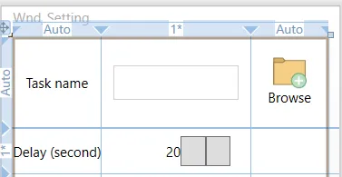
结果如下:
另一个答案 - 在u/dogracer和u/Dave NP的基础上进行改进:
<Button Content = "{Binding object}" >
    <Button.Style >
        <Style TargetType="Button">
            <Setter Property = "ContentTemplate" >
                <Setter.Value >
                    <DataTemplate >
                        <StackPanel >
                            <Image  Source="{Binding Path=Content.ImageUrl, RelativeSource={RelativeSource FindAncestor, AncestorType={x:Type Button}}}" >
                                <TextBlock Text = "{Binding Path=Content.Text,RelativeSource={RelativeSource FindAncestor, AncestorType={x:Type Button}}}" />
                        </ StackPanel >
                    </ DataTemplate >
                </ Setter.Value >
            </ Setter >
        </ Style >
    </ Button.Style >
</ Button >
xmlns:ap="clr-namespace:MyProject.Path.To.AttachedProperties.Namesapce"的形式呈现,其中ap成为您用于引用该命名空间中的内容的前缀。 - jeffora