@mrramos的答案几乎完整,但这段代码不会产生期望的结果。我阅读了建议的文章并实现了自己的类。我的用例仅是文本字段选中时的阴影,因此命名为ShadowTextField。
简要说明如下,因为很多内容不必理解就可以实现一个简单的阴影效果:
paint()方法从OutlineInputBorder复制而来,包括_cornersAreCircular()和_gapBorderPath()。
在paint方法中添加了以下几行代码以产生阴影效果。
     Path path = Path();
      path.addRRect(center);
      canvas.drawShadow(path, Colors.black, 5, true);
      final shadowPaint = Paint();
      shadowPaint.strokeWidth = 0;
      shadowPaint.color = Colors.white;
      shadowPaint.style = PaintingStyle.fill;
      canvas.drawRRect(center, shadowPaint);
      canvas.drawRRect(center, paint);
完整的文件类。
import 'package:flutter/material.dart';
import 'dart:ui' show lerpDouble;
import 'dart:math' as math;
class SelectedInputBorderWithShadow extends OutlineInputBorder {
const SelectedInputBorderWithShadow({
BorderSide borderSide = const BorderSide(),
borderRadius = const BorderRadius.all(Radius.circular(5)),
gapPadding = 4.0,
}) : super(
borderSide: borderSide,
borderRadius: borderRadius,
gapPadding: gapPadding,
);
static bool _cornersAreCircular(BorderRadius borderRadius) {
return borderRadius.topLeft.x == borderRadius.topLeft.y &&
borderRadius.bottomLeft.x == borderRadius.bottomLeft.y &&
borderRadius.topRight.x == borderRadius.topRight.y &&
borderRadius.bottomRight.x == borderRadius.bottomRight.y;
}
Path _gapBorderPath(
Canvas canvas, RRect center, double start, double extent) {
final RRect scaledRRect = center.scaleRadii();
final Rect tlCorner = Rect.fromLTWH(
scaledRRect.left,
scaledRRect.top,
scaledRRect.tlRadiusX * 2.0,
scaledRRect.tlRadiusY * 2.0,
);
final Rect trCorner = Rect.fromLTWH(
scaledRRect.right - scaledRRect.trRadiusX * 2.0,
scaledRRect.top,
scaledRRect.trRadiusX * 2.0,
scaledRRect.trRadiusY * 2.0,
);
final Rect brCorner = Rect.fromLTWH(
scaledRRect.right - scaledRRect.brRadiusX * 2.0,
scaledRRect.bottom - scaledRRect.brRadiusY * 2.0,
scaledRRect.brRadiusX * 2.0,
scaledRRect.brRadiusY * 2.0,
);
final Rect blCorner = Rect.fromLTWH(
scaledRRect.left,
scaledRRect.bottom - scaledRRect.blRadiusY * 2.0,
scaledRRect.blRadiusX * 2.0,
scaledRRect.blRadiusX * 2.0,
);
const double cornerArcSweep = math.pi / 2.0;
final double tlCornerArcSweep = math.acos(
(1 - start / scaledRRect.tlRadiusX).clamp(0.0, 1.0),
);
final Path path = Path()..addArc(tlCorner, math.pi, tlCornerArcSweep);
if (start > scaledRRect.tlRadiusX)
path.lineTo(scaledRRect.left + start, scaledRRect.top);
const double trCornerArcStart = (3 * math.pi) / 2.0;
const double trCornerArcSweep = cornerArcSweep;
if (start + extent < scaledRRect.width - scaledRRect.trRadiusX) {
path.moveTo(scaledRRect.left + start + extent, scaledRRect.top);
path.lineTo(scaledRRect.right - scaledRRect.trRadiusX, scaledRRect.top);
path.addArc(trCorner, trCornerArcStart, trCornerArcSweep);
} else if (start + extent < scaledRRect.width) {
final double dx = scaledRRect.width - (start + extent);
final double sweep = math.asin(
(1 - dx / scaledRRect.trRadiusX).clamp(0.0, 1.0),
);
path.addArc(trCorner, trCornerArcStart + sweep, trCornerArcSweep - sweep);
}
return path
..moveTo(scaledRRect.right, scaledRRect.top + scaledRRect.trRadiusY)
..lineTo(scaledRRect.right, scaledRRect.bottom - scaledRRect.brRadiusY)
..addArc(brCorner, 0.0, cornerArcSweep)
..lineTo(scaledRRect.left + scaledRRect.blRadiusX, scaledRRect.bottom)
..addArc(blCorner, math.pi / 2.0, cornerArcSweep)
..lineTo(scaledRRect.left, scaledRRect.top + scaledRRect.tlRadiusY);
}
@override
void paint(
Canvas canvas,
Rect rect, {
double? gapStart,
double gapExtent = 0.0,
double gapPercentage = 0.0,
TextDirection? textDirection,
}) {
assert(gapExtent != null);
assert(gapPercentage >= 0.0 && gapPercentage <= 1.0);
assert(_cornersAreCircular(borderRadius));
final Paint paint = borderSide.toPaint();
final RRect outer = borderRadius.toRRect(rect);
final RRect center = outer.deflate(borderSide.width / 2.0);
if (gapStart == null || gapExtent <= 0.0 || gapPercentage == 0.0) {
Path path = Path();
path.addRRect(center);
canvas.drawShadow(path, Colors.black, 5, true);
final shadowPaint = Paint();
shadowPaint.strokeWidth = 0;
shadowPaint.color = Colors.white;
shadowPaint.style = PaintingStyle.fill;
canvas.drawRRect(center, shadowPaint);
canvas.drawRRect(center, paint);
} else {
final double extent =
lerpDouble(0.0, gapExtent + gapPadding * 2.0, gapPercentage)!;
switch (textDirection!) {
case TextDirection.rtl:
final Path path = _gapBorderPath(canvas, center,
math.max(0.0, gapStart + gapPadding - extent), extent);
canvas.drawPath(path, paint);
break;
case TextDirection.ltr:
final Path path = _gapBorderPath(
canvas, center, math.max(0.0, gapStart - gapPadding), extent);
canvas.drawPath(path, paint);
break;
}
}
}
}
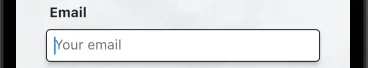
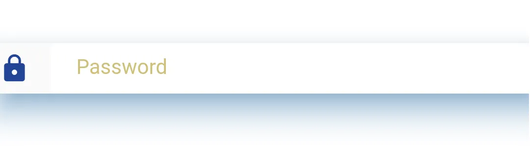
我的结果看起来像这样。

helperText或errorText,它看起来很好。否则,阴影会占用额外的空间,看起来不太好。:( - BambinoUAcolor: Colors.transparent添加到Material中,可以在使用更高的BorderRadius.circular值时移除方形形状。 - lolelo