我需要在我的Flutter项目中给一些图标添加阴影效果。我已检查了图标类的构造函数,但没有任何指向阴影的内容。你有任何实现方法的想法吗?
14个回答
49
最终我使用这个解决方法得到了想要的东西。我希望它能帮助需要类似东西的人。
Stack(
  children: <Widget>[
    Positioned(
      left: 1.0,
      top: 2.0,
      child: Icon(icon, color: Colors.black54),
    ),
    Icon(icon, color: Colors.white),
  ],
),
- Dzeri
3
42呃……感觉很肮脏。 - mik
4虽然不太好看,但它能派上用场!加一些阿尔法值会让它更好。 - dcg
2这看起来很不干净,但低头看看吧。这是所有解决方案中最干净的一个。 - RobbB
27
Icon小部件具有shadows属性,您可以使用该属性为图标添加阴影。
const Icon(
     icon,
     shadows: <Shadow>[Shadow(color: Colors.black, blurRadius: 15.0)],
     size: 60,
     color: Colors.white,
)
- Rupayan
2
在所有的建议中,我发现这个是最简单和外观最好的解决方案。 - CybeX
为了获得更好的效果,可以使用
black45 偏移量,例如 <Shadow>[Shadow(color: Colors.black45, blurRadius: 20.0, offset: Offset(0, 2.0))]。 - CybeX11
Container(
  decoration: BoxDecoration(
    shape: BoxShape.circle,
    boxShadow: [
      BoxShadow(
        color: Colors.grey[400]!,
        blurRadius: 5.0,
      ),
    ]
  ),
  child: Icon(
    Icons.fiber_manual_record,
    color: Colors.amber,
    size:15,
  )
),
- Dev. R
3
请解释你的答案。 - Doruk Eren Aktaş
我该如何为其他图标添加阴影?使用fiber_manual_record时效果很好。 - Phanindra
1将你的代码更新为null安全,为color添加“!”。 - Felipe Sales
6
您可以使用IconShadowWidget()。
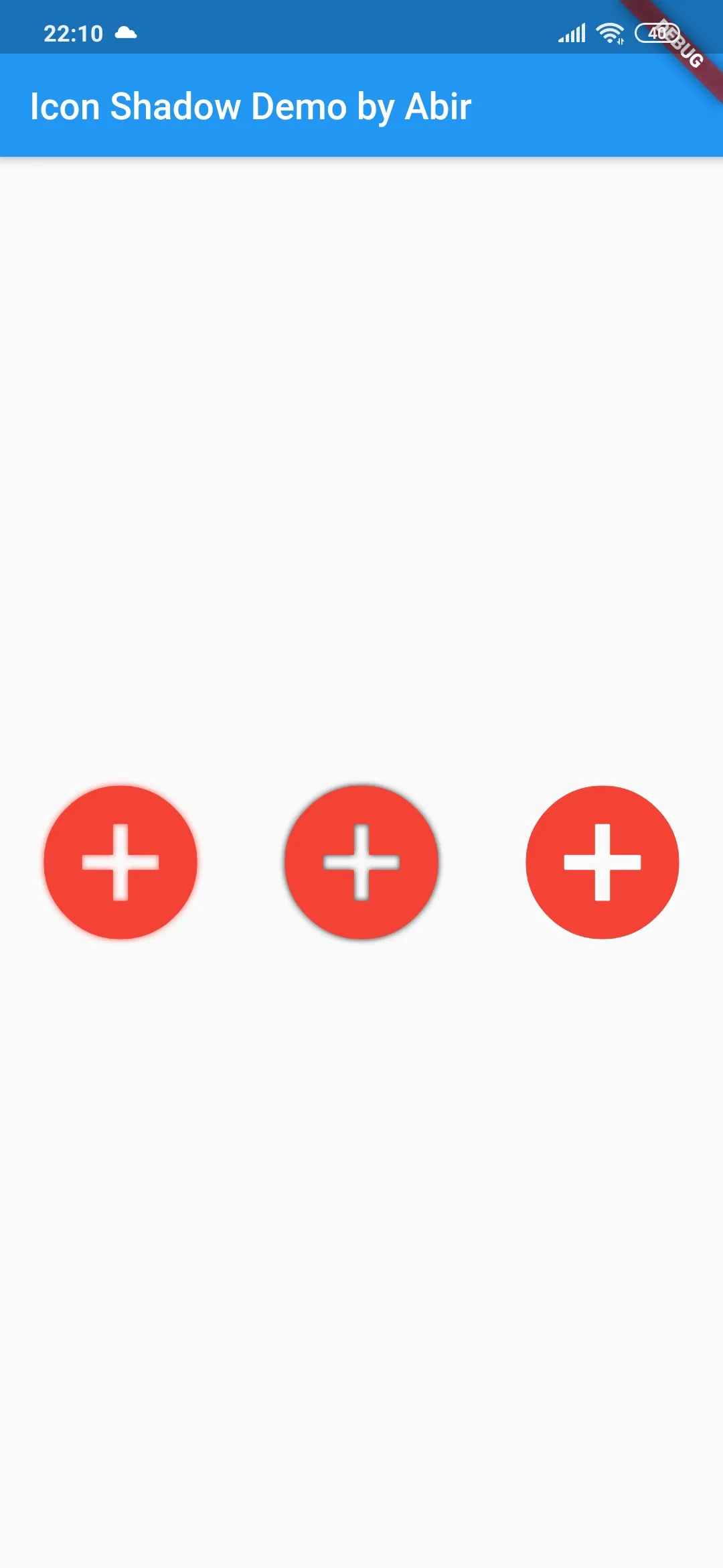
如何使用:
1. 在pubspec.yaml中添加依赖项:
icon_shadow: ^1.0.1
2. 导入你的 Dart 代码:
import 'package:icon_shadow/icon_shadow.dart';
3. 添加图标:
Center(
            child: Row(
              mainAxisAlignment: MainAxisAlignment.spaceEvenly,
              children: <Widget>[
        IconShadowWidget(
          Icon(
            Icons.add_circle,
            color: Colors.red,
            size: 100.0,
          ),
        ),
        IconShadowWidget(
          Icon(
            Icons.add_circle,
            color: Colors.red,
            size: 100.0,
          ),
          shadowColor: Colors.black,
        ),
        IconShadowWidget(
          Icon(
            Icons.add_circle,
            color: Colors.red,
            size: 100.0,
          ),
          shadowColor: Colors.black,
          showShadow: false,
        ),
              ],
            ),
          ),
你还可以查看我的GitHub存储库。
- Abir Ahsan
5
每当您需要高程/阴影时,请记住Card小部件。因此,您可以将其包装在Card和SizedBox中:
          Card(
          elevation: 10,
          shape: RoundedRectangleBorder(
            borderRadius: BorderRadius.circular(35.0),
          ),
          child: SizedBox(
            width: 35,
            height: 35,
            child: Icon(
              Icons.close,
              color: Colors.black,
              size: 19,
            ),
          ),
        )
更好的是,这里有一个带有材料气泡效果和阴影的图标按钮(在下面的GIF中,阴影的质量看起来很糟糕,这是因为GIF本身的原因)。
 :
:
          Card(
          elevation: 10,
          shape: RoundedRectangleBorder(
            borderRadius: BorderRadius.circular(35.0),
          ),
          child: ClipOval(
            child: Material(
              color: Colors.transparent, // button color
              child: InkWell(
                splashColor: Colors.red, // inkwell color
                child: SizedBox(
                  width: 35,
                  height: 35,
                  child: Icon(
                    Icons.close,
                    color: Colors.black,
                    size: 19,
                  ),
                ),
                onTap: () {},
              ),
            ),
          ),
        )
- Eren
4
从 @Dzeri 的答案中借鉴了这个想法(https://dev59.com/D1MI5IYBdhLWcg3w5v_J#55668093),并将其封装成小部件,从而使其可重复使用。
小部件
class ShadowIcon extends StatelessWidget {
  final IconData icon;
  final Color color;

  ShadowIcon(this.icon, {Key key, this.color: kLight}) : super(key: key);

  @override
  Widget build(BuildContext context) {
    return Stack(
      children: [
        Positioned(
          left: 0.5,
          top: 0.5,
          child: BackdropFilter(
            filter: ImageFilter.blur(
              sigmaX: 1.0,
              sigmaY: 1.0,
            ),
            child: FaIcon(this.icon, color: kDark.withOpacity(0.7)),
          ),
        ),
        FaIcon(this.icon, color: color),
      ],
    );
  }
}
BackdropFilter似乎无法按预期工作,但无论如何我只需要一个微妙的投影。我还使用了font_awesome_flutter包,但您可以使用本地的Icon小部件替换FaIcon。
用法
您可以简单地将本地的Icon替换为ShadowIcon小部件调用:
IconButton(
  icon: ShadowIcon(FontAwesomeIcons.chevronLeft, color: kLight),
  onPressed: () => Get.back(),
),
- Tuco
3
目前,直接向图标小部件添加阴影是不可能的。但是,您可以使用 IconData 图标的其他信息来将图标显示为样式文本。
Text(
  String.fromCharCode(Icons.add.codePoint),
  style: TextStyle(
    fontFamily: Icons.add.fontFamily,
    color: Colors.white,
    fontSize: 20.0,
    shadows: [
      BoxShadow(
        color: ColorTheme.blackLight,
        spreadRadius: 2,
        blurRadius: 2,
      )
    ],
    height: 1 //if this isn't set, the shadow will be cut off on the top and bottom
  )
);
- JSC500
2
这是最聪明的方法,因为它允许使用 Shadow(不是 BoxShadow,我需要 Shadow),但不幸的是,在 IconButton 内部它无法工作,至少在 Web 上是如此。它显示一个无效字符而不是真正的字符。 - Hamza Abbad
@HamzaAbbad 我在 Flutter Web 上使用 IconButton,现在它可以工作了。
我的问题是 spreadRadius 对于阴影效果没有起作用,但其他方面都很好。 - amir_a14
2
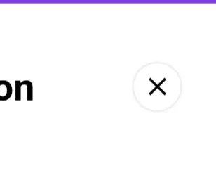
  InkWell(
      child: Container(
                padding: const EdgeInsets.all(4.0),
                decoration: BoxDecoration(
                             color: Colors.white,
                             shape: BoxShape.circle,
                             boxShadow: [
                                BoxShadow(
                                  color: Colors.grey,
                                  blurRadius: .5,
                                ),
                              ]),
                child: Icon(
                         Icons.clear,
                         color: Colors.black,
                         size: 25,
                          )),
                    ),
结果会像这张图片一样:
 :
:
- Omar Alshyokh
1
您可以使用装饰图标插件在图标上添加阴影。

代码在这里:
Scaffold(
  body: Center(
    child: Row(
      mainAxisAlignment: MainAxisAlignment.spaceEvenly,
      children: [
        DecoratedIcon(
          Icons.android,
          color: Colors.purple,
          size: 60.0,
          shadows: [
            BoxShadow(
              blurRadius: 42.0,
              color: Colors.purpleAccent,
            ),
            BoxShadow(
              blurRadius: 12.0,
              color: Colors.white,
            ),
          ],
        ),
        DecoratedIcon(
          Icons.favorite,
          color: Colors.lightBlue.shade50,
          size: 60.0,
          shadows: [
            BoxShadow(
              blurRadius: 12.0,
              color: Colors.blue,
            ),
            BoxShadow(
              blurRadius: 12.0,
              color: Colors.green,
              offset: Offset(0, 6.0),
            ),
          ],
        ),
        DecoratedIcon(
          Icons.fingerprint,
          color: Colors.orange,
          size: 60.0,
          shadows: [
            BoxShadow(
              color: Colors.black,
              offset: Offset(3.0, 3.0),
            ),
          ],
        ),
      ],
    ),
  ),
);
- Mahmoud Abu Alheja
1
太好了。运行良好。谢谢! - PhillipJacobs
1
尝试一下,使用图标字体。
GestureDetector(
child: Container(
padding: EdgeInsets.only(right: 10, top: 10),
child: Text('\u{e5d3}',
style: TextStyle(
fontSize: 22,
color: Colors.white,
fontFamily: 'MaterialIcons',
shadows: [
BoxShadow(color: Colors.black, blurRadius: 2)
])),
),
onTap: () {}
)
Icon data from icons.dart
/// <i class="material-icons md-36">more_horiz</i> — material icon named "more horiz".
static const IconData more_horiz = IconData(0xe5d3, fontFamily: 'MaterialIcons');
- zhengwu119
网页内容由stack overflow 提供, 点击上面的可以查看英文原文,
原文链接
原文链接