在Axes3d(matplotlib)中去除空白间隔

6
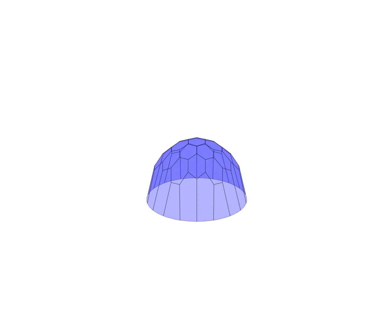
我正在绘制一个由许多多边形组成的曲面。如下所示,绘图非常简单。
def plotSurface(cell, numOfLayer, name=None, alpha = 0.5):
    #import the libraries
    from mpl_toolkits.mplot3d import Axes3D
    import matplotlib as mpl
    from mpl_toolkits.mplot3d.art3d import Poly3DCollection
    import numpy as np
    import matplotlib.pyplot as plt
    #limits of the plot
    radius = (numOfLayer>1)*(np.sqrt(3.)*(numOfLayer-1)-Length)+Length#the radius of circle to be projected on
    #plotting part
    fig = plt.figure(frameon=False,figsize=(12,10))
    ax = Axes3D(fig)
    ax.set_xlim((-2*radius,2*radius))
    ax.set_ylim((-2*radius,2*radius))
    ax.set_zlim((-0.5*radius,2*radius))
    ax.axis('off')
    #fig = plt.figure()
    #ax = fig.gca(projection='3d')
    ##iterating through the cell##
    for stuff happening here : verts are the polygon vertices
          #adding to 3d plot
          ax.add_collection3d(Poly3DCollection(verts,alpha = alpha))
    if name == None:#plot the figure
        plt.show()
    else:
        plt.savefig(name,bbox_inches='tight')
    return

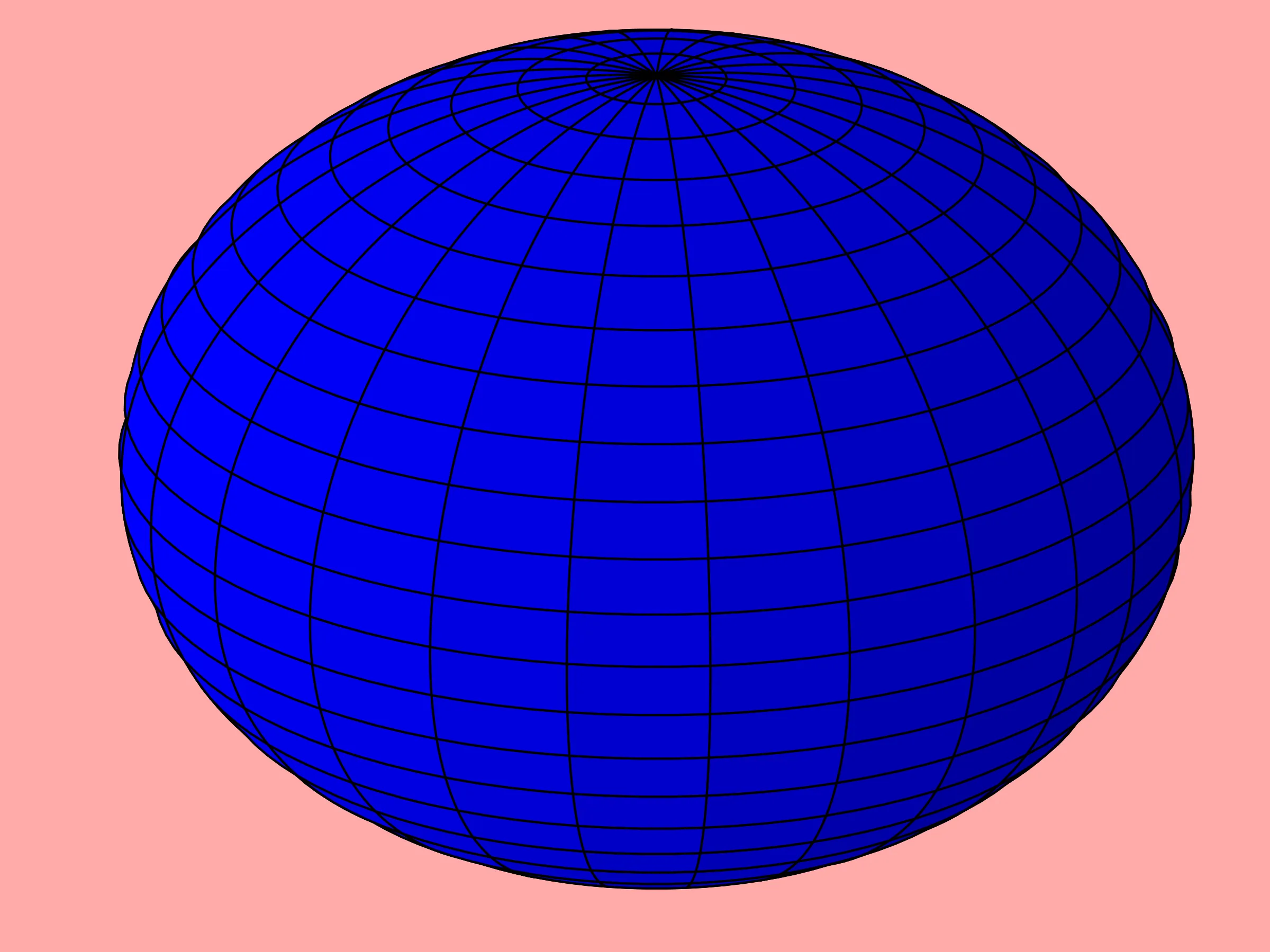
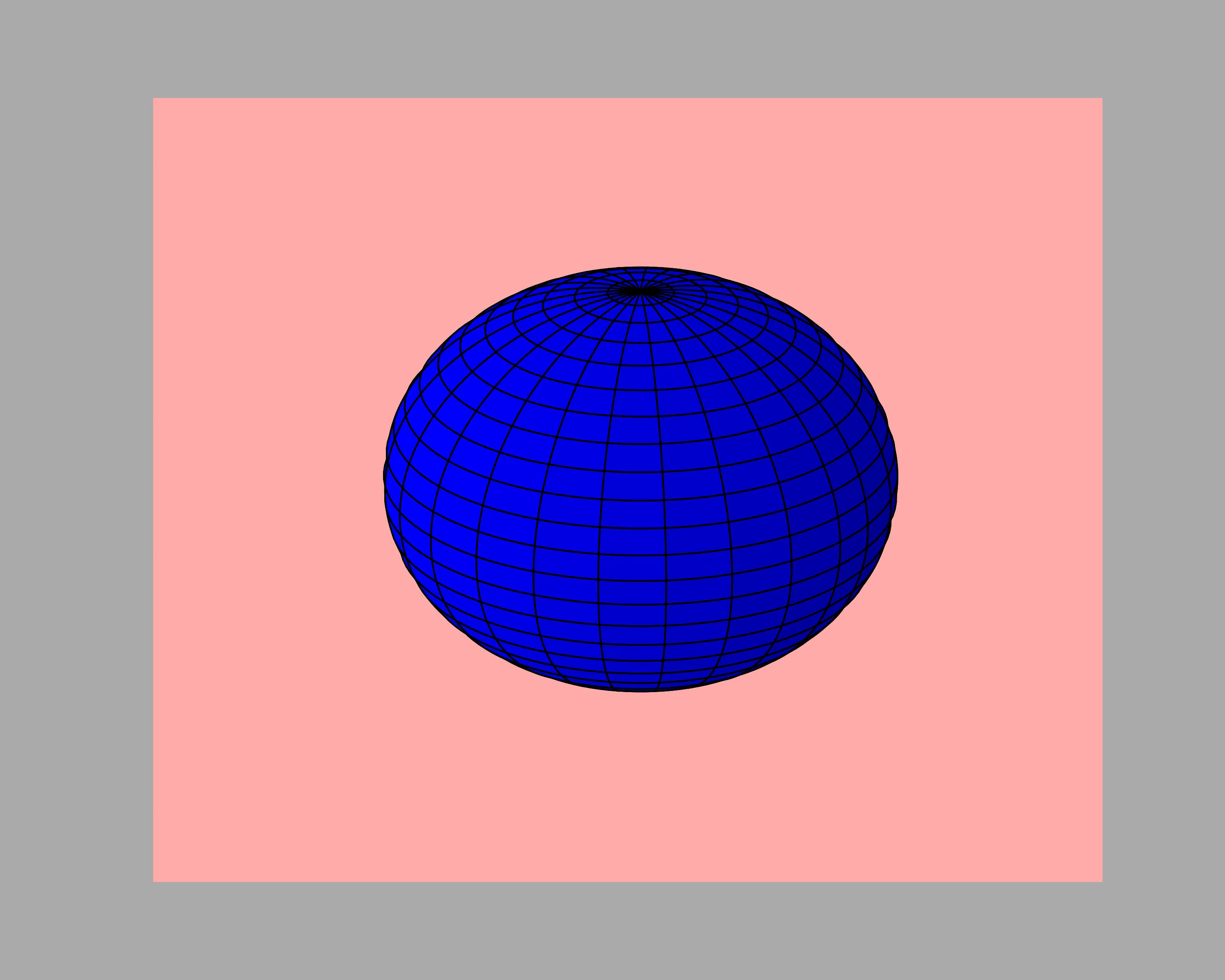
我看到的图片如下所示。有很大的白色空间,但图像很小。我希望图像覆盖大部分空间。我该如何实现?

enter image description here


减小坐标轴的限制?例如,
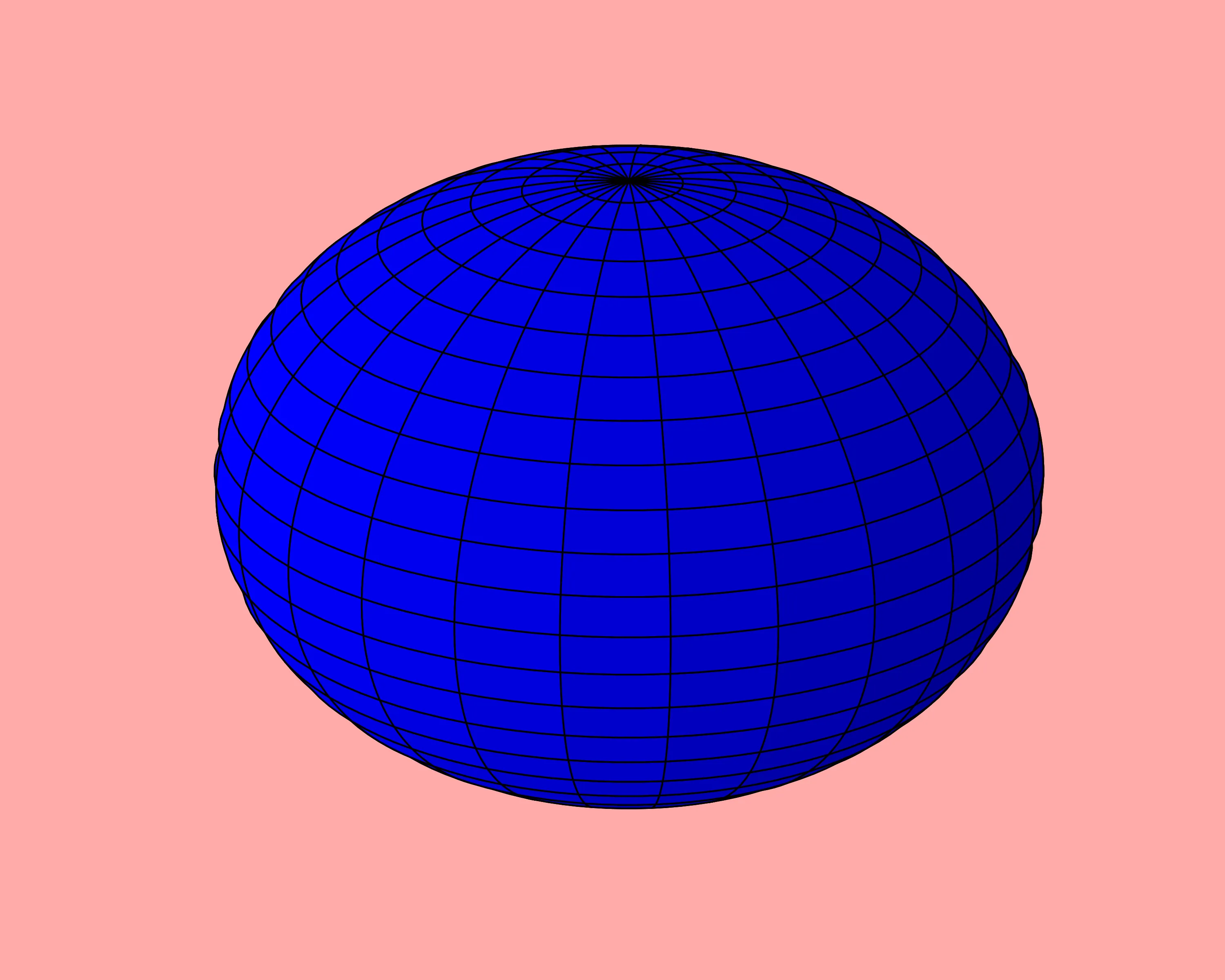
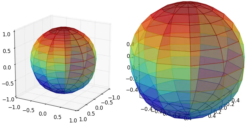
ax.set_xlim(-1.1*radius, 1.1*radius)等等。 - tmdavison
没有轴限制是因为我使用的恰好适合绘图形状。所以这不是解决方案。 - jkhadka
fig.subplots_adjust(left=0, right=1, bottom=0, top=1) 将会移除轴线外部的大量空白。 - tmdavison
虽然有了这个,但仍然存在一些空间。非常感谢 :) 这帮了大忙 - jkhadka
2个回答

10

您可以通过以下几种方式修改空格:

  1. Reduce the whitespace inside the axes. To do this, you could modify the x, y and z limits using:

    ax.set_xlim()
    ax.set_ylim()
    ax.set_zlim()
    
  2. Reduce the whitespace outside the axes. To do this, you can use:

    fig.subplots_adjust(left=0, right=1, bottom=0, top=1)
    
  3. Finally, you could just save a portion of the figure when you call savefig. You can modify this area using the bbox_inches kwarg, by using an actual Bbox rather than setting it to tight.

例如,让我们考虑来自matplotlib图库的这张图片。请注意,我已经改变了坐标轴和图形背景颜色,以便它们在下面的页面上清晰可见。
from mpl_toolkits.mplot3d import Axes3D
import matplotlib.pyplot as plt
import numpy as np

fig = plt.figure(figsize=(10,8))
# I added a pink axis background, just so its easy to see against the white page
ax = fig.add_subplot(111, projection='3d', facecolor='#FFAAAA')

u = np.linspace(0, 2 * np.pi, 100)
v = np.linspace(0, np.pi, 100)

x = 10 * np.outer(np.cos(u), np.sin(v))
y = 10 * np.outer(np.sin(u), np.sin(v))
z = 10 * np.outer(np.ones(np.size(u)), np.cos(v))
ax.plot_surface(x, y, z, rstride=4, cstride=4, color='b')

ax.axis('off')

# Save the original figure (using a grey background for the figure for clarity)
plt.savefig('3d_whitespace0.png', facecolor='#AAAAAA')

enter image description here

# Step 1 above: change the axes limits
ax.set_xlim(-8, 8)
ax.set_ylim(-8, 8)
ax.set_zlim(-8, 8)

plt.savefig('3d_whitespace1.png', facecolor='#AAAAAA')

enter image description here

# Step 2 above: change the subplot margins
fig.subplots_adjust(left=0, right=1, bottom=0, top=1)

plt.savefig('3d_whitespace2.png', facecolor='#AAAAAA')

enter image description here

# Step 3 above: save only a portion of the figure. Here we will cut one inch
# off each side of the figure, to change the 10in x 8in figure to 8in x 6in
bbox = fig.bbox_inches.from_bounds(1, 1, 8, 6)

plt.savefig('3d_whitespace3.png', bbox_inches=bbox, facecolor='#AAAAAA')

enter image description here


请注意,axisbg已被弃用,替换为facecolor - supergra
谢谢@supergra,我已经相应地编辑了答案。 - tmdavison

3
图形边距可以通过设置fig.subplots_adjust(top=1, bottom=0, left=0, right=1)来减少。这可能足够,也可能不足,具体取决于实际图形。
同时要注意,如果轴的纵横比设置为相等,则必须将figsize设置为平方。 (这在本例中并非如此,但在其他情况下可能需要)。
最后一个调节选项是减小轴限制。可以将其设置为较小的值以减少对象周围的白色空间。 例如,在原点周围绘制半径为1的球体,人们会倾向于将限制设置为[-1,1]以将整个球体适合绘图。 但是,这将留下很多空白空间。将限制缩小到[-0.57,0.57]将使球体完美地适合于图形中。为了看到这种效果,我在下面的示例中保留了轴。
import matplotlib.pyplot as plt
from matplotlib import cm
from mpl_toolkits.mplot3d import Axes3D
import numpy as np

u = np.linspace(0, 2 * np.pi, 12)
v = np.linspace(0, np.pi,15)
x =  np.outer(np.cos(u), np.sin(v))
y =  np.outer(np.sin(u), np.sin(v))
z =  np.outer(np.ones(np.size(u)), np.cos(v))
F = np.sin(x)*y + z
F = (F-F.min())/(F-F.min()).max()

#Set colours and render
fig = plt.figure(figsize=(8,4))
fig.subplots_adjust(top=1, bottom=0, left=0, right=1, wspace=0)
ax = fig.add_subplot(121, projection='3d')
ax2 = fig.add_subplot(122, projection='3d')

# plotting a sphere with radius 1. 
# Naturally, setting the limits to 1 makes sense
ax.plot_surface(x,y,z,  rstride=1, cstride=1, facecolors=cm.jet(F), alpha=0.5)
ax.set_xlim(np.array([-1,1]))
ax.set_ylim(np.array([-1,1]))
ax.set_zlim(np.array([-1,1]))

# plotting a sphere with radius 1. 
# but now reducing the limits
ax2.plot_surface(x,y,z,  rstride=1, cstride=1, facecolors=cm.jet(1-F), alpha=0.5) 
ax2.set_xlim(np.array([-1,1])*.57)
ax2.set_ylim(np.array([-1,1])*.57)
ax2.set_zlim(np.array([-1,1])*.57)

#ax.axis('off') # turned on to see the effect. Turn off to have a nice image.
plt.show()

enter image description here


网页内容由stack overflow 提供, 点击上面的
可以查看英文原文,
原文链接