我的ggpmisc程序包中的stat_poly_eq()函数可以基于线性模型拟合在图形上添加文本标签。(统计学中,stat_ma_eq()和stat_quant_eq()函数同样支持主要轴回归和分位数回归。每个eq函数都有一个相匹配的line绘图函数。)
我已经在2023-03-30更新了这篇关于'ggpmisc'(>= 0.5.0)和'ggplot2'(>= 3.4.0)的答案。主要更改是使用'ggpmisc'(==0.5.0)中添加的use_label()函数来组装标签并映射它们。虽然aes()和after_stat()的使用没有改变,但use_label()使映射和组装标签的编码更简单。
在示例中,我使用
stat_poly_line()代替
stat_smooth(),因为它具有与
stat_poly_eq()相同的默认值,用于
method和
formula。在所有代码示例中,我省略了
stat_poly_line()的附加参数,因为它们与添加标签的问题无关。
library(ggplot2)
library(ggpmisc)
df <- data.frame(x = c(1:100))
df$y <- 2 + 3 * df$x + rnorm(100, sd = 40)
df$yy <- 2 + 3 * df$x + 0.1 * df$x^2 + rnorm(100, sd = 40)
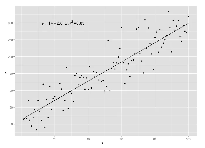
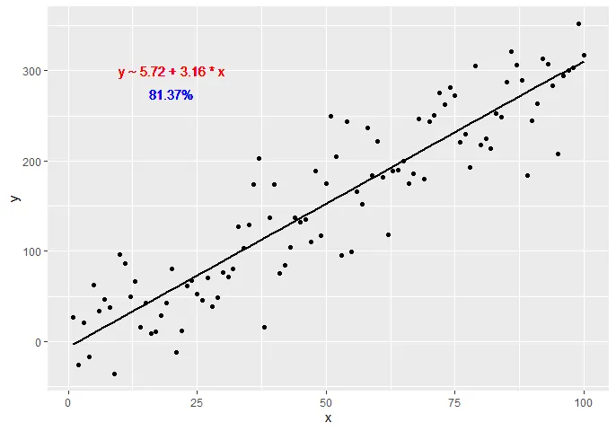
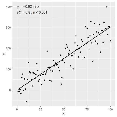
ggplot(data = df, aes(x = x, y = y)) +
stat_poly_line() +
stat_poly_eq() +
geom_point()

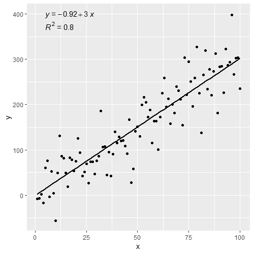
ggplot(data = df, aes(x = x, y = y)) +
stat_poly_line() +
stat_poly_eq(use_label(c("eq", "R2"))) +
geom_point()

ggplot(data = df, aes(x = x, y = y)) +
stat_poly_line() +
stat_poly_eq(use_label(c("eq", "adj.R2", "f", "p", "n"))) +
geom_point()

ggplot(data = df, aes(x = x, y = y)) +
stat_poly_line() +
stat_poly_eq(use_label(c("R2", "R2.confint", "n"))) +
geom_point()

ggplot(data = df, aes(x = x, y = y)) +
stat_poly_line() +
stat_poly_eq(use_label("eq")) +
stat_poly_eq(label.y = 0.9) +
geom_point()

ggplot(data = df, aes(x = x, y = y)) +
stat_poly_line(formula = y ~ x + 0) +
stat_poly_eq(use_label("eq"),
formula = y ~ x + 0) +
geom_point()

ggplot(data = df, aes(x = x, y = yy)) +
stat_poly_line(formula = y ~ poly(x, 2, raw = TRUE)) +
stat_poly_eq(formula = y ~ poly(x, 2, raw = TRUE), use_label("eq")) +
geom_point()

ggplot(data = df, aes(x = x, y = y)) +
stat_poly_line() +
stat_poly_eq(eq.with.lhs = "italic(hat(y))~`=`~",
use_label(c("eq", "R2"))) +
geom_point()

ggplot(data = df, aes(x = x, y = y)) +
stat_poly_line() +
stat_poly_eq(eq.with.lhs = "italic(h)~`=`~",
eq.x.rhs = "~italic(z)",
use_label("eq")) +
labs(x = expression(italic(z)), y = expression(italic(h))) +
geom_point()

dfg <- data.frame(x = c(1:100))
dfg$y <- 20 * c(0, 1) + 3 * df$x + rnorm(100, sd = 40)
dfg$group <- factor(rep(c("A", "B"), 50))
ggplot(data = dfg, aes(x = x, y = y, colour = group)) +
stat_poly_line() +
stat_poly_eq(use_label(c("eq", "R2"))) +
geom_point()

ggplot(data = dfg, aes(x = x, y = y, linetype = group, grp.label = group)) +
stat_poly_line() +
stat_poly_eq(use_label(c("grp", "eq", "R2"))) +
geom_point()

ggplot(data = dfg, aes(x = x, y = y, linetype = group, grp.label = group)) +
stat_poly_line() +
stat_poly_eq(aes(label = paste(after_stat(grp.label), "*\": \"*",
after_stat(eq.label), "*\", \"*",
after_stat(rr.label), sep = ""))) +
geom_point()

ggplot(data = dfg, aes(x = x, y = y)) +
stat_poly_line() +
stat_poly_eq(use_label(c("eq", "R2"))) +
geom_point(aes(colour = group))

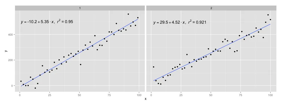
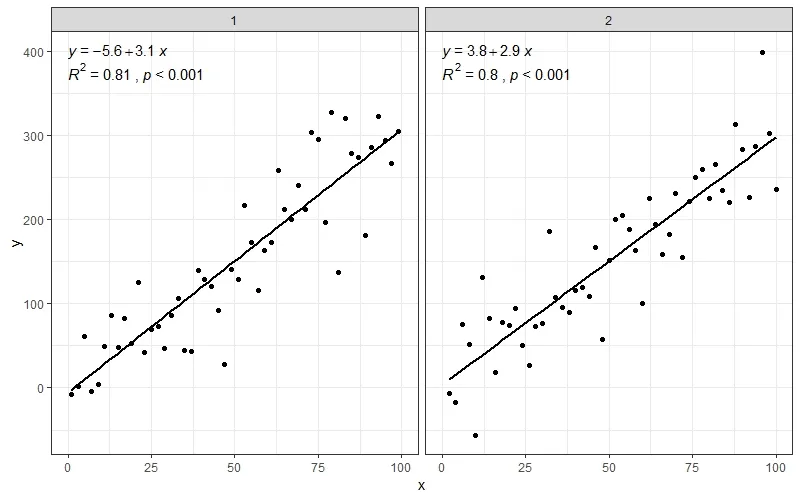
ggplot(data = dfg, aes(x = x, y = y)) +
stat_poly_line() +
stat_poly_eq(use_label(c("eq", "R2"))) +
geom_point() +
facet_wrap(~group)

使用reprex v2.0.2于2023年3月30日创建
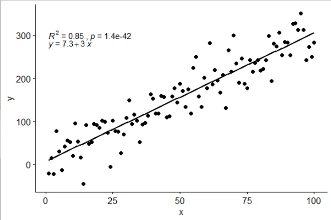

latticeExtra::lmlineq()。 - Josh O'Brien错误:'lmlineq'不是来自'namespace:latticeExtra'的导出对象- robertspierre